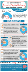
We’re likely all familiar with A/B testing when it comes to our landing pages. A/B testing lets you compare two different designs to find the approach that works best for your audience. But how many of us put that same level of attention and care into creating our lead generation forms? Micro-testing is A/B testing on a smaller scale. By making little adjustments to lead generation forms, you can often get big results. Let’s dive into this infographic from Formstack and see what a big difference a few pixels can make.
The size of your lead generation form can often be the biggest hurdle to conversion. Don’t overwhelm your users by asking them for their life history right away. Expecting them to sink more than a few seconds into filling out your form is liable to scare them off. Focus on the essentials: name and email address. The rest can come later. Grabbing only what you need the most can boost your conversion rate by 120%. You can also set up your form to show or hide questions based on a user’s previous answers – this strategy can snag you 50% more submissions.
When it comes to lead generation forms, looks matter. There are three key things to keep in mind:
- Placement: forms that sit on the right-hand side of the page generate 24% more leads
- Copy: Adding an extra word in the submit button can boost your conversion rate more than threefold
- Colour: Blue, green, and orange are powerful attention-grabbers. Take advantage of them.
It’s also important to optimize your site for mobile users. After all, 48% of Google searches are done through mobile phones now. Mobile-friendly forms could include features like shorter typing fields, easy-to-use dropdown lists, or simple select buttons. Make it even easier for your users by allowing them to link or log in via their social media accounts. This will help to autofill your form, and can raise your conversion rate by nearly 200%!
Lastly, make sure that your changes suit your audience by doing A/B testing the same way you would for your landing page. A good rule of thumb is to first test the copy, then the form length, and then your colour scheme. Happy testing!
Have you discovered the benefits of micro-testing? Are you still working hard at finding that perfect shade of orange for your submit button? Let me know in the comments.
Digital & Social Articles on Business 2 Community
(108)


