
Whoa there, where are you going?
A sub-goal of any website is to keep the visitors you get for longer.
If you’ve spent countless marketing hours and handfuls of cash luring people to your site, that last thing you want is for them to disappear in less than a minute.
Let’s see what we can do to keep visitors on your website for longer…
1. Visual appeal is most important.

A study from kinesisinc.com found that web users’ initial impression of websites was 94% visual. Making your page beautiful is one of the most powerful ways to earn the respect of your viewer.
Makes, sense doesn’t it?
If you like the look of something, you’ll stick around a little bit longer.
2. Understand your target audience.

You need to know who you are targeting.
And get into their mind.
Learn the way they think so you can seize their attention with something immediate, relevant, and eye-catching. Depending on the demographic, just what will grab the most attention is an issue of much contention.
Are visitors younger? A graphic or animation might hold their interest, more than just a text headline. Undertake research and interviews to get a view of who your audience really is.
3. Get to the point.

Most visitors decide whether or not to close a web page in half a second. Google witnessed a drop in visitors after a load delay of just 0.4 seconds.
You have so little time to deliver your message, so economize your word choice. Say it short, and say it sweet.
4. Have intuitive flow.
A popular school of thought advocates against complex site design with a simple mantra: Don’t make the user think, which is an awesome book by Steve Krug – a longstanding expert on the subject of web usability. Essentially the interface of your site should be so simple as to barely even exist at all. The second the viewer has to stop, back up and figure out how to work your website, you’ve lost them. Most of them will end up closing the page, if navigation gets too difficult.
5. Make relevant content and weave it together.

Content (particularly novel content) and SEO will bring viewers to your website, but relevance and cross-references will keep them there. One article’s worth of attention is nice enough, but keeping viewers longer will increase the chances that you get a conversion, whether you want an email address or are making a sale.
6. Keep titles clear and obvious.
 Have you ever avoided a link because the headline was confusing?
Most people don’t have time to spend figuring out exactly for whom the bell tolls. Especially in this day and age when the headline is often the link that brings viewers in the first place, the most successful websites will promise their message in the title. This article is living proof: clear titles are better for readers, and they make better SEO.
7. Break content into mini-bites to make it easier to read.

Have you ever seen a giant wall of text in an article and skipped it over because you couldn’t be bothered to read the whole thing?
Everyone else is the same way.
We subconsciously believe that huge blocks of text will take too long to read. But, as a designer and marketer, you need the viewer to read all of it to understand your value. So what do you do?
You break it up into one- to four-sentence bits, just like we’ve done with this segment of the article. Continue asking questions, to keep readers engaged and to set up big impacts.
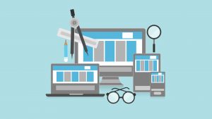
8. Give them more than text.

Today, we consume pictures, videos, music and text in a variety of forms. Infographics in particular, make up a big chunk of our article consumption.
Instagrams and Vines and tweets and Snaps—it’s built up an expectation in the consumer that content should manifest in more than one medium. Compel your viewers with more than just text to earn their time and respect as a content provider.
9. Build your website to be scanned.

People these days read in a rapid-fire kind of fashion, skimming down the page and flicking over to the next thing instantaneously. When they do so, their eye movements follow this pattern:
The F-shaped speed-reading pattern
You should arrange your content and text to hold the most relevant pieces of information on the left and top. There are special methods of designing for F-shaped skimming, but no guide is perfect: better to understand the speed-reader and design from the ground up than blindly following a rule.
Have fun, and remember: if this was useful please share it with your friends!
Digital & Social Articles on Business 2 Community(105)