Product pages are the most visited parts of any ecommerce site, and if you aim to double or triple your product page conversion rate, there are simple and effective ways you can follow.
These will not only turn more visitors into buyers, but will also decrease your bounce rates and keep potential customers engaged with your site.
It is common sense to say that a sale only becomes official once a customer reaches the checkout page.
But when you think about it, the place in your site where visitors really make a purchase decision are your product pages. See the best practices to create a high conversion product page.
Want to boost your product page conversions? Download this checklist of 19 simple steps to optimize your product page today.
Highlight important information
Any opportunity to address any hesitation and confusion must be addressed on your product pages.
Check out Lazada.sg and how they readily answer questions a visitor may have in mind that may prevent them from proceeding to the checkout page.

- Is it in stock?
- Does the product come with warranty protection?
- Do other people like the product?
- How soon can it be delivered?
- How much is the shipping?
Use any critical point as an opportunity to close a sale. Highlight important information to be clear about what you offer and why it is a wise decision to buy the product from you.
It also helps to have an FAQ section on your product pages, like what Roller Skate Nation does. If it increased Roller Skate Nation’s conversions by 69%, it can work for your site, too.

Use high-quality product photos
Using high-quality product photos is a great way you can show your visitors what they are getting.
Studies show that bigger photos yield higher conversion rates. However, having big photos does not mean a guaranteed boost in conversions. Product photos must still be compelling and high-quality.

Aside from increasing its size, have different photos that feature the product from different angles. This makes up for the lack of product interaction inherent in online shopping. Having a zoom capability is also best.
With photos, you can also help your visitors visualize the product better by providing context how it looks in a real-life. See the huge difference between Ralph Lauren and Amazon product presentation.

Build trust with social proof & trust seals
There are many things going on inside the mind of a visitor, especially if your business is new or if it is their first time to visit your site.
Ease those doubts with these four solutions:
Allow customers to make reviews. Show your visitors that you have nothing to hide, and allowing your satisfied customers to share their experiences validates the quality of your product.
And more importantly, products with customer reviews have 10% higher conversion rates than those without one.

Leverage on the best reviews. Having awesome customer reviews highlighted on a product page gives your site social proof. It shows that not only do your customers buy and use your product, but they care enough to encourage others to buy it as well.
Add trust badges and SSL Certificates. In a survey by Actual Insights, 61% of respondents cancelled a purchase all because trust badges were missing on the site.
Baymard Institute’s test shows that the selection of the right trust badges is very important for building customers’ trust. You should have these trust badges to show the legitimacy of your site.

And to let your visitors know that your site is technically secure and protected against network sniffing, have a quality SSL certificate from a trusted provider such as DigiCert.
Add more badges. Aside from legitimacy and security, use badges to prove how genuine your products are.
“Premium Quality” or “100% Original Product” are examples of product features that are best illustrated in a badge than in bulleted copy form.
You can also add badges of authenticity, such as this one from Express Watches UK. When they changed their badge from ‘Never Beaten on Price’ to ‘Seiko Authorized Dealer’, it spurred their sales to 107%!

Improve your product description
Part of product detail page optimization is having great product descriptions. Aside from photos, purchase decisions are based on these.
Make sure your product descriptions are full, clear, and substantial, and you can improve yours by doing the following:
Have a bulleted list of short descriptions next to your product photo. No fluff, no hype. Without having to scroll all the way down, tell who the product is for, what it does, and why it is good.

Below the product photo and short descriptions, have an area where you can go further with the product features. Cover all important points and be very detailed such that your visitors will not have any single question left.
You know you’ve done your job well when halfway through reading it and your visitors are already convinced to proceed to the checkout page.

Build an emotional connection. Having the technical features of a product is important, but having a creative story and a little imagination (and cuteness) behind it can be beneficial – a few dollars more to be exact.
Let your visitors know what they are getting. A product page cannot stand alone in identifying concerns that affect the buying process.
That is why it helps to do A/B testing constantly to find out customer anxieties and what can be done to address it, just like what Marketing Experiments did for an ebook retailer.

They wanted to know which of the four versions (product descriptions) will make a visitor purchase an ebook – the presence of security seals on the site (Version A), the compatibility of the e-book with different devices (Version B), the book’s synopsis (Version C) or the quick accessibility of the product upon purchase (Version D).
Of the four, they found out that the book’s synopsis shapes a visitor’s buying decision. When version C was applied on the site, it generated a 78% relative change in conversion.
Promote the ‘Add to Cart’ button
Whether your CTA is ‘Add to Cart’, ‘Add to Basket’ or ‘Buy Now’, make it a prominent feature on your product page.
It must be identifiable and should compel visitors to take action, just like what RIPT Apparel did with their CTA button.

Changing the CTA button from black and white to green and by adding the 24-hour limited time offer next to it increased their conversion rate by 6.3%. This adds proof to the fact that creating urgency drives conversion rates up.
Also, regularly test the color and copy of your CTA. There is no formula that guarantees the best conversion rates, but it is widely recommended that a white space around the CTA button helps in making it clear where to click.
Lastly, keep the color and the copy of your CTA button simple, and conduct A/B testing as well for its design and size.
Use urgency and scarcity
Nothing compels people to take action faster than the possibility of losing a deal. That is why creating the illusion of urgency and scarcity and incorporating it to your ecommerce product page optimization strategy can be a huge advantage.
It is a classic technique in affecting consumer behavior on supply and demand – if supply is limited (scarce) and if a product is important (urgent), people will be more compelled to buy immediately and in some case, buy more than what they need.

Think about that those times when Apple releases a new iPhone. Be creative with your urgency and scarcity strategy with the following recommendations:
Set deadlines. Check out how Amazon does a fine job in creating urgency with deadlines.
Use urgent colors like red, yellow, and orange. A 2011 study by HubSpot confirms that red over green can increase conversions by least 21%.

Experiment on words, such as ‘now’, ‘today’, ‘hurry’ and other similar words that can push people to act immediately.
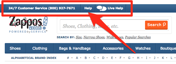
Integrate live chat and support features
77% of retailers consider live chat a critical communication method, and you should too. It makes you more accessible to your visitors. It also works for their peace of mind.
And like an FAQ page, allowing customers to speak to a business representative can help them make an informed buying decision.

Also, make your contact details, such as your phone number, social media accounts or email address, clearly visible on top of your product page. You may think it is a minor thing to consider, but it significantly adds to your site’s trust signals.

Conclusion
High conversion product pages are the lifeblood of your site.
While you may be confident with its aesthetics and user experience, you have to review your product pages and identify how many people leave and proceed to the checkout page.
Study the unique shopping behavior trends on your site, specifically the number of products added to the shopping cart after product details were reviewed (cart-to-detail rate) and the number of those products in the shopping cart that were purchased after the same product details were reviewed (buy-to-detail rate).
Also, visualize exactly what your visitors are doing on your product pages through heat map tracking to enjoy more conversions and improved engagement.
Finally, constantly check for best practices on product page conversion optimization and do regular testing on your product pages. You might be surprised that the simplest of modifications can make a world of difference to your site’s conversion rates.
Digital & Social Articles on Business 2 Community(52)