Think of some of the best digital marketers on the web. Who are the ones that come to mind? You probably think of people like Neil Patel, Jeff Bullas, Jay Baer and Noah Kagan. What all of these marketers have in common is that they are pros at creating consistent and engaging content. Yet it’s so difficult for us to continue to produce original content that it blows our minds when we see how great these marketers are at creating it.
Let’s take a closer look at Neil Patel’s blog. On average, each of his articles gets shared a minimum of about 350 times. A minimum. Except, Neil Patel’s blog posts are barely original. In fact the majority of his posts follow a rather consistent list-based layout. The reason this is the case is because in order to produce such a vast amount of content, and still maintain some degree of control over his other work, he needs other people to do some (if not most) of the writing for him. So he creates a template or layout that his staff writers can follow. After assessing about 20 of his blog posts, I comprised the following list of the 7 factors that Neil Patel ensures are present in every one of his blog posts.
1) A statistic opener/general statement (interchangeable)
The first couple of sentences of Neil’s blog posts either consists of a statistic or data point, or a general statement about the subject at hand. For the most part though, this statement functions as a hook and highlights a point that the reader may never have known. The point of the opener is to enlighten and engage. Neil has to ensure that his readers continue to make their way through the blog post, and so grabbing their attention right off the bat is crucial.
2) A question
Once Neil has gotten the facts out, his next step is to ask the reader a question. Take a look at this article on the 9 Types of Blog Posts Proven To Generate Organic Visitors. Either right before, or closely after the very first chart in the post, he asks
“But what types of content should you create if you want to drive social engagement and organic leads?”
This is essentially the thesis of Neil’s article. This is the question every marketer reading the post is usually thinking, and it’s generally the title reworded. The question is the perfect setup that draws the reader deeper into the article. Why does this question work so well? Because sometimes by phrasing a fact as an open-ended thought, a writer can evoke more curiosity from the reader. As Aristotle once said in his Metaphysics, “All men (and women) by nature desire to know”.
3) An Image or a Chart
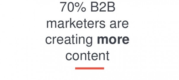
Following this question, or perhaps slightly preceding the question, Neil Patel includes an image or a chart in his blog. This is usually another statistic that helps frame the content which will follow in his article. Sometimes, the image he uses is a chart that highlights the results from a survey, or a timeline of the subject in question’s success over a given period. At other times the image is simply a textual statistic represented in a much larger font, like the one below.

And in all fairness, doesn’t that image stands out a lot more than if I just told you that 70% of B2B marketers are creating more content? Neil Patel figured as much too.
4) A prompt to download an ebook
Following the image or chart that he includes, Neil plugs a prompt to download an ebook. But you know what? The ebook isn’t anything special, in fact it’s the exact same content that’s in the blog post, but available as a PDF. Why is this such a smart idea? You might ask yourself why on earth you would even download an ebook if you’re already reading the article online? Well for one, if you commute to work, you probably do a lot of reading on the subway or on the bus, and chances are you either don’t want to use up all of your data. or there isn’t any service under ground. If you have an ebook saved to your phone or to your computer, you can easily access that content wherever you are. Why is this beneficial to Neil? Well it help him expand his email list, because in order to download the PDF, you need to surpass an email gate, but it also means that he reflects an image of reliability in his readers’ minds. There is no harm in producing the content as an ebook, because he is simply repurposing it and making it available to those who might prefer to store a document on their hard drive as opposed to accessing it on the internet.
5) Another chart or infographic
Often (but not always) Neil will include another chart, or an infographic that summarizes the point of his article. In fact, Neil is a huge advocate for infographics and often talks about which elements to keep in mind when you are looking to create an infographic. According to Unbounce there has been an increase of 800% in the demand for infographics since 2012. There are plenty of amazing infographic tools that exist as well that marketers can use if they do not have the funds or time to hire a designer. Neil also understands that using an infographic in his blog post, he can repurpose a piece of content that potentially holds a lot of data or statistics, without necessarily having to do a lot of research.
Essentially, infographics are a great way to touch on specific facts, or to back up your points in a visually engaging way.
6) The List
Then Neil gets into the bulk of his content: the list of the top 10 things you can do to achieve “X”, or the 23 tools that will make “Y” easier. In fact, almost every single one of Neil’s posts is set up as a list or a step-by-step guide. From September 1, 2015 to October 15th, 2015, Neil posted 23 different article. 19 of those 23 was a list-based post or a step by step guide. That means that on average, 83% of his posts are lists. And who can blame him? Lists are some of the most popular pieces of content floating around in the web, after infographics. Look at Buzzfeed, after all. All they produce is lists, and people can’t get enough of them.
7) Lot’s of content curation
Finally, one of the principal factors that make Neil’s blog posts so informative and so consistent is the fact that the information is primarily curated. Take a look at this article that he wrote in June of 2015 on creating viral content. The information in the article isn’t anything new. He actually references articles that date back as far as 2012. At one point he states, that “…in a recent study 46% of businesses find it difficult to create compelling content”, but the study in question is actually from March of 2014. He also points out the popularity and virality of lists and infographics in a graph that was featured on Noah Kagan’s blog. Not surprisingly, the post is from 2014 as well.
I’m not suggesting anything against Neil Patel, all I’m trying to highlight is that a lot of his content is recycled, and a lot of his content reappears throughout previous blog posts. Take a look at this article and note the title. Then take a look at this article. He touches upon the same subject matter, and even his backlinks are doubled, but he repurposes the content on different sites. Remember that point about 70% of marketers making more content? Well this is exactly one of the ways that are managing to achieve this heightened level of content production.
The point is, content curation is essential for any marketer who is hoping to produce “consistent” and “engaging” material for their readers, and there is no argument that Neil Patel is doing just that. He has his method outlined perfectly so that anyone can follow his layout and still be able to write an article that people want to read, share and link back to.
Digital & Social Articles on Business 2 Community(139)