— August 2, 2019

Mediamodifier / Pixabay
One of the most important parts of an ecommerce strategy is also the one that often gets overlooked the most: the checkout and payment section.
All ecommerce practitioners know just how important the sales funnel is; but they’re often unclear on how the checkout process affects a visitor.
Here’s the truth:
The checkout page is a critical cog in this mechanism. When potential customers get to the checkout page, they need to feel comfortable enough to enter their confidential information. The process needs to be easy enough for them to warrant handing over their hard-earned money for whatever they’re buying. And the page should flow intuitively so that they instantly know what to do the moment it’s done loading. Any sign of friction can lead to an abandoned cart.
Here are six steps to improve the ecommerce payment process:
1. Don’t Redirect to Other Websites
It’s easy and convenient to just push the whole payment system off onto another website and let them handle it. They’ve already provided a way for people to pay – so there’s no sense in redesigning the wheel.
Except that it pushes customers away. It was hard work just getting them to the store and through the whole sales funnel. Now they end up on another website, feeling like they’re giving their money away to someone else.
This will be the last thing the customers see. Rather make it be the business they bought from and form a good lasting impression. Thank your buyer with a message after the payment is through and bid them farewell until next time. The goal after securing that first payment is to have a customer come back, after all.
2. Design with Intent
Make it easy for customers to navigate to the checkout page and don’t bombard them while they’re there. The only goal for this page should be to get them through that checkout and payment process. The rest of the website was designed to take them here, but this part shouldn’t lead them anywhere else.
Studies show that 28% of shoppers in the US abandon their cart only because the checkout process was too long or complicated.
Make the design easy to follow and let visitors know exactly what the next step is. A clear flow and minimal features will help get them to that finish line.
3. Provide Multiple Popular Payment Options
There’s a vast array of different payment options out there, and it’s impossible to include them all. But limiting visitors to one or two payment methods will drive them away to competitors who cater to their needs. HostGator has a list of the top 10 payment methods people prefer right now.
There’s nothing to do but follow the money, as they say.

Source: Payer
4. Make the Payment Process as Short as Possible
People are busy. They have places to be and things to do. The whole point of online shopping is to get something quickly and effortlessly. It’s the e-commerce store’s job to make sure that’s what happens.
According to a report by Barilliance, account creation was the second leading cause of cart abandonment in 2017. That’s a huge reason to look into how and why people need to log in to buy from the site. Using anonymous guest checkouts is a credible option, and plenty of online stores offer that option. If there’s no valid reason for having a customer create an account, then don’t force them to.
5. Reassure Customers that their Data is Safe (and Back it Up!)
Customers trust the website to keep their private information and credit card details safe.
Breached data is a huge risk for online businesses. So let people know that everything is being done to protect their information. Then back that statement up by following best cybersecurity practices and using legitimate online security tools. Don’t save passwords in plain text, make regular backups, use password managers, and get a business VPN to protect all that data.
There are a lot of things that go into keeping an online business safe. But it’s a crucial step that can’t be ignored.
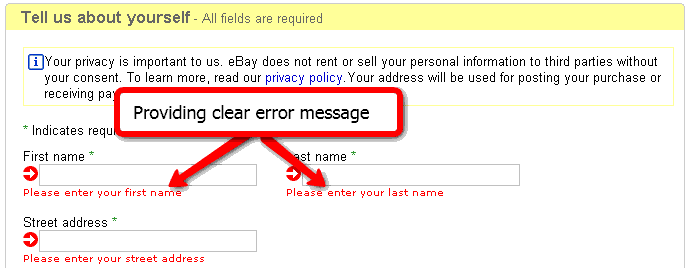
6. Provide Clear Error Messages
People make mistakes, forget their passwords, and get confused, so they enter the wrong details sometimes. Then there’s also the people who shop through proxies or travel and use different credit cards. Poorly designed websites provide an error message at the top or bottom of the page where the person isn’t currently looking. Others provide unclear messages that don’t help the person figure out what went wrong.
Don’t leave them guessing. Provide a clear reason for why the purchase couldn’t go through and help guide them towards a quick solution. User experience is important, so don’t just write “Something went wrong”. Let your buyers know what happened, explain the situation briefly but be straightforward and offer help if you can.
For example, don’t write “Login failed.” Instead say “Sorry, the password/username is incorrect” and offer to help recover it right away. A user-oriented design and copy goes a long way.

Source: eBay
The Bottom Line
If all else fails, always think of the customer first. Keep it simple and fast, and there’s little doubt that they’ll come back for more.
Digital & Social Articles on Business 2 Community
(75)


