If a picture is worth a thousand words, we should be able to take some pointers from that picture to write our words. Great design succeeds for a reason, and many of those reasons are transferrable to how marketers go about writing compelling content.
Here are a few principles that designers stick to that you should also follow when creating content:
1. Stay on Brand
Brand guidelines are a must for every great designer. Staying on brand with design makes it easier for your audience to look at a piece and know it comes from your company.
And just as you’d never see Apple create a piece of collateral using Comic Sans or cartoons, you’d never see The New York Times publish a Buzzfeed-style listicle.
What does this have to do with great writing? Create a writing style guide, just as you would for design. Instead of fonts and colors, determine tone, voice, and any other aspects of your written brand that you want to call out. At Uberflip, we have our own brand & style guide to help internal writers keep with the brand voice as well as guiding freelance or guest writers.
2. Keep It Clean & Concise
Minimalist design is in right now, especially for websites. A clean design helps direct viewers to the most important information quickly and easily. It’s easy for designers to go overboard with treatments and extra frills, but if you can’t look at a piece in a few seconds and know what the intended message is, the design fails.
Similarly, great writing should be able to guide readers to the most important points with as little fluff possible. Especially in business writing, hyperbole and flowery writing do nothing for the audience. If your visitors are looking for information, give it to them.
No need to write a novel where a paragraph will do.
3. Test What Works
Great designers will A/B test different layouts or even color options to see what drives the most engagement. They can take this knowledge and adapt their designs accordingly to make sure they’re giving the audience what they want to see while meeting business goals.
Look at the metrics for your different types of content pieces. If your white papers are getting just a handful of downloads but your webinar signups are through the roof, it’s an easy indicator of the type of content your audience likes to consume.
However, don’t stop testing. Just because your webinars are doing well doesn’t mean that every topic you need to create content for lends itself to a webinar. Test, test, and test again!
4. A “Boring” Subject Doesn’t Call For Boring Design
We can’t all work for companies like Disney where fun is inherently built into the product or service. And you know what? That’s ok. Plenty of companies in “boring” industries still create beautiful and intriguing work. You’re only boring if you choose to be!
If you’re in an industry that lacks pizazz, you can still come up with some interesting content. One of my favorite examples of this is BambooHR. HR software isn’t exactly something that makes people boil over with excitement; however, the content team has done some great work. I especially think their videos are a great example of how you can let your company’s human side shine.
5. Create a hierarchy
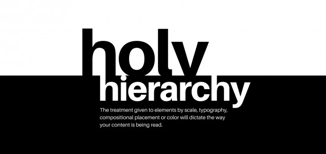
Source: Canva
Hierarchy gives design its focal points. Designers use hierarchy to guide their viewers to areas that are more important than others so that with even a quick glance, the most important messages are seen.
When creating content, know what your goal is and organize your writing around that goal. If you’re writing a blog post, put what you want readers to take away the most at the very beginning and use elements, like headers or bolded type, to draw their attention towards important points.
This way, even if your reader skims your piece, they can quickly see if it’s worth more of their time. I can’t tell you how many times I’ve instantly clicked off of an article because it had no distinct breaks in a huge body of text.
Learning From Design
Though designers rely on proven best practices to shape their approach, they always keep a close eye on new visual trends that start to form. As mentioned, minimal presentations are becoming increasingly popular in addition to more “flat” looks with less dimensional shading.
But tides continuously change. So while the five design components we covered today are sound tips to improve and strengthen your writing, always keep your eyes peeled for new effective stylistic approaches.
Can you think of any other ways that great design and great writing overlap? Let me know in the comments below!
Digital & Social Articles on Business 2 Community(40)