“Design is content with intent. Content without intent is noise. Intent without content is decoration.”
– Joe Sparano
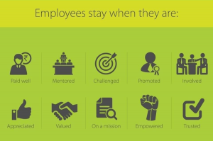
It’s no secret that simplicity reigns supreme in web design. The simplicity of a website’s design can go a long way towards making it the well-oiled, lead-converting machine you want it to be. On a practical level, keeping your website simple to use will help get more visitors there in the first place. This is because search engines consider both the content and the structure of website when creating rankings. On a more functional level, the simplicity of a website will make it visually pleasing and easy to navigate for visitors once they get there.
How to use this information, though? Make your website as sparse as possible and devoid of all those imaginative flourishes? Of course not.
The secret, then, is to be creative in ways that clarify, not clutter. Every control button and piece of content you include on your site should offer a visitor a clear path towards learning about – and then purchasing – your product/service. Here are some great examples of websites that are visually striking, easy to use, and effective at turning visitors into customers.
Microsoft
Based on some website designs I have seen, it seems certain companies believe that a site’s functionality depends on its conformity of shape. Not true! In fact, total conformity will lead you straight past functionality and into the realm of the mind-numbing. All of the pieces of content on your webpage have a different purpose, so why not treat them – aesthetically and geographically – as such?
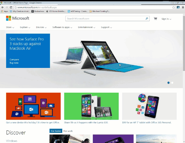
Take Microsoft’s home page for example. Pieces of content come in the form of cards, rectangles cascading down the page as you scroll, varying in color and size. These little incongruences don’t even become immediately apparent, though, because of how well they have been fit together.
More specifically, Microsoft has organized the cards of content in a way that emphasizes sensible paths of action for visitors. Say for instance, you are a casual visitor to the site. You aren’t looking for information on any one product in particular quite yet, but Microsoft is a brand you know and you are in the habit of frequenting their site to see what new products they have been working on. You wouldn’t want to have to sift through a standard product grid to try to determine what looks new, would you? For this reason, they’ve included giant, colorful cards highlighting their newest products and features.
Sandwiched around these large highlighted cards, Microsoft uses smaller ones to target more purchase-ready visitors. Since these people already have an idea of what they are looking for, the visual ‘hook’ of the card isn’t as important as how easy it is to navigate.
If you are one of these visitors, you have a couple of options. You can use the header menu at the top, where you can navigate based on the different mediums Microsoft dabbles in (software, video games, entertainment, etc.). Or, you can use the more specific cards of content down below, where you can navigate based on informational offerings (like ‘About Us’, ‘Popular Resources’, etc.).
For a leading multimedia corporation that deals in many varieties of technology, Microsoft’s website makes their brand easy to recognize and their product offerings easy to navigate.
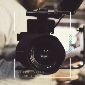
Hot Dot
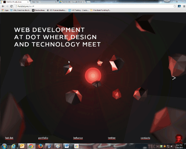
So, it may be a bit of a cheat to include a successful web design firm in a blog about successfully designed websites. But with HotDot’s eye-popping aesthetics and functional interface, I couldn’t resist. Besides, why not learn from the best?
The website’s home page uses large, boldly accented images that demand attention. This is okay for a company like HotDot, because these images are directly related to the service they offer. Their immediate method of communicating their expertise is by showing, instead of telling; perfect for a company in a visual industry.
Like many websites over the past few years, HotDot uses a parallax scrolling technique to ‘deepen’ the visual field of the website. Parallax scrolling means using multiple background fields which ascend up the screen (relative to your scrolling) at different speeds. Our eyes naturally adjust to the dissonance by attributing different ‘depths’ to the content even though they’re all being displayed on a two-dimensional screen. The technique, while very cool, can become an overwrought cliché in the wrong hands. If used in a way that complements the content it is presenting, though, it can add modern style and strengthen the visitor’s engagement.
One reason HotDot’s use of the technique is so appealing is that they’ve eschewed the commonly used vertical method and instead created a horizontal, left-right scroll. It’s a subtly unexpected trick, but it helps pull you in as you scroll. They’re taking advantage of the fact that the content highlighted on their home page isn’t comprised of written blurbs, but instead big, arrestingly beautiful images. As the images slide with your scroll, you feel as though you’re slowly moving along the wall of an art gallery. Besides, English speakers read left-to-right anyways, so the cognitive leap they’re asking the user to make isn’t a big one, and is more than made up for by the site’s sleek functionality.
Two thumbs up (or maybe two thumbs left-to-right).
PayPal
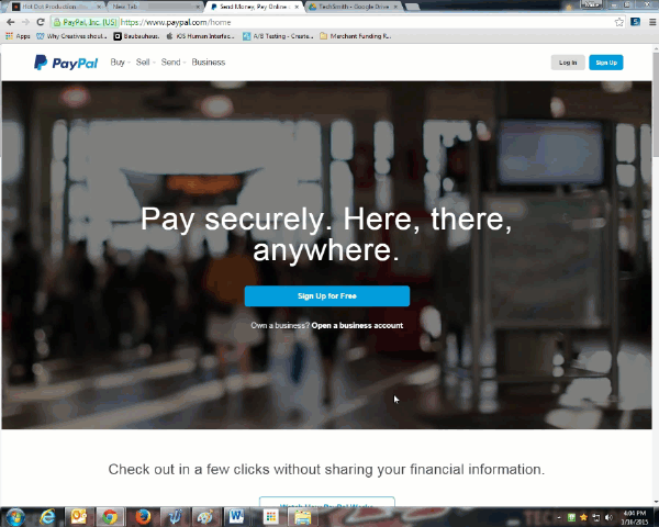
PayPal recently overhauled their website in an attempt to make it more modern and user-friendly. To start, they chucked the classic rigid controls and in their place put smoother ones – far easier on the eyes. Next, they added a moving-image background that shows how their product can be used in everyday life. An overhaul like this is always ambitious because it can alienate the users who had become accustomed to the inner workings of the previous site. It seems in this case though, that PayPal pulled it off with aplomb.
The moving-image background does a great job of accentuating what makes their product so useful (enabling customers to make – and merchants to receive – payment by credit card via mobile device), without being overwhelming or distracting. If you want to watch it, great, but if you want to get straight to business, it’s not going to impede you in any way like a separate, pop-up video ad would.
Speaking of getting straight to business, PayPal’s new site does a great job of leaving the functional path completely up to the user. If you’re already a customer, making the purchase or getting the info you need is as immediate as you would want. While there are some large-form rectangles of advertising PayPal has chosen to highlight, you aren’t confronted with those until you scroll down quite a bit.
If you already know exactly what you want to accomplish on the site, the menu controls at the top are easy to access and well-labelled for simplicity of use. You can get anywhere you need to go through these without having to scroll at all.
Fit-EST
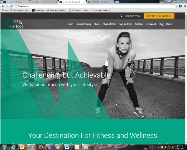
Fit-EST is a gym and wellness center located in Westport, Connecticut who worked with us to improve their website. The modern look we came up with for them shows visitors that their unique strategic approach puts them on the cutting edge of athletic training.
If you are seeking out a gym’s website, you likely have already diagnosed the problem of wanting to get fit. By now, it’s a matter of deciding between different gyms in your area to find the one that is right for you. So what about Fit-EST’s page is convincing enough for you to join?
For starters, this is another strong example of how parallax scrolling can maintain a visitor’s interest and modernize the feel of the site. As we scroll down, the drawn graphic slides over and merges with the large, bright image of a woman exercising. The motion feels natural and leads to comfortable progression into the next block of content below.
Further down, we see the blocks of more detailed content (similar to Microsoft’s example from above) on what sets them apart from the competition. This comes in the form of testimonials and class descriptions. Testimonials are always great to include because they show your site’s visitors some in-the-flesh proof of how your company could potentially help them. As (almost) always, we also have the header menu at the top. This acts as a kind of conceptual anchor, where the standard options of navigation are presented horizontally so the visitor can always return there if the more creative content below becomes confusing.
Our hope, though, is that someone visiting the site will follow the easy progression of content down to the bottom, where a call-to-action is conveniently waiting to help them become a lead. Along the way, they’ll have seen what Fit-EST has to offer, why it’s a unique and effective approach, and live examples of people it has been successful for.
RECAP
Okay, so we’ve seen some examples of sites that work well, but what do they have in common? Let’s Recap:
1) Sensible paths of action:
- A visitor to your site should be able to sense a clearly defined functional path. As they navigate along this path, they’ll be able to absorb whatever content you choose in the order and manner that’s best suited for their needs.
2) An attractive (not distracting) eye catcher:
- This doesn’t mean your site has to have parallax scrolling, necessarily. Think, though, about how many other sites your visitor is viewing in the same day. It could be in the triple digits. What’s going to set yours apart?
3) Don’t worry about content conformity
- Every piece of content you include on your site is there for a different reason: treat them like it!
4) Funnel your level of detail
- Not every visitor to your site needs the same level of detail. As they scroll, allow them an easy, logical path towards the content that is best suited for them.
5) Include a call to action where the content is most detail oriented
- Once your visitor has seen the specifics on your product or service, there should be a clear opportunity to use that information. What better way to use it than to take the next step towards becoming a customer?
6) Traditional header menus won’t take away from an otherwise modern design
- With all of our examples we saw traditional header menus despite a more modern surrounding site structure. This is okay. It’s reassuring to your site’s visitors to have something at the top that they know they can return to if the more creatively curated content below isn’t for them.
(294)