
The other day, a friend of mine shared a YouTube video on Facebook. I don’t usually care much about what my friends like and share on Facebook. But for some
The other day, a friend of mine shared a YouTube video on Facebook. I don’t usually care much about what my friends like and share on Facebook. But for some reason I was captivated, and I clicked on it.
It was an illustrated picture of a blackhole, pretty with its orange outline and dark background. The caption on the thumbnail was “Mini Black Hole”.
The thumbnail got my attention and I eventually watch the whole video.
It turns out the caption wasn’t misleading. The video was very informative about a mini black hole.
I also learned that if there was a black hole the size of a penny suddenly appeared beside me, it would destroy Earth.
I subscribed to that channel right away, and later that night I binge-watched their video collection.
When you look at their video thumbnails (the channel name is Kurzgesagt), you can see why I decided to watch. Their thumbnails are clear and interesting to look at.
Unlike the tempting thumbnails that only look for more views, these are the kind of thumbnail that actually get the audience to watch the entirety of the video.
Why Shouldn’t You Look Just for More Views?
The truth is I have bad experiences with tempting thumbnails. You’ll know what I mean shortly.
Did you watch it? Now you see what I meant by misleading thumbnails, don’t you?
It’s amazing how a single image can tempt you to click that play button, isn’t it?
FYI, Simple Pickup is an entertainment channel. The more views they get the more their ads revenue is.
It makes enough sense to me. They earn money per view, so that’s all they care about.
But if you’re making video content for your business, you shouldn’t mustn’t mislead your audience just to increase the views on your videos, or they’ll end up hating your company.
Remember, you are not publishing videos on YouTube for monetization, but for exposure.
You can get extra earnings from YouTube. Yes, I get that and it’s good for you. But that shouldn’t be your focus.
The main point of making videos as your content is to get more exposure and leads which hopefully will increase your potential sales and thus, revenue through your products/services, not YouTube ads.
But that will not happen if nobody watches your video. That’s why you should make a custom thumbnail for your video: to make a thumbnail as attractive as possible without misleading viewers with something else.
The main purpose of a video’s thumbnail is to make your audience interested, curious, and eager to watch the video behind it. It’s basically the cover of your video.
While it’s true that we shouldn’t judge a book by its cover, most people do judge a video by its thumbnail.
There are two ways you can select a thumbnail for your YouTube videos.
First, you can pick between the three frames YouTube chooses for you.
or
You can upload custom thumbnails engineered to reach more viewers.
The first step is rather easy: one click and it’s done. But I’ll be honest with you, YouTube auto-generated thumbnails suck. They can be blurry most of the time and your audience doesn’t like that.
The other option provides you with the ability to upload your own thumbnail for your video.
As a precaution, you’ll need to verify your account. It’s a far more promising option compared to the first one, though.
Let’s skip ahead and prance on to the part where we talk about how a YouTube thumbnail should be when you’re running a content campaign for your business.
1. Use High-Definition Image that Describes Your Video
While the rest of these suggestions are highly optional (perhaps you’ll use only one of them), this point is a MUST.
There’s nothing more annoying than seeing a blurry or pixelated image as a video thumbnail.
Not to mention the pretty-girl-wearing-a-two-piece-outfit-while-eating-bananas thumbnails that are clearly clickbait and have nothing to do with the rest of the video.
It’s mandatory that you choose a high-resolution image at least 1280 pixels x 720 pixels (or, even better, 1920 pixels x 1080 pixels) that SUIT THE MESSAGE OF THE VIDEO you’re about to publish.
Sorry for the caps lock. I just can’t stress that enough.
It doesn’t have to be a frame from your video. That’s the point and advantage of uploading your custom thumbnails.
According to Bailey Rosser, an audience development strategist, viewers will most likely ignore a blurry or distorted thumbnail: it doesn’t set high expectations for your video.
Remember that thumbnails appear all over YouTube and on various devices. So make sure your thumbnail is clear and understandable in different display sizes, namely smartphone display, tablet display and desktop display.
In addition to the image resolution, you should make or choose an image with high contrast and lots of visual depth. That way you’ll have your subject really pop in the thumbnail.
Take a look at this video’s thumbnail from TheBackyardScientist.
It’s the definition of a high-resolution thumbnail with good composition, and actually represents the rest of the video even though it’s not raw frame taken from the video.
2. Apply the Psychology of Color
If you want your viewers to have certain emotion(s) triggered, you should consider applying the psychology of color to your thumbnail.
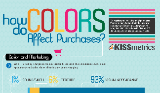
KISSmetrics made an awesome infographic about color psychology in relation to marketing. It’s a perfect reference for business owners and marketers. Click the thumbnail below for the full-size infographic.
Applying color psychology works best with non-photographic thumbnails. That’s because it’s easier to add, remove or modify the color composition of your image.
How you apply the colors to induce certain emotions in your audience depends on the product or service that you offer.
For example, we made a video about the history of St. Valentine. We wanted to make the audience feel the love, purity and sweetness of the legend of love.
That’s why we chose red and beige as the basic colors for our thumbnail and added a big heart as the universal symbol of love.
3. Authority Figure and Faces
Having an authority figure posing for your YouTube video thumbnail gives your audience the impression that your video (and therefore your company) has a solid stance in that particular niche.
YouTube Creator Playbook also suggests that face pictures attract most of the viewers’ attention. In fact, we humans have psychologically evolved to look for eye contact and faces for figure recognition.
Therefore, a close-up picture of an authority figure looking straight at the camera tends to work best in attracting viewers’ attention.
If you’re active in content writing or content marketing, you might have bumped into this video:
Sujan is a well-known expert in growth marketing and entrepreneurship. He writes regularly for major websites such as Entrepreneur and Forbes.
This type of thumbnail is effective in catching the audience’s eyes. Sujan Patel is an expert with lots of audience who look up to him, making his presence in a video’s thumbnail persuasive to his audience.
The text written on it is also good to make the thumbnail easier to see in smaller displays.
4. Well-Sized Text
Generally, a video thumbnail should be able to speak for itself.
Even so, there are occasions when a brief sentence is needed to show what’s beyond the thumbnail of your video.
Sometimes those texts serve to clarify the content, to explain expressions, or simply to add impressions to entice viewers to click that play button, like this example.
There are subjects that can’t be covered simply by using images, like expressions. Take the example above of the subject of YouTube’s #1 subscribed channel owner, PewDiePie, reading mean comments about him.
If you do need to add text to your thumbnails, 1 to 6 words is enough. More than 6 words will take up too much space from your thumbnail.
The purpose is to expose the visual component as much as possible, but still effectively tell people what the video is all about using one image.
On that note, make sure that the text is readable in all display types (mobile or desktop) so your audience doesn’t have to squint their eyes.
Better yet, add your brand watermark into the thumbnail of your video. A case study by Wasp shows that a custom-branded thumbnail can pay off with more views.
In smaller sizes, recognizing a face from a thumbnail is almost an impossible task. That’s why text is needed.
In the example above, the “Lip Sync Battle” part is what counts. It’s hard to see what Ellen is posing for, especially when the thumbnail appears in small size.
It’s one among many cases where you should add text to your thumbnail.
Additionally, the TV show’s editor crew managed to squeeze the logo in there. It gives them more exposure and more recognition when their videos are displayed in YouTube’s suggestion bar.

Takeaways
In a nutshell, here’s how you make a good YouTube thumbnail for your video content campaign:
1. Pick a high-definition image (1280×720 or more) that describes your video.
2. Compose the color of your thumbnail based on how you want your audience to feel.
3. Put face pictures of an authority figure(s) to attract the audience’s attention and trust.
So, what approach do you think you’re going to use for your YouTube videos? Let me know in the comments.
Digital & Social Articles on Business 2 Community(143)