Electronic mail has come a long way since its humble, text-only roots. The modern medium is one rich in imagery, animation and – if you fancy it – interactivity.
")
Until recently, interactive email could only be achieved by means of some CSS wizardy. While CSS was never actually intended for this purpose, it’s capable of powering surprisingly complex interactive content. In the JavaScript-free world of email, this was a revelation.
Of course, technology doesn’t stand still for long. The advent of Google’s AMP for Email has introduced a standardised system of interactive email. Is that the death knell for CSS-based interactivity? Not yet and potentially not at all.
It’s early days and remains to be seen whether AMP becomes widely-adopted or winds up on the digital scrapheap alongside previous efforts to reinvent the inbox. As it happens, the places where AMP doesn’t work are the ones where ‘conventional’ interactivity does. That means iPhone, iPad, Samsung and Apple Mail – devices and clients with a huge user base.
I’ve enthused previously about the benefits of interactive email. This time, let’s focus on the challenges and how to overcome them.
People don’t realise that your email is interactive
Traditionally, clicking something in an email means visiting a website. Your customer may not expect to interact with your mailing directly. You need to let them know that they can.
A restaurant chain’s choose-your-flavour email, which I received recently, failed to do that. Based on the sender’s history of adventurous marketing campaigns, I suspected that the email was interactive. But it wasn’t immediately apparent. The interactive triggers could just have easily been plain old links. I wonder how many people closed the email, unaware of the interactive content therein.
You can also encounter this scenario in reverse – that is to say hyperlinks masquerading as interactive elements. I found a good – or should that be bad – example in another recent mailing. It was a travel newsletter with a fun-looking destination finder form. But it wasn’t really a form. It was just one big image which linked through to a landing page. Apart from being misleading, such click trickery trains people to think of email as a non-interactive environment.
So, how do you signal that your email is genuinely interactive? There are a couple of methods. The first option is to suggest interactivity through familiar visual cues. Take the menu icon in this B&Q email for example:
")
The ‘hamburger’ button is universally-recognised and its usage is second nature. If a user wants to see what’s on the menu, they won’t stop to think: “hey, wait a minute – this in an email!”. They’ll just push the button. The same principle applies to other widely-used graphic design elements such as carousel arrows and zoom icons.
The other option is to throw subtlety out the window. If you’ve gone to the effort of developing an interactive marvel, then that is something worth shouting about. Loudly. Don’t be afraid to plaster a big, bold message on your email to do just that. How about a CSS-animated, tooltip-esque pop-up message?
")
A lot of email clients don’t support interactive content
It’s true – interactive content isn’t universally supported. Attempt to run it in Outlook, for example, and you can expect to see the components strewn across the page. It’s not a pretty sight:
")
Outlook: “Is this what you wanted?”
But just because interactivity doesn’t work everywhere, doesn’t mean you shouldn’t use it anywhere. And yet, creating a fantastic interactive experience for one customer must not mean a broken email for someone else. This is where fallback content comes in.
There’s an encouragingly straightforward approach to fallback content. To explain how it works, I’ll firstly need to summarise the mechanisms of interactive email. It all revolves around the activation and deactivation of checkboxes. CSS lets us change the rules applied to any element on the page based on a checkbox’s state. We can also tie each checkbox to its own trigger. That’s everything we need to build buttons, menus, quizzes and all manner of other interactive content.
By placing a pre-checked checkbox, we can set up a compatibility test. If a device passes the test, it’ll display the interactive content. Fail, and it’ll show a static fallback instead. It’s an elegant solution, both from a coding and logical perspective.
What’s more, people using incompatible email clients don’t actually have to miss out on the fun. Invite them to a hosted version of your email and they can enjoy the full experience in their browser instead. Fantastic – your interactive email is now open to everyone.
")
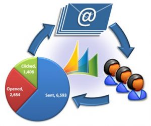
Click reports don’t measure engagement with interactive content
Interactive elements are not hyperlinks so they don’t register in your mailing reports. But that doesn’t mean that you can’t see what’s going on.
If you’re sending an email in which certain links only become available after specific interactive elements have been triggered, you’ll be able to form a picture of engagement. If the same links are present in your non-interactive fallback, that’s okay. Just apply a different tracking tag to the two incarnations of each link and they’ll be distinct in your reports. Simple but effective.
Need something a little more sophisticated? Drop in some additional tracking pixels. Rather than loading them the moment your email is opened, you can instead set them as invisible background images and call upon them only when specific interactive elements are activated. Now you can monitor customer behaviour with as many layers of complexity as required. This technique is so powerful, in fact, that you can build customer surveys inside an email. That click report isn’t looking like the be-all and end-all any more.
Is it worth the effort?
Developing interactive email can be challenging and time-consuming. Without a suitable pay-off, that would mean a lot of hard work for nothing.
Fortunately, the stats are on our side. Zembula’s interactive email survey found that as many as 82% of customers are more likely to engage with an interactive email than a static one. The aforementioned B&Q saw a staggering 18% increase in responder-to-open rate as a result of an interactive email.
Still not convinced? Consider these advantages:
• Immediate results
In the fast-paced world of the internet, clicking through to a website is a time commitment. That short delay while a web page loads is enough to deter clicks. With in-email interactivity there is no such delay. User action is met with instantaneous feedback, increasing the incentive to engage.
• Relevance
Interactive content gives your customer options before they come through to your website. When the time comes for that final click, your customer is directed to the most relevant page and product on your website.
• It’s fun
While quality content should always be your priority, static newsletters can become boring. Make your emails something to look forward to by providing a rich, dynamic and varied experience. Surprises such as quizzes and games keep your email programmme fresh and encourage your audience to open your messages again in the future.
A problem wouldn’t be a problem at all if it wasn’t worth solving. With the plethora of design and functionality options afforded by interactive email, I reckon it’s worth taking on the challenge.
Digital & Social Articles on Business 2 Community
(52)