— July 10, 2017
The call to action is a core component of marketing, sales, and any persuasion-based effort today.
There’s been a lot of content written about how to tweak CTA copy, color, size, and other elements, but sometimes, it’s easiest to learn through examples.
In this way, we can see how theoretical principles play out in the real world, and how they can create effective experiences. Therefore, this post won’t cover a ton of theory, but rather will focus on the applied uses of that theory on CTAs.
A good CTA isn’t the only element you need to succeed online, but a good CTA will certainly improve your effectiveness. Let’s return quickly to the basics before we dive into any call to action examples…
What is a Call to Action?
If you’ve been in marketing for a minute, you’re certainly familiar with what a call to action is. But let’s quickly review the definition quickly for reference.
In marketing, a call to action (also known as a “CTA”) refers to any message designed to prompt an immediate response or encourage an immediate sale. It really is as simple as it sounds: a call for someone to take action.
In the most common online iteration, a CTA is a combination of words or phrases that seek to inspire action. In conversion optimization, a typical call to action example would like something like this:

Call to Action Examples in Conversion Optimization
A while ago, VWO put out some data that said CTAs were by far the most popular A/B test run on their platform. 30% of tests involved a call to action.

This makes sense, especially when you think about how most people learn about conversion rate optimization (namely through case studies where small CTA tweaks lead to huge lifts).

While a CTA test often isn’t the largest possible area of impact for experimentation, tons of CTAs are so bad that you can pick up some easy wins in this area.
Additionally, no web element lives in isolation. A good CTA draws heavily upon the context of the page. When you optimize other elements, your CTA may need tweaking as well.
Sure enough, here’s a call to action example where the CTA itself isn’t really wrong, but the other page elements like the background image make it super hard to read or see:

However, CTAs aren’t exclusive to conversion optimization or website design. In any avenue of persuasion, including sales, fundraising, etc., a call to action is used to prompt action (though in sales, it’s typically called “the close“).

When you define a call to action, it seems fairly straightforward, but many people still mess up this simple element.
Not many call to action examples are truly bad, but many could use some tweaking, like this one:

The orange color is a nice contrast to the page, but the button is quite small and still hard to notice. “Learn more” is somewhat vague in terms of leading you to understand what the next step is.
Or this one, where the CTA buttons for the products could definitely be made more prominent and noticeable:

Sometimes, there is no clear call to action, and instead, there is only an automatic rotating slider 🙁

Unfortunately, that’s not uncommon. At the very least, if you don’t have a clear call to action, add one. Another example of a site without a clear CTA:

There are a variety of call to action best practices. I’ll leave the theory, for the most part, to other articles, and in this piece, I’ll use examples to guide, instruct, and inspire CTA ideas.
20+ Call to Action Examples (with Reviews and Critiques)
1. Unbounce
After doing tons of button tests over the past several years, Michael Aagaard realized there are generally two questions that help you write the CTA button copy. Those two questions are:
- What is my prospect’s motivation for clicking this button?
- What is my prospect going to get when (s)he clicks this button?
If you can answer those questions crisply, concisely, and clearly, you’ll have a quality CTA button.

Unbounce’s homepage CTA does that well. “Explore the Unbounce Platform” is unique and concise, and you know that you’ll be brought to a page to learn more about the product’s features.
2. KlientBoost
It’s tough to shake things up with CTAs. Most of them tend to offer the same things: “Download now,” “Get Access,” or “Contact Us.”
KlientBoost does a good job shaking things up, and instead of using something like “Contact Us” they say “Get My Free Proposal” – seemingly, a more compelling offer. It’s also more specific. You know exactly what the endgame here is. “Contact us” is vague, but a free proposal is concrete.

3. Usabilla

Not every CTA has to be a super clever or witty. In fact, for anybody outside of the inbound or digital marketing echo chamber, a CTA saying “YES!! I want to save money and get instant access!” with blinking yellow arrows is probably a bit annoying and extra.

“Request a Demo” is boring, but if a demo is what the desired action is, it’s perfectly suitable. Clarity trumps persuasion. Just be consistent. Usabilla does that well, calling for a demo everywhere on their homepage.
4. HotJar

The word “free” is intoxicating for marketers. We sprinkle it everywhere to hype up offers, and it usually works wonders. Humans like free stuff.
Therefore, if you have a freemium offer or a free trial, why not emphasize that? One of the biggest hurdles to conversion is uncertainty regarding payment or risk. If you can mitigate that with some soothing copy emphasizing that, “no, it won’t cost you anything,” do that.
5. TaxJar

Sometimes, you don’t have to have the word “Free” in the CTA. Sometimes it’s obvious from the setup and page context (pro tip: it’s always about the page context).
That’s the case with TaxJar, where a solid amount of copy is devoted to explaining this is a free trial (no credit card required). “Get Started” is a solid point of action here.
6. Bulletproof

Bulletproof has a well-optimized site. The user experience, in my opinion, is excellent. They’re clearly testing things regularly.
The homepage features a largely prototypical CTA examples of ecommerce: “Shop Now.” It’s not clever, unique, or unusually witty, but it explains pretty clearly what you’re (almost certainly) looking to do on the site.
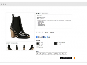
On the same line, we’ve often seen “See Selection” outperform “Shop Now.” Even better, you can personalize for return visitors or past buyers with a “See What’s New” (as long as you have new things to show):

To complement this, they use a prototypical product page CTA as well: “Add to Cart.” Most of the time, conversion optimization best practice is to do what your customer expect. That’s where prototypical design comes into play.

7. Travel Wisconsin

Travel Wisconsin splits their homepage CTAs two ways, “Our Family Vacation,” and “Trip Ideas for You.” Now, I don’t know their audience well, but I can imagine trip ideas is a more compelling offer, much more in line with the intent of the site visitor.
But in any case, the combination of the two CTAs is a bit confusing, and “Our Family Vacation” is completely vague. Everything above the fold is pretty vague, in fact.
8. CXL Institute

CXL Institute has a few different offers, ranging from one-off live courses and certification programs to the more comprehensive and high touch All Access plan. Therefore, we convey them in different ways on the homepage.
Granted, many people arrive directly on the given sales/landing page they’re interested in. In any case, we change up the CTA based on the offer from there. Many people want demos in addition to a substantial amount of people who’d like to just purchase right away, so we offer both options for the All Access plan.

These things changes, and we’re iterating, so it may be different in the future, but our current CTAs reflect the different intents of our audience and the different natures of our offers.
9. BounceX
A CTA doesn’t have to be words in a rectangular box with a contrasting color. In its essence, a CTA just calls for action (the nomenclature here is quite literal). So, you can get creative with the execution.
BounceX does a great job at making you click play and watch their promo video:

10. Bounce X (part 2)
BounceX has a treasure trove of behavioral marketing content in their “think tank.”
Each piece of content has its own well-designed landing page. Each call to action example could be a case study in how to do things right. The size, color and contrast, affordance – everything about the design is great. In addition, they do copywriting well.

They answer the question, “I want to ____” and use that as their CTA copy.
11. BounceX (part 3)

Same story in this example. This call to action example is for a webinar, so the copy changes to “Watch it Now,” keeping pace with the context of the offer.
12. Intercom
Intercom maintains consistency with both CTAs above the fold on their homepage Since they offer a free trial, it’s a simple “Get Started,” with an email opt-in as well.

13. Zoom
Zoom’s homepage follows a similar structure, with a contrasting and noticeable CTA offering visitors the chance to sign up. Since it’s also a trial (and free), they just go for it right away.

14. CXL
This is the general template we use for our lead generation landing pages. This one, in particular, is for a webinar and goes for clarity: “Attend Webinar.” Again, we try to follow the formula of answering, “I Want To ____,” and that works in this scenario.

15. Tim Ferriss
Tim Ferriss’s call to action is unique both in placement and in terms of the offer. His big offer and focus now is the podcast, so he prominently asks users to “Click to Listen.”

16. Paleo Leap
I’m a huge fan of Paleo Leap, but I’m not a big fan of their CTAs. There are dozens of them on the homepage (where does one start?), so it’s difficult to understand the most important desired action. In addition, the design could use work – the CTAs are hardly noticeable at a glance and blend right into the white background.

17. Looker
Looker has two CTAs on their homepage, which goes against common CRO best practices.

Sure, having only one action per page reduces distraction and makes things more clear for the visitor. But if you’re selling enterprise software, why not cater to how people want to buy? You may wish they’d all demo, or they’d all sign up for a trial, but people exhibit different buying habits – and when the value of a sale is so high, why rule it out because of ‘best practices’?
So, you can choose either a live demo or a recorded version, which I think is great. However, their recorded demo page could use some work. No one wants to “submit,” especially when the offer appears to be a free trial.

18. Tableau
I’m not a huge fan of Tableau’s CTA. Well, there are actually two above the fold, and the one that pops out is the “Try Now” on the upper right-hand side of the screen, which may be intentional.

But the one below the headline that says “See in Action” is both hard to see/find and somewhat vague. Does “see in action” mean I get a pre-recorded demo like the Looker call to action example? Does it mean I’m scheduling a live demo? Does it mean I get an interactive walk through?

Turns out it’s the first one, a triggered promo video, but you would have a hard time guessing based on the CTA copy.
19. Verve Coffee
This one is pretty bad.
Starting from the page-context level, the headline and image aren’t super enlightening. I’m not sure what an “adventure pack is. Then the CTA is “Join the Adventure,” but since I’m on a website for a coffee brand, I was under the impression I was shopping for coffee. Very confusing.

20. Nomadic Matt
Strong CTA copy (“Get Travel Tips,” which follows the “I Want To ___” formula). Easy and intuitive form. Wonderful page context. Contrasting colors and prominently displayed above the fold. Well done!

Before You Test: Some Caveats
This guide is meant to inspire, not to instruct. Every website is contextually, and while I can judge these call to action examples against the theory of design and copywriting, I don’t know how they’re actually performing.
So, here comes the common conversion optimization advice: test it yourself.
…Or don’t. Maybe it’s not the highest value area for optimization. Maybe you have bigger biggest challenges. Qubit put out an awesome meta-analysis of 6700+ ecommerce experiments, and they found that CTA tests, on average, don’t move the needle often (and when they do, it’s not by a lot):

Maybe you’ve already tested a ton of CTAs and have a pretty good level of knowledge as to what works. CTA tests scale well, meaning once you’ve done enough experimentation you can usually replicate the winners across similar offers. We use the same CTA across any similar landing pages with similar offers.
And if you’re just starting to optimize your website, it may be more beneficial to start with some higher impact areas. Use conversion research to discover real problems on your site, don’t just test CTAs because they’re easy to set up in a visual editor.
Conclusion
The call to action is an important element of website design, conversion optimization, or any form of marketing or persuasion. Invest some time and effort into crafting good CTA copy, making sure the design is right, and designing with the page context in mind.
This post outlined a huge list of call to action examples. Probably too many – some good, some bad, some awful or non-existent. The hope isn’t that you’ll copy any of them outright, but rather they’ll act as inspiration or fuel for thought on how you design your own.
Business & Finance Articles on Business 2 Community
(248)