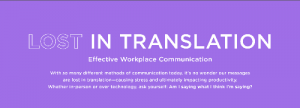
Ever heard the saying, “never trust a skinny chef?”
Well, when it comes to SaaS providers, the saying is “Never trust a SaaS provider with a subpar website.”
It should be a big red flag if you’re seeking a company that provides software as a service (SaaS) and one of the options has a messy or difficult site. Pretty telling in regards to what they’re able to offer to you as a customer.
Luckily, there’s more good than bad out there in the market.
Elements of a Strong Software Website
There are some pretty basic needs that a good SaaS website should meet in order to qualify as a prospective solution. It’s all about striving for an exceptional user experience, which is exactly what your own visitors are looking for.
Here are just a handful of key elements to pay attention to when doing your shopping or pulling inspiration:
Easy to Navigate
There’s nothing more frustrating than getting to a webpage and having no idea where to find what you’re looking for or, even worse, not understanding what you’re looking at.
A strong, well-developed website will have an easy navigation system in place. It should consist of:
- A clean navigation bar
- An easily found search bar
- Clear, understandable CTAs
- Relevant imagery
- Copy that communicates value and context
All of these pieces work together to help make sure that visitors make it to where they want to be. If it’s a bit unclear where they’re starting, it shouldn’t be too difficult to make their way toward the right webpage.
Intuitive
There’s a natural flow that a website should follow. Being intuitive kind of works hand in hand with being organized.
Visitors expect a header, some relevant images or graphics, links to other related pages, and so on and so forth. People have trained themselves to engage with websites in a particular fashion, and it can create a poor user experience if you break too far away.
That’s not to say that you shouldn’t experiment with or customize your site, but if you’re really swinging in left field, you can’t expect everyone to understand your play.
It’s kind of like following a template.
Yes, you can shift things around and test different versions, but all of the key elements should still be there.
If a website is disrupting a visitor’s experience too much, you can expect them to fall off rather easily.
Helpful
This is probably the most important element of them all, especially for SaaS websites.
It’s safe to assume that anyone intentionally landing on your website is there to try and resolve a pain point or find some form of value. Whether it be buying a product or reading up on new content from a blog, they’re seeking something to aid them.
If a website isn’t presented as helpful with relevant, valuable content, then it’s of no use to the user.
And “helpful” doesn’t just apply to content either. Is there a glossary or knowledge management system in place to help visitors who may not be well-versed in industry lingo? Are there sales or service reps at the ready for anyone needing guidance?
How responsive is the website to your needs and pain points? If it’s not there to support you as a potential customer, then it’s not doing it right.
Mobile Friendly
In today’s market, being optimized for mobile use can’t be overlooked. Most users will likely have their first interactions with a website over their mobile device than on a desktop nowadays.
If a website isn’t designed to load quickly and cleanly on a smartphone screen, then it will be exited almost immediately. No one wastes any time trying to navigate any particular site when they have other, mobile-friendly competitors to turn to.
This element is even more important when you consider how the modern consumer performs a ton of research before making a purchase.
A website needs to be built with phones and tablets in mind or it risks being dismissed as an option.
Attractive
It seems kind of shallow, but people do factor looks into their decision-making process. It’s hard to foster trust in customers if your website looks outdated or poorly designed.
It’s typically the more contemporary, responsive, and tastefully developed sites that convert.
Of course, none of that matters if the visual elements of the website aren’t relevant to the company or the product. Branding is how you tie everything together with a nice bow, so make sure that the brand is clearly defined and consistent throughout the website.
20 of the Best Software Website Examples
Depending on what software is being pitched, SaaS websites vary tremendously in size and look.
And no matter if you’re looking to make buy a new tool for your business or are seeking inspiration for your own site’s redesign, it’s always beneficial to see what’s been done well.
Here are 20 of the best examples of software websites we’ve seen online.
1. MailChimp
")
MailChimp is an online provider of email marketing services. Their site offers users a vibrant yet minimal design. Their most recent slogan – “Build your brand. Sell more stuff.” – pretty much says it all.
2. Adyen
")
Adyen is an SaaS company that offers businesses a multi-channel payment platform for accepting payments online, on mobile devices, and in store. Their homepage instantly speaks to B2B buyers’ main pain point: how to easily collect payments from customers.
What’s more, their navigation menu is organized and built to help guide visitors through the site with minimal friction.
3. Alteryx
")
Alteryx provides software for preparing, blending, and analyzing data. This is a great service for businesses that need capabilities beyond those offered by Microsoft Excel.
As soon as you reach the website, you’ll know exactly what they offer – self-service data analytics. They skip the catchy tagline, like other providers, and take a direct approach. It’s just as effective!
4. Slack
")
This is one of the coolest software websites on this list
Slack is a messaging app for teams that allows them to kick off a new project, hire a new team member, deploy code, review contracts, measure an A/B test plan, finalize your budgets, and more.
The layout is clean and simple, and the content is concise. An excellent user experience!
5. LambdaTest
")
LambdaTest offers a software platform that specializes in cross-browser compatibility testing for both desktop and mobile. It’s designed for pre-release testing and analysis to help clients ensure that their apps work seamlessly on any platform.
As you navigate their homepage, you’re provided with a short and descriptive explanation of their services and company details. It’s divided into easily digestible, cohesive sections.
6. Typeform
")
Typeform is a SaaS platform that allows users to build dynamic, engaging online forms, surveys, and quizzes instantly.
With a lively graphical homepage and a witty tagline, visitors know as soon as they visit the website that using their platform creating online forms is easy and fun.
7. Code42
")
Code42 is a cloud-based data protection and security solution for businesses to help mitigate the risks of data loss and provide disaster recovery from events. This website is about a serious topic, and it’s perfectly reflected in its no nonsense design.
The company starts by offering visitors an opportunity to learn about endpoint data protection and how it is essential for any business today.
They understand that their product isn’t as well known as CRM or project management software, so they use their site to educate visitors about the importance of data protection.
8. Nutmeg
")
Nutmeg is one of the best online investment management platforms with one of the most solid software websites. Their homepage has a clear path to conversion with a cleverly worded CTA that beats other SaaS websites.
It outlines the advantages of their solutions throughout the page with simple design and additional clear CTAs. It includes an interactive calculator that helps visitors better understand how Nutmeg can help their business, specifically.
9. Lucky Orange
")
Lucky Orange is an online SaaS analytics platform that uses heatmaps to show how visitors are using your website. Three elements immediately stand out in their design – its minimalism, effective use of color, and instantly grabbing content.
10. Dropbox
")
This SaaS is a file hosting service that is the perfect example of functional simplicity in software websites.
Minimal clutter on the homepage means that visitors have less information to deal with and can jump right into the functionality they offer. They carefully choose content to display only the necessary information you’ll need strategically placed.
11. Quid
")
Remember when we said that you don’t want to break from the norm in explosive ways? Quid tows that line pretty well with their rather long homepage, but in a good way.
The screenshot above isn’t the first thing you see when you click to their site. In fact, it’s not even the second section. Quid makes a unique play by having a scroll-heavy main page that keeps user attention with amazing visuals, negative space, and value-centric copy about their services.
It’s a bold statement, but they make it well.
12. Toggl
")
Toggl has a very animation and graphics heavy website that creates a fun, interactive experience for their visitors.
Every listed feature, pricing table, and featured image has some sort of moving imagery meant to draw the eye.
Usually, we’d say that being too animated can work against you (busy webpages can be distracting and overwhelming), but Toggl pares it down with a calm background color and plenty of white space to give your gaze a break.
13. Sketch
")
Sketch has a fantastic knowledge management system (KMS) that’s so meticulously organized, you’d have to have a very serious problem in order to call their support team.
As you click through the table of contents (and their quirky icons), you’ll find videos, gifs, and screenshot walkthroughs for most of their featured plugins and extensions.
14. Asana
")
When we talked about having valuable content upfront, we had Asana in mind. Just a half scroll down their homepage will put you in front of a video demo of the work management platform.
It’s an easy to follow production that lays out exactly how Asana works and what it can do for a business. Less than a minute long, it’s a pretty convenient run through if you don’t have the time to read through their well-written features lists.
15. Recurly
")
Recurly breaks down their value in short snippets throughout their website, highlighting each unique feature and benefit with care.
The website follows a very specific style guide with consistent branding throughout as well, capturing and keeping attention with fun pops of color and sweet graphics.
16. Squarespace
")
Squarespace has a beautifully laid out website with plenty of information about how their platform can help your build your own functional and well-designed website.
They have a call to action that is not overbearing, yet it is still easy to locate. Plus, they offer a slideshow demonstration that shows how you can turn your ideas into reality.
17. Stripe
")
Stripe has a fantastic website that is easy to navigate. They also clearly display what they do by using visuals that are engaging and easy to understand.
Their CTAs are simple and in a convenient location so they’re easy to find. They also have the logos of popular businesses that use their software right below their hero section.
18. Intercom
")
The copywriting on Intercom is clear and concise, which makes it easy for prospects to understand. They also have a CTA at the top right of their homepage that moves with the user as they scroll down to explore more of the homepage.
Their images demonstrate how their messenger app works, which is a great way to showcase their software and highlight the benefits of using it. The website is simple, visually appealing, and easy for visitors to use.
19. Help Scout
")
Help Scout’s website is incredibly engaging. They provide a short video as the focal point of their homepage that describes their customer service software and details why it’s important and valuable for companies.
Their site has a friendly appearance that delivers a ton of information. While navigating throughout the site, visitors learn what Help Scout can do with screenshots, graphic images, and short paragraphs.
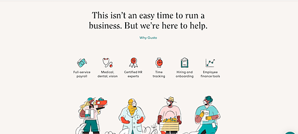
20. Gusto
")
Gusto’s homepage on their website is tailored to business owners who may be in crisis due to the current issues they may be facing due to COVID-19. In just a few words, they describe what they can do for businesses.
The hero image shows real Gusto users in action, and below that, visitors see a visually appealing cartoon that displays a few workers with masks on, continuing their regular activities. The icons above the workers bring users to relevant tools on their site.
Additionally, their main nav bar is intuitive, so you can find any information you need in an instant. Simply put, Gusto’s user-friendly website experience suggests that their software is probably just as easy to navigate.
The bottom line?
Good SaaS software websites are a welcome mat for the provider’s brand. It’s important that they use engaging messaging, effectively demonstrate the value of their solution, and provide the user with an excellent experience.
The best SaaS websites will hit the visitor and wow them the moment they land!
Digital & Social Articles on Business 2 Community
(80)