The worst feeling is when you think your work is complete, but it’s really just begun. You spent all this time prepping an email or building out an ad only to find out that, yes it’s working fine, but it’s missing something…
 Thank You Page Examples to Learn From")
Don’t let this happen to your thank you pages! A thank you page with missing elements can make all the difference between a fleeting customer and a loyal customer.
In this post, we share 16 thank you page examples that prove just that. And we’re going to have some fun by giving each one a quality score from 1-20 based on four key factors:
- Clarity
- Next steps
- Creativity
- Level of appreciation
Our criteria for these thank you page examples
Before we get into the details, here are the thank you page best practices we used in our evaluation:
Keep it short and sweet
When it comes to thank you pages, the more concise the better. A few sentences should do the trick. If you have more information to relay, you should have a follow up method in place beyond your thank you page.
Also, there should be a prominent heading on the page clearly confirming that the user has successfully completed the action.
 Thank You Page Examples to Learn From")
Be clear and purposeful with next steps
When users get to your thank you page, you don’t want them wondering “Now what?” If there are additional steps to be taken to complete the action, make these clear.
And even though they’ve completed an action already, now it’s time to keep them engaged. Add in a second call to action, such as to:
- Share on social
- Join a referral program
- Claim a discount
- Leave a review
- Download a guide or case study
- Book a demo or consult
These are great opportunities to push your customers further down the funnel. Whichever one you choose, make those next steps clear so you can get a conversion boost and open the doors for further interaction.
For example, our content download thank you pages have a clear green button to get the guide and then a clear next step to try our free Google Ads Grader tool.
 Thank You Page Examples to Learn From")
Less is more…
There’s nothing worse than a busy thank you page. If you’re including too many visuals, callouts for next steps, or calls to action, you’ll end up with an eye sore that will just confuse viewers. In fact, multiple offers can decrease landing page conversions by up to 266%. So don’t lose sight of the purpose of your thank you page. Treat it like a landing page and test out different variants until you know what truly works.
…but keep it eye-catching
While you don’t want to confuse your viewers, you still want to catch their attention. But with landing pages, you only have about eight seconds to make an impression, and this number could be even less for thank you pages. Plus, people are 80% more likely to read content if it’s combined with bold, attention-grabbing imagery. So be sure to have at least one eye-catching element to grab attention in a pinch.
 Thank You Page Examples to Learn From")
This thank you page uses appealing imagery and a clear white button to draw your eye to the desired action.
…and on-brand
Just like a landing page should be consistent with the ad before it, your thank you page should be consistent with the landing page before it. To maintain brand consistency, be sure that your thank you page copy and visuals match up with your style guide. This means including similar colors, logos, as well as voice and text styling as your website or other company materials.
Actually say thank you…
While it’s great to get bonus engagement activity from your thank you page, don’t lose sight of the point behind it: to thank your customers! 91% of consumers say they’re more likely to do business with companies that appreciate their customers. One of the easiest ways for your business to do just that is by simply saying thank you.
 Thank You Page Examples to Learn From")
…and personalize it!
Personalized CTAs convert 202% better than normal CTAs. This means you should segment your thank you page offers to match your various audience personas for better results. You could also use automation to get the page to contain the first name they provided in the form.
 Thank You Page Examples to Learn From")
Thank you page examples we can learn from
With the above tips in mind, we’re now going to review some thank you page examples from across the web.: Let’s have some fun rating each one based on the elements below:
- Clarity: Is the thank you page concise and organized? Does it clearly confirm the action the user just took?
- Next steps: Are next steps clear without being aggressive or underwhelming? Are they easy to take?
- Creativity: Does the thank you page have fun, eye-catching visuals or copy? Is it consistent with the brand?
- Level of appreciation: Does the brand say thank you in a thoughtful or personalized way?
We’ll assign a score of 1-5 for each of these four elements (five being strongest), so the maximum quality score is 20.
1. Kuat
The first thank you page example comes from biking brand Kuat.
 Thank You Page Examples to Learn From")
Our thank you page score: 11
- Clarity: 2
While “PRODUCT REGISTRATION” is loud and clear, the user doesn’t get explicit confirmation that they’ve successfully registered until they read the body text. But Kuat does provide support contact information, which is helpful. - Next steps:1
Asking customers for a review is a great idea for a next step, since reviews are crucial for local SEO, but Kuat gives several different options and doesn’t link to them, so there is almost zero chance the user will take this action. - Creativity: 4
The page is on-brand and uses a creative and eye-catching image, but the copy is slightly bland. - Level of appreciation: 4
Kuat says thanks in the body text, but could replace the “PRODUCT REGISTRATION” heading with “Thanks for registering your product!” But it does express appreciation for its customers’ support in the bold text.
2. Kickresume
This Kickresume thank you page example confirms an ebook send.
 Thank You Page Examples to Learn From")
Our thank you page score: 12
- Organization: 5
This is the perfect example of a sweet and simple thank you page. “Your book is on the way!” confirms the action taken and adds a level of excitement. However, calling it a “book” could confuse viewers, since this is for an ebook, and it could have mentioned when and where users can expect it. - Next steps: 4
The next step—to share the ebook on social—is clear and the buttons to share are put right below for ease of access. - Creativity: 3
The call-to-action phrase is creative, and encouraging users to help their friends get a dream job is a clever way of marketing with emotion. Otherwise the page is blank and bland. - Level of appreciation: 0
Kickresume forgot to thank its customers! It could have said something like “Thanks for letting us help you!” or “Thanks for downloading the ebook!”
3. SimplyMeasured
This SimplyMeasured thank you page example is for a free reporting guide download.
 Thank You Page Examples to Learn From")
Our thank you page score: 15
- Organization: 5
This page confirms that the user has completed the required action and tells them how to obtain the guide without any fluff. And kudos to them for calling out a potential customer pain point when receiving their guide and how to resolve it if needed. - Next steps: 2
By keeping the navigation bar, SimplyMeasured offers another CTA at the top (to request a demo), but could have pointed to it a bit more clearly. - Creativity: 3. The visual of its dashboards is eye-catching without being distracting, and brand consistency is clear here, but the copy doesn’t feel super friendly or compelling.
- Level of appreciation: 5
Saying thank you twice never hurts!
4. Content Marketing Institute
Content Marketing Institute had this thank you page for folks who signed up to download specific courses.
 Thank You Page Examples to Learn From")
Our thank you page score: 14
- Clarity: 5
Am I surprised that a content marketing brand thank you page embodied crystal clear copywriting? Not in the slightest. CMI makes its thank you clear with a black, bolded headline and then provides the link to download the course with “as promised” right after it. It also reinforces what, exactly, the user just downloaded with multiple mentions of the course name. - Next steps: 1
People love to follow trends, so the suggestions of other popular content is a nice touch. However, there are three options to download, plus an event registration CTA, and each offer is the same color and size as the CTA to download the intended course. And then there are the options in the navigation bar. So while the copy is cohesive and it flows nicely, there is too much of it for a thank you page and users could struggle to pick where to go next. - Creativity: 3
CMI’s clean graphics here take the cake. The simple imagery to go along with the selected course gives a customized feel and the page stays on-brand. But as mentioned, the page is busy and overwhelming. - Level of appreciation: 5
Bold, black, and exclamation point—no complaints here!
5. Wrike
Online productivity tool Wrike displays this colorful thank you page after an ebook download.
 Thank You Page Examples to Learn From")
Our thank you page score: 20
- Clarity: 5
The content throughout this thank you page example is not only clear, concise, and organized, but the steps to get the eBook are also super easy—they can even click the button to view the guide right in their browser. - Next steps: 5
In comparison to the CMI thank you page example above, this is a much better way of providing additional content. With less text and fewer options on the page, it’s easier for viewers to quickly make a decision. Plus, suggesting related resources that don’t require a download may convert better since these people have already completed a download once. - Creativity: 5
Wrike seriously deserves full points here because it was able to make a visually appealing thank you page using abstract graphics—which is refreshing. It also keeps its viewers engaged in a unique way by suggesting content to take them back to the site. - Level of appreciation: 5
Unlike other forms of content creation, thank pages are one of the few areas where exclamation points are okay. The big, friendly exclamation point at the end of Wrike’s thank you adds emphasis to its level of appreciation.
6. Backlinko
This thank you page example by Backlinko is for a newsletter sign up.
 Thank You Page Examples to Learn From")
Our thank you page score: 11
- Clarity: 4
While the user hasn’t quite completed all of the required actions, the page could still use a heading that confirms completion of the first step. - Next steps: 4
The next step here—to confirm your subscription—is clear. And Backlinko is one step ahead of its customers with the reminder to check their spam folder. However, the screenshot of the call to action button in the email it is referring to could lead users to think that this is the button to click and is broken. And why so many steps to confirm, Backlinko? I know it’s the usual “go to your email to confirm,” but spelling out the steps like this makes it seem like a chore. - Creativity: 3
SEO can be daunting to some, so Backlinko’s mention of “link building strategies” and “SEO tips” drives home the value of the newsletter and encourages the user to confirm their subscription. But while the content is strong and conversational, the page is visually lackluster and unappealing. - Level of appreciation: 0
This is a multi-step process, and Backlinko hasn’t yet thanked its user for subscribing. Instead, it comes right out of the gate with an urgent and stern-sounding message.
7. Grimont Wines
This thank you page example by Grimont Wines is for completed purchases.
 Thank You Page Examples to Learn From")
Our thank you page score: 17
- Organization: 5
No complaints here! The confirmation is clear and the copy is organized and concise. - Next steps: 3
Grimont Wines incentivize users to make another purchase with a 20% discount offer, and the countdown to when this offer expires adds urgency. However, it could have made this offer more prominent with bigger text and a link back to its shopping page, and the social share buttons on the bottom could distract users away from taking the primary action. - Creativity: 4
The thank you page design matches that of the bottle which is aesthetically pleasing and draws the eye into the thank you text. And the live countdown portion adds a level of fun and excitement. However, the super-light text style is hard to read. - Level of appreciation: 5
I love how the thank you is highlighted in the middle of the thank you page for an added punch of appreciation.
8. The Name Stamp
The name Stamp’s post-purchase thank you page is a two-in-one combo with its note of appreciation and secret offer.
 Thank You Page Examples to Learn From")
Our thank you page score: 20
- Clarity: 5
The organization of this thank you page is on-brand for The Name Stamp’s site—keeping everything consolidated to the middle of the page to draw the eye in so nothing gets missed. And even with two large headings on the page, The Name Stamp makes both the completed action and the next steps clear. - Next steps: 5
In comparison to the thank you page example above, Name Stamp promotes its deal more clearly. Using “secret” in their copy entices viewers because it adds a feeling of exclusivity. - Creativity: 5
Emojis are a welcome twist to a standard thank you page. The emojis not only match the brand well but also help to make the appreciation and promotion portions pop. - Level of appreciation: 5
Another super appreciative thank you page example with two thank you sentiments included.
9. Hubspot
This thank you page example is from Hubspot for downloading a free ebook.
 Thank You Page Examples to Learn From")
Our thank you page score: 15
Between the personalization, purpose, and pretty design, this thank you page is hitting (mostly) all the marks!
- Clarity: 5
Hubspot provides clear confirmation that the user has completed the action and how to get the ebook. They also bullet out the ebook’s highlights to pack a value punch. - Next steps: 5
Hubspot is a household name for all things conversion optimization, so it’s no surprise this thank you page example is a top contender. Including the two action options next to one another makes it easy for viewers to quickly understand their options—but the bright and contrasting “Download” button color adds an attractive pop and keeps the visitor focused on the primary action Hubspot wants them to take. - Creativity: 4
The visualization of the ebook and brand consistency gives Hubspot’s thank you page some flair. However, what really sells on this thank you page is the insertion of the user’s name to add a personal touch. - Level of appreciation: 1
At this point, a thank you would be necessary because this person has already input their valuable information. However, the personalized name insertion can still make the customer feel appreciated.
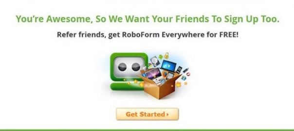
10. RoboForm
This RoboForm thank you page example is for signing up to use its free product.
 Thank You Page Examples to Learn From")
Our thank you page score: 10
- Clarity: 1
The copy is brief, but the heading only indirectly confirms that the user has signed up. Plus, what did they sign up for? Why should they be glad they did? - Next steps: 1
The action Roboform wants you to take is super clear: to join their referral program. However, since there isn’t consistency in capitalization between the two headings, it’s not clear that you’ll be getting one of their paid products, Roboform Everywhere, for free. Rather it sounds like by referring customers, you’ll be doing them a favor and getting Roboform everywhere. - Creativity: 5
Roboform’s creative elements stay consistent with its brand and compliment its adorable robot mascot nicely. And instead of a standard “thank you” it offers a compliment to butter up its customers—which helps them stand out. - Level of appreciation: 3
This is not a standard thank you, but Roboform still gets points for still making users feel appreciated in a different way.
11. Educators for Excellence
Educators for Excellence wraps up our thank you page example roundup with a page made for event registrants.
 Thank You Page Examples to Learn From")
Our thank you page score: 15
- Organization: 5
The confirmation here is loud and clear. This is one of the few thank you page examples with contact information. For events, including a link for contacts is super helpful. - Next steps: 2
Aside from contacting for questions, it’s unclear what Educators for Excellence is looking for you to do next. The three prominent CTA buttons are layered on top of all the other options within the main navigation bar and footer. - Creativity: 4
In terms of creative, this thank you page is clean with simple green accents—which is on brand for Educators for Excellence. However, with all that text this thank you page could benefit from a visual. Perhaps a compelling picture showing what to expect at the event. - Level of appreciation: 4
While this brand also says thank you twice like a couple of our other thank you page examples, the lack of punctuation makes me feel like something is still missing here.
Use these thank you page examples to perfect yours
Use these thank you page examples as your go-to for your next thank you page brainstorm. And even though I covered a lot above, I want to leave you with some final reminders.
- Clearly confirm the action you’re thanking your customers for and tell them what to expect next.
- Don’t be afraid to bullet out a few of your offer’s highlights to pack a value punch.
- Use trigger emails to send a follow up to your leads and customers post-action.
- Think about what you can add to your thank you page as “icing on the cake,” like a discount code, downloadable coupon, or any other sales promotion.
- Treat your thank you page as you would a landing page! That means constantly testing out different variants until you know what truly works.
Most importantly, keep your thank you page simple and engaging so your brand’s personality and creativity shines through.
Now that you know how to tell a good thank you page example from a bad one, let us know in the comments which thank you page you think is best!
Digital & Social Articles on Business 2 Community
(76)