 Lara Berendt — March 27, 2017
 When marketing managers, IT administrators, copywriters, designers and developers come together to hash out project plans and timelines, things go more smoothly when everyone can speak the same language.
So what do you do if you don’t know your duotone from your parallax? We can help.
If you’re about to kick off a web design project, or just want to be able to speak intelligently when you work with your design team or agency, knowing these buzzwords will help you chime in confidently. Here are some of-the-moment web design terms that can help you better understand the look, feel and functionality of your new site.
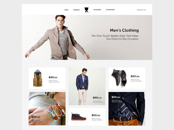
1. Card layouts
As simplicity and responsiveness continue their reign in the field of web design, card layouts have become a popular tool for chunking out information into small modules that can be easily sorted, personalized, flipped through and swiped. As a refinement of the tile layouts popularized in recent years, cards add new layers of richness and interactivity with animations and hover effects. Card layouts lend themselves to a variety of applications, especially news sites, blogs, product catalogs and community platforms.
“The usefulness of the card UI pattern goes beyond loading times and translating across different screen sizes,” writes Jerry Cao for Designmodo. “Bite-sized content matches the attention span of most web users (especially on mobile devices).”
Source: UXPin
Source: Provectus
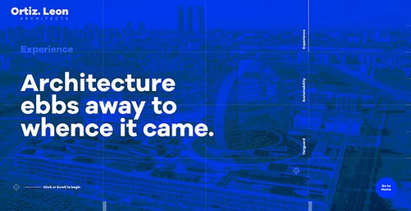
2. Duotone
A keen editing eye is crucial to effective design, and that applies to color as much as content. Duotone images are essentially made up of two dominant tones, created by generating a grayscale image and replacing highlights or midtones with contrasting colors.
With duotone images, designers can inject mood and personality into a web layout using a restrained, sophisticated color palette. These visual touches can hold together a site’s look and feel, offering cohesion and consistency while communicating aspects of a brand’s identity, or the energy or tone of a piece of content.

Source: Adison Partners
Source: Ortiz Leon Architecture
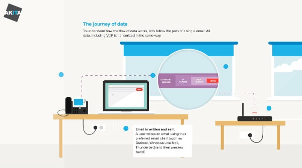
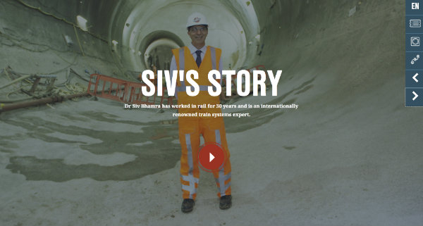
3. Dynamic storytelling
Web marketing today is all about connecting with your audience and making them feel something for your brand. Dynamic storytelling is a means to this end, combining the use of imagery, graphics, videos and text to weave a compelling narrative about a company’s product or service, or to show the humans behind the business.
Rich storytelling like this requires a greater time investment in storyboarding, writing and multimedia asset creation. But it can pay off when these content marketing endeavors deliver heightened engagement and loyalty for your brand.
Source: Akita
Source: Bechtel Rail
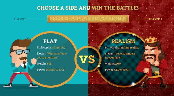
4. Flat design
Flat design essentially scales back digital graphics and design elements from 3-D to 2-D. By limiting or eliminating the use of realism-based design effects like drop shadows, gradients and textures, designers can emphasize usability and speed up page load times across devices. Flat design techniques use minimalism, solid colors and crisp edges to simplify the user experience and let the content shine.
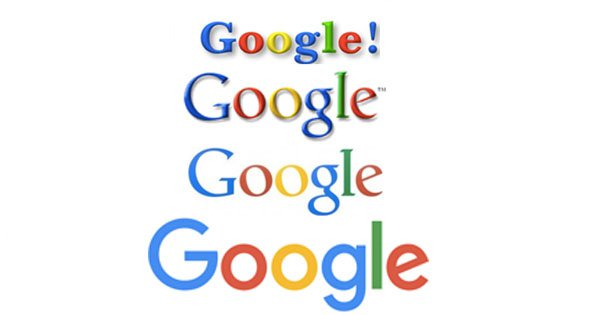
The evolution of Google’s logo is a prime example of the trend toward flat design. As shown below, Google’s logo has progressed from prominent drop shadows and beveled edges to a much simpler two-dimensional logo with a cleaner, sans serif font. This movement toward minimalism is echoed across the modern web as designers pare down stylistic elements to the bare basics.
Source: ellodave
Source: Flat vs Realism
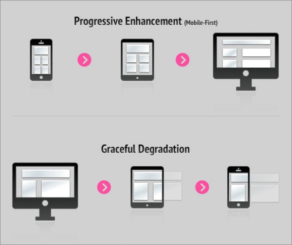
5. Graceful degradation and progressive enhancement
Graceful degradation describes a design approach that arose in the last decade. As browsers, operating systems and screen sizes proliferated, it created a challenge for designers, who sought to maintain the integrity of their designs for all users.
In the graceful degradation approach, designers created an optimal experience for modern browsers and full-sized screens, but then built safeguards into their code to ensure a site remained functional on older browsers and mobile screens, albeit with some features omitted. The downside to this approach is that those with older technology or smaller screens could end up with a subpar experience. For this reason, graceful degradation has largely been eclipsed by a contrasting approach called progressive enhancement.
With progressive enhancement, designers start with the smallest and simplest web experience, typically for mobile devices. This mindshift forces them to prioritize content and features to create a great design for a broad audience. From there, they add features and functionality, progressively enhancing the interface for larger screens or more advanced browsers. The benefit is that smaller screen users are no longer an afterthought—they’re top priority.
Source: t3n
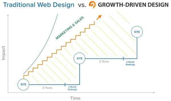
6. Growth-driven design
Traditionally, website redesigns happened every several years and took about three to six months to complete. Once a new site had launched, designers and marketers would hope for the best and make the most of their new site until they restarted the process a few years later.
Growth-driven design offers an enticing alternative to the old-school design process. The GDD approach involves a shorter planning and development time, allowing businesses to launch a new site more quickly, then make ongoing data-driven optimizations as designers learn how the new site is performing. This process is becoming the standard for modern web designers because it allows for more nimbleness, and uses time and budget more efficiently.
Source: Growth-Driven Design
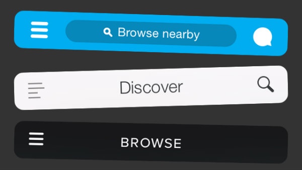
7. Hamburger menu
With the rise of mobile web design came a need to condense site navigation menus into something more compact and expandable for miniature screens. Enter the hamburger menu—the design world’s kitschy name for those three stacked horizontal lines you’ve come to know. It’s usually found in the top left-hand or right-hand corner of a user interface, and is also called a side menu, flyout menu or navigation drawer.
Some criticize the hamburger menu for obscuring navigation options or for increasing the number of taps users must complete to reach their destination. But like many UX standards, the menu has become ingrained across the web, and users have now come to expect it. Still, viable mobile-friendly alternatives to the hamburger menu include traditional top menus with fewer items; tabbed menus; scrolling menus; or dropdowns.
Source: TechCrunch
8. JavaScript
You probably know that Javascript, like HTML and CSS, is a programming language. But it happens to be the language that makes possible much of the automation, animations and interactive elements that make modern websites cool. As Deborah Lee Soltesz writes for Techwalla, “Web developers use JavaScript for anything from automating simple tasks to creating complex Web pages that behave like desktop software applications.”
So you have JavaScript largely to thank for many of the fun, dynamic features of today’s best-designed websites—when elements bounce or wiggle as you hover over them, when charts and progress bars fill with color before your eyes, when text appears to type itself, and much more.

Source: Fribly
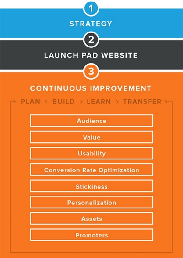
9. Launch pad site
In the growth-driven design process, an accelerated research and planning phase culminates in a list of high-priority site improvements, which are then developed and deployed in a launch pad site.
“We use a launch pad website to get a base website out into the real world to see how the user actually interacts with it,” writes Luke Summerfield for HubSpot. “We then have a clear idea of how to improve the site, making it a user-driven design process.”
From the launch pad site, the design team measures site performance and tracks user behaviors to identify areas for optimization, and then makes site updates in regular sprints, continuously transferring lessons learned back into the design and development process.
Source: Growth Driven Design
10. Long scrolling or infinite scrolling
It turns out, the notion that people only read what’s “above the fold” on web pages is an utter myth. A study by Chartbeat found that 66 percent of attention on a normal media page is focused below the fold, and research by Wichita State University found that people can actually read long, scrolling pages faster than paginated ones.
Infinite scrolling gets rid of pagination by automatically loading more content when you reach the bottom of a page, and it can be ideal for browsing scenarios, such as on e-commerce sites. Long-scrolling home pages can be useful for dynamic storytelling. Designers should use long and infinite scrolling selectively, though, as they’re not right for every situation.
“For task-driven activities, infinite scrolling can feel like drowning in an information abyss with no end in sight,” writes Hoa Loranger for Nielsen. “People who need specific types of information expect content to be grouped and layered according to relevance, by pages.”

Source: artrayd
11. Material Design
Material Design is a language developed by Google in 2014 that has since permeated much of the modern web and mobile app content you see today. With Material Design, Google set out to create a digital design standard informed by traditional print design principles and user-focused at every turn.
As Google describes it, “Deliberate color choices, edge-to-edge imagery, large-scale typography, and intentional white space create a bold and graphic interface that immerse the user in the experience.”
Material Design applies many of the flat design principles we discussed above, but also accounts for some elements of realism and dimensionality through the subtle use of layering, gradients and simple shadows. Material Design has led to what many refer to as “flat design 2.0.” The image below shows the difference between a completely flat design, on top, and the subtle enhancements of Material Design techniques, on the bottom.
Source: Second Language Design
12. Microinteractions
As you explore a website or app, you’ve grown accustomed to certain reactions and feedback mechanisms that let you know what’s going on within the user interface. These are microinteractions, tiny moments of communication that can enhance understanding or even spark delight.
As Jerry Cao explains in UXPin, some common examples of microinteractions include haptic feedback vibrations when you alter settings on your mobile phone, the pull-to-refresh pattern you’ve come to recognize, and animations that indicate clickability or communicate that an action has been completed. These minor design and UX touches are often what takes a website from good to great.

Source: John Noussis

Source: time4design
13. Parallax
You’ve almost certainly seen parallax effects around the web over the past few years, but you might not know their name. Parallax designs create a 3-D effect by using two or more layers of color, text or image content and coding them to move at different speeds, and sometimes in different directions.
These effects can be compelling storytelling tools, conveying a sense of place or the tone of content and generally making a site feel more dynamic and interactive. They can also provide useful cues to site users, helping them navigate through content and features.

Source: Webydo

Source: Jake Blakeley
14. Split screen
Split-screen layouts have become a popular choice for landing pages and home pages. The binary approach is ideal for serving up two distinct user paths from a single page, for instance, when a business needs to speak to two audiences with contrasting needs. It can also be a pleasing way to include large-scale imagery while balancing it out with some visual relief on the other half of the screen.
“A common approach to web design is to rank things in order of importance,” writes Patrick McNeil for Web Designer Depot. “This importance is then reflected in the hierarchy and structure of the design. But what if you actually have two things to promote? This approach allows you to give prominence to them both and allow the user to rapidly select between them.”
Source: Onextrapixel

Source: Studio Meta
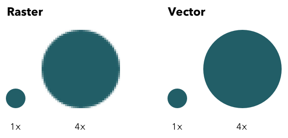
15. SVGs
SVG stands for scalable vector graphic. It’s an image file format, like JPG, PNG or GIF, but web designers love SVGs because they’re more flexible and can be faster loading. As John Moore Williams describes for Webflow, while JPGs and the like are made up of pixels and rasters, SVGs are made of vectors, which are essentially mathematical descriptions of a shape. This makes SVGs resolution-independent, which is a huge plus for responsive, mobile-ready web designs, says Williams.
JPGs and PNGs have to be uploaded to the back end of your site and downloaded each time a site visitor loads the web page, but SVG files can be embedded directly in the web page. This can reduce the number of http requests needed as browsers execute your web pages, helping your site load faster.
SVGs aren’t usually the right choice for photography, but the format works well for relatively flat images that will need to be scaled up seamlessly.
Source: Quick Left
Digital & Social Articles on Business 2 Community
(161)