A well designed pricing page can be a brand building tool that can help your prospects better understand your business.
There are many elements to consider when creating your pricing page including strategy, messaging, and the design itself. The structure of each of these elements plays a role in increasing the conversion rate of your page.
How to Decide on Your Pricing Page Design
Let’s look at each aspect of the pricing page design you need to focus on to drive conversions.
Headline
This is usually the first thing visitors see when they land on your pricing page. Headlines make for a great opportunity to spark engagement.
A good headline needs to be:
- Short in length
- Concise in description
- Compelling in messaging
- Clear in highlighting value
Copy
The words on your pricing page are essential in communicating the perks and differences in pricing for your products or services. Many pricing pages make use of bulleted lists that break down the features associated with each tier of a product or service.
Bottom line: Your copy should aim to impress and entice the reader to make a purchase.
Images and Visuals
Nobody is going to be interested in your pricing page if you don’t have any visual components. You need to strike up a balance between content and visuals in a way that effectively communicates value and addresses potential friction points.
Engaging, high quality visuals, like photos, graphics, and video, can draw readers in and even build an emotional connection with them.
Social Proof
In its simplest definition, social proof refers to anything that shows evidence of people using and benefitting from your products or services. You want potential buyers to see this so they get a clear understanding of how valuable your offerings can truly be.
There are many ways to incorporate social proof on your pricing page, including the following:
- Case studies
- Reviews
- Testimonials
White Space
The last thing you want to do for people landing on your pricing page is make them feel overwhelmed or confused. This is where white space comes in handy.
Leave plenty of open space in your design so readers can find what they’re looking for without being torn by too many visual components or too much text.
White space gives your pricing page content room to breathe. It’s essential in the world of modern web design. The trend toward minimalism and simplicity is meant to foster a positive user experience.
Security
In the current landscape of cyberattacks and identity theft, you need to keep readers assured that their data is safe with you. First, get the right security certifications, such as HTTPS.
Then, highlight it! Include the trusted seals to give potential buyers a sense of comfort and trust in you. When you display a seal, you’re showing readers a message they’re familiar with – a message that assures the safety of their information.
Messaging
There are many different ways you can tailor the messaging of your copy on the pricing page. Some common tactics you can use include:
- Urgency – entice them to make a purchase fast by offering an additional benefit, like a discount, or by promoting a limited time offer with a clock counting down to expiration.
- FOMO – stoke fear of missing out by showcasing levels of inventory or limited availability or highlighting the number of people who purchased your offerings.
Variety of Options
You’re likely targeting several different kinds of buyers, which is why you need to present a variety. Bottom line: many visitors are coming to you with different needs.
You can address their needs by presenting solutions that fit their budget and highlighting the benefits of each option. This is where a comparison table comes in handy.
Pricing Page Best Practices
When you follow the right tips and tricks, you can fully optimize your pricing page to rank well on search as well as support your target audience as they advance through the buyer’s journey.
Follow these 12 best practices to get the most mileage out of your pricing page.
Add Long-Tail Keywords.
Short keywords typically have high search volume, but there’s plenty of data suggesting that this common assumption is just that – an assumption.
Ahrefs found that 29 percent of keywords with over 10,000 monthly searches are made up of three or more words.
")
Source: Ahrefs
Long tail keywords are often less competitive than their short counterparts, so it’s important to invest some time into conducting keyword research and identifying good opportunities to pursue that align with what your target audience is searching for.
Use SEO tools like Ahrefs to dive deep on what people are searching. This should inform how you write your pricing page copy.
Define Pain Points and Objectives.
To truly get into the minds of your potential customers, you will need to answer their questions before they even talk to your sales team. You want your pricing page to be informative, but not overbearing. Before you start designing your pricing page, think of objectives the customer might have.
This is why buyer persona research is so important. The more you understand what they’re looking for and why they’re looking for it, the better equipped you are at guiding them through the buyer’s journey toward making a purchase decision.
Your pricing page will have to answer what your customers get out of working with you, since that is what they will be looking for the second they land on the page.
Add Internal Links.
When you have high-ranking pages, you should use them to convert other pages through internal links. For your pricing page, internal links hosted on your homepage or your “About Us” page would be ideal for this purpose, because people often visit those pages when they’re searching for pricing and services information.
Having your pricing and services page in your header or footer will reduce bounce rates, as well. Some potential customers only have a few minutes to look for what they need, so make sure it is easily accessible.
Use a Comparison Table.
As we mentioned, you should be presenting a set of options that fit different potential buyers. Comparison tables are ideal for communicating that information in a visually appealing, concise way.
You should aim to have your entire table show up on one screen. This way, visitors can see all the features and pricing information in one shot. Otherwise, they’ll have to scroll and might lose track of each item.
Keep Design Simple.
There are many ways to simplify the aesthetic and design of your pricing page. For example, consider removing sidebar content, navigation menus, and other elements that pull their attention away from the core of the page – the pricing.
Provide Live Chat and Other Support Channels.
Visitors are going to have questions, especially if they’re nearing their decision. This is where conversational marketing techniques, like live chat and chatbots, can be impactful.
By adding these elements to your pricing page, you’re delivering a couple of channels for visitors to directly contact you. They can ask questions that may be tied to their objections.
An added benefit: live chat gets them directly in contact with your sales team. This opens the door for more conversation and potentially even a sales call.
Choose Plan Names Wisely.
You want the names of your plans to match the features of each one. You can make fun names that denote levels of involvement, or just be straightforward.
For example, SaaS companies often point visitors in the right direction by naming their lowest tier something that’s associated with smaller companies, like “small business” or “starter.”
Develop an Exit Intent Strategy.
You can continue engaging with visitors, even as they’re preparing to leave your pricing page. An exit intent strategy is crucial to have in place, especially on your pricing page.
Consider adding pop-ups to prevent them from leaving in the moment. Tailor your popup messaging to your audience so it captures their attention and entices them to further engage with you.
Highlight the Best Choice.
Sometimes, visitors just want their decisions narrowed down, which is why it’s helpful to call out a specific pricing tier that you want them to purchase. You can use different colors, fonts, and buttons to highlight an option.
Many companies use messaging like “most popular” or “best value” when calling out a choice. This directs visitors to further investigate that particular option.
Make the CTA Easy to Find.
This is a bit obvious, but you’d be surprised at how some companies bury their CTAs. When it comes to CTA placement, remember to keep it simple.
Place it above the fold, making it visible for visitors right when they land on the page. You can add additional buttons at the bottom for those who scroll down to seek out more information.
Offer Free Trial and Guarantees.
No matter how awesome your products or services are, your target audience is going to feel hesitation when it comes to making the purchase. Free trials help because you’re putting your products or services directly in their hands.
When the trial period ends, they likely don’t want to part with it. This can lead them to make the purchase.
Additionally, you can offer money-back guarantees. This “no risk” messaging, similar to free trials, encourages prospects to try it out. Because why not?
Commit to Testing Continuously.
As with any digital marketing initiative, you want to continually optimize your efforts. Check in on your pricing page performance on a regular basis.
You can use heatmapping software and other analytics tools to better understand visitor behavior. This data should inform some changes.
Also, run A/B tests on elements of your pricing page design, like CTA button colors or copy. This way, you’re getting the most out of it.
Need some inspiration so you can update your pricing page? Start studying the best of the best and take notes.
Best Pricing Page Examples That Fuel Sales
These pricing page examples demonstrate many of the best practices we covered. Let’s look at examples, broken down by industry.
Best SaaS Pricing Page Examples
SaaS companies often provide many different tiers to appeal to businesses of all sizes, from startups and solopreneurs all the way to enterprise level.
1. Mailchimp
Names of your pricing plans are important! By using descriptive meaningful names, you can reduce customer frustration and easily direct them to the plan that’s best for them.
Mailchimp uses simple names that are pretty self explanatory. By distinguishing between new businesses (which is a FREE plan!), growing businesses, and professional enterprises, visitors to Mailchimp’s pricing page immediately know which plan is best for them.
But, to compare the plans even quicker, Mailchimp lines them up side by side, checking off each box to the feature available in the package. This way, you can easily see which plan has all the features you need to help your business succeed.
2. TunnelBear
")
TunnelBear is a subscription service that focuses on providing apps that allow users to browse the internet privately and securely.
Their pricing page (and the rest of their website) is a great example of branding. How can you not love a company that features a bear shooting laser beams out of its eyes on their pricing page?
Actually, their pricing page really shows their brand’s personality. Buying a service can be a difficult decision, but TunnelBears’ humor and graphics make it a little easier… and they get bonus points for accepting Bitcoin and jars of honey as payment!
3. TicketLeap
TicketLeap is a ticketing service for special events. They allow users to create event pages, promote them, and them sell tickets through the site.
TicketLeap’s pricing model is pretty complicated, but their pricing page makes it easy to understand – it allows you to see how ticket pricing options affect your bottom line and exactly how much TicketLeap takes.
By presenting complicated information in a simple way, it makes the decision making process easier. There’s even a “calculate your fees” section for those who want to know the nitty gritty about what profits they will get out of TicketLeap’s service.
4. Buffer
")
Buffer is a social media management platform that allows you to schedule posts across multiple platforms. It allows you to publish, schedule, and analyze all of your posts in a single place.
They offer a free option that is a great way to convert visitors and then work to convert free users into paying customers later. They also use testimonials and trust icons. By using “Transparent Pricing,” they easily explain their costs to new conversions.
5. Zendesk
Zendesk is a customer relationship management (CRM) software developer that offers businesses a suite of customer management tools. Their suite includes live chat, social messaging apps, self service guide, and customer support software solutions.
Their pricing page uses very clear names to describe their plans, so you have a really good idea of what you’re getting for each price point. If you’re unsure, they have a “Compare Our Plans” CTA button on the page, which allows visitors to compare exactly what they are getting at each level of service.
6. Box
")
Box is a file sharing and collaboration platform for individuals and businesses. Their pricing page is informative, intuitive, and well designed.
They built the page to clearly differentiate between individuals and businesses making the user experience simple. They also highlight the profit maximizing option with their “Most Popular” label standing out on the page.
7. Squarespace
")
Squarespace is a website design and hosting platform that appeals to both personal and business users. On their simplistic pricing page, they easily list out all the features each plan as to offer.
They also include FAQs on the pricing page, making it easy for users to get answers to questions without having to bounce from the pricing page.
8. Wistia
Wistia is a professional video hosting site that includes analytics and marketing tools. Wistia’s pricing page is an example of a great design.
It relies heavily on visuals to compare the three tiers of packages available. It says a lot with a little, which is just what people want these days. And, don’t forget the simple CTA button at the end encouraging people to contact sales!
9. Slack
")
Slack is a collaboration communications tool that allows team members to send messages to each other using text, video, and voice. Their pricing page builds upon each level to explain the additional features as you move through the plans.
It’s very easy to read, using a lot of negative space to make the highlights stand out, and includes a section of trust icons showing their focus on enterprise security and compliance programs.
10. Freshdesk
")
Freshdesk is a customer support software and ticketing system that can easily customize and automate your work. Its pricing page tagline says it all: “Simple, honest, affordable pricing.” And its design is no exception.
Animated images tell the story of each package, and as you scroll further you can check out the features that come with each plan. Plus, there is even a monthly to yearly option that you can toggle with to see how pricing varies – simplicity at its finest!
Consumer Goods and Services Pricing Page Examples
When it comes to goods and services for consumers, you can see a similar approach. Many B2C companies offer tiered plans, and some adopt a freemium model.
11. Spotify
")
Spotify is a subscription music service that offers a free version and a premium plan. Their pricing page makes it easy to see the difference between their plans without any complicated fine print.
They emphasize their premium plan in a great way that clearly tells you the benefits of a monthly subscription. They also use graphics to clearly display the fact that the premium plan comes without any advertising. No wonder half our office has it!
12. HelloFresh
")
HelloFresh is a meal delivery service that brings fresh, homemade meals right to your doorstep. When it comes to pricing, there are a lot of options to choose from – so HelloFresh makes it easy for you.
When you head to HelloFresh’s pricing page, you’ll see the three plans available – Veggie, Classic, and Family – as well as the price per serving for each plan. However, with a few easy switches, you can see how much each plan is based on the number of people and the number of recipes you want per week.
Simply put, HelloFresh makes understanding your customization and pricing options a breeze.
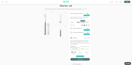
13. quip
")
Quip is an oral hygiene company that offers subscription-based options, delivering affordable electric toothbrushes, toothpaste, and floss right to your door. They’ve been all the rage for their sleek designs, easy-to-use products, and their budget-friendliness.
Their products and pricing page is clean, with plenty of educational content walking buyers through their various options, including materials as well as toothpaste and floss add-ons. They also include refill plan information and clickable links to describe what the refill plan consists of.
Bottom line: quip does a great job of communicating a variety of options, highlighting price differences and potential saving opportunities, in a clean, concise manner.
Misc. Pricing Page Examples
No matter the industry or type of company, businesses that thrive understand the importance of a slick pricing page.
14. Statista
Statista is a business that offers users access to millions of online surveys, market data, and statistics with a mouse click. Trust is a major issue when it comes to making a buying decision. Statista’s pricing page instills both trust and safety.
Testimonials and trust icons on a pricing page can give visitors a good example of companies that are using your service. Statista offers company logos on their pricing page as well as testimonials below and next to their pricing plans.
15. Blend
Blend is an inbound marketing agency that’s there to help all businesses improve their marketing strategies. When it comes to pricing page design, sometimes less is more, and Blend understands that.
Blend’s pricing page breaks down its pricing into three tiers, but then goes on to explain what all the features include. This element is graphic and simple, and it helps prospects know exactly what they are going to get with few words.
Win Big With an Awesome Pricing Page Design
Your businesses pricing page is a great way to reinforce your brand and ideals.
Whether it’s showcasing your brand personality through whimsical graphics like Wistia, or through irreverent text and laser beam shooting bears like TunnelBear, using interesting graphics and expressing your brand identity through text can draw a visitor in.
Combine that with clearly descriptive product names that reduce visitor confusion and present complicated information in a simple manner, and you’ll increase your conversion rates in no time!
Digital & Social Articles on Business 2 Community
(59)