Emails are not just any banal communication tool. Well-designed emails that share valuable information not only help in customer acquisition and conversion but also in retaining them by building a strong relationship. Designing an email that helps to achieve all this, thus becomes essential.
It’s time to bid adieu to 2016 and you must be gearing yourself up for the New Year with new marketing plans at the top of your list of things to do. To know what designs will work for you in 2017, it is essential to analyze the year gone by and take learning for implementation in the coming year. The Monks here help you take a peek into the email design takeaways from 2016:
The Mobile Eon
According to Litmus, in the year 2016, an average 55% emails were opened on a mobile device. So now, it’s like, design for mobile first and then work backward to email consumption on other platforms.
A responsive design helps subscribers view the content of your emails on their mobile device without having to pinch to zoom. Another way to make things easy is to go for the single column layout, which can be scrolled and read without inconvenience.
Emails with an appeal
Social networks like Facebook are thriving really well on the concept of visual content and so is email marketing. Visually appealing emails with high definition images grab attention and gather better engagement rates. A commonly used pattern is a killer image above the fold and card based layout or zig-zag sections below it.
Terrain, a home décor curator, is a master at using amazing images in its emails. Here is one of their beautiful emails.

The balancing act
An unwritten rule that the image: text ratio must be 40:60 is something for everyone to follow if you wish to surpass the hassles of deliverability. In case you wish to defy the rule for you want to make your email image more visually pleasing, you can choose to add a background image. Even if an ESP like Outlook blocks background images, there is a way to handle the issue.
Don’t skate on thin ice, fallback
As mentioned above, images are a sure shot way to impress subscribers but what if an ESP blocks images? What will fill the space? Will it be a turn-off? With many ESPs blocking images as default, only allowing to show them if the subscriber opts in to, it is essential that you have a fallback ALT text or pixel art that renders well across all email clients. A fallback color works well for background images.
Color is the catch
Color has always played an important role in the success of a marketing campaign and is even more prominent now in email marketing. Using two bold colors for accents supported by a few others that will tone down the effect of the dominant ones and also go well with them is a smart idea. Specific colors show specific emotional impact on the subscribers’ minds. Hence, choose your color palette thoughtfully also keeping in mind your brand image. A light background with dark text on it is better than doing it vice-versa.
Kate Spade uses bright fluorescent background colors to highlight the product descriptions and balances that with images over a white background.

White space positives
Known as negative space, white space when used appropriately, bestows all positive consequences for your marketing email especially because it improves the scalability of emails viewed on mobiles. More the white space, more are your chances of drawing subscriber’s attention to important areas in the email (mostly the CTAs). Good enough spacing and line height also have a good impact. Another positive is that white space is responsive and adjusts wonderfully to the device on which the email is opened, thus making it a hit with mobile users.
Lands’ End created their Valentine’s Day email with quite some white space, channelizing the subscriber’s attention to the images created in heart shapes.

Flat Design still fascinates
Flat design has been popular since a couple of years and still continues to rock the email marketing world. The minimalistic design format it embraces is what makes it a hit. With no shadow effect, textures, gradients, flat design mainly uses color to make the emails beautiful. Animations, shadow effect, grid-based layouts are used in material designs to give the 3D effect.
Sephora’s email is a perfect example of a flat design. They have focused on utilizing colors to make their email beautiful.

Interactivity in Emails – There’s no looking back
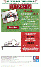
Interactivity made a stunning debut and the euphoria still continues! With the awesomeness it carries, it is all set to make it big in email marketing. Interactivity not only makes your emails come to life but also helps to fit a lot of content in a concise email. In a nutshell, it makes your emails STAND OUT in the inbox. Marketers are already making the most with interactive elements like drop down Menus, Accordions, Flip, Scratch, Sliders and Rotating Banners in their emails and grabbing attention like never before.
Temptations used countdown timer in their email to notify their customers about the validity of their offers, which includes free shipping.

The vibrancy of Animation
This eye-catchy, smart way of conveying a message is liked by one and all. The use of GIF in email has increased to a great extent as it is easier to create a GIF as compared to CSS animation. Moreover, what gives it an edge over the rest is its compatibility across most of the email clients. CSS animation can help to create an image of a superior quality and a small file size but what goes against it is the complexities involved with creating them and poor support from email clients.
Starbucks uses GIF in most of their emails. Here is one example of how a subtle GIF can make a difference.

Return of the Video
Videos are engaging. And videos in email can increase open rates by 19% and click-through rates by 50%. The only problem with videos is that there are many email clients that do not support videos in email. But with Apple’s iOS 10 version released in 2016 supporting HTML5 videos, it seems the scenario is about to change.
Timing it right with Live Data
Providing data that updates every time an email is opened is a good way to show you care. This trending way works really well when it comes to announcing an event or end of a sale through a countdown timer. Also, weather conditions can be updated. Every time subscribers open that particular email, they see updated time or weather conditions, which stand corrected at that particular point in time.
Live social media feeds
Just like the live data, live social media feeds can also make your email stand out. You have the option of adding a Twitter, Facebook, or Instagram feed to showcase latest photographs or tweets about you.
Yoga Rebel uses its Facebook as well as Instagram feeds to grab the attention of the millennials.

Email Design Takeaways in a nutshell
Beautifully designed, visually pleasing emails are in. This calls for out-of-the-box thinking if you wish to stand out from the crowd with drool-worthy emails. In 2016, marketers made sure to:
• Create responsive emails
• Put extra time in making captivating, image-based designs
• Stick to the 40:60 Text: Image ratio, as far as possible
• Provide fallback support to all images
• Employ a perfect blend of bright and pastel colors
• Utilize white space to highlight important areas
• Continue with minimalistic, flat design
• Focus on interactive elements
• Go on with animation, particularly GIF images
• Plan about adding a video in emails
• Implement live data to provide better UX
• Add live social media feeds, wherever essential
(65)