So you want to generate some leads on your website, do you? Well, do you have any forms for people to fill out so you can convert them from visitors into leads? Do you have any landing pages with content offers, downloadable guides, or even consultation requests? If you answered “No” to any of these questions, you should start by learning what landing pages are and how to optimize them.
If you answered “Yes” to any of these questions, then read on to see 10 excellent landing page design examples that I have handpicked just for you!
Example 1: Instapaper
This landing page is super simplistic! It’s attention grabbing title and engaging visual drives your attention to the Call-to-Action (CTA) directly below, which invites you to create an account. Once clicked, the CTA opens up a lightbox to fill out your email and password. And that’s it, you’re done. You’ve created your Instapaper account.

Example 2: Intercom
Intercom does an excellent job of taking a confusing process and simplifying it down with the clever use of icons and imagery. The large header, “Customer communication made simple” brings the user in and leaves them with only one form field to fill out. You can get started with Intercom by simply entering your email address. Talk about a low barrier to entry.

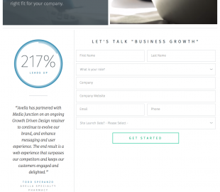
Example 3: Media Junction
This landing page has some great qualities to it. The inclusion of an eye-catching video (which you can’t see in the image below, but go to their site and check it out). The testimonial creates a sense of credibility and trustworthiness, leaving you with the feeling that if you choose to work with them, they’ll produce results. Speaking of results…I can’t imagine this landing page doesn’t produce great results.

Example 4: Wistia
Wistia is all about conversion here with this page. The subtle pattern contrasts perfectly against the white form fields and blue CTA button. And even if you still need a little more before filling out your info, they have graciously placed additional details below the form area for your reading pleasure.

Example 5: Codeacademy
Once again, simple and direct wins me over with this design and layout. I would bet the general user who is visiting this site is already there because of the SERP link that they clicked on. So the headline is straightforward, telling the user exactly what they can expect once they fill out the form. I also enjoy the inclusion of a sign up option with either your Google Plus or Facebook account. Some people feel more secure when they don’t have to give out their information and can link their social accounts to other applications. Overall, the few basic elements this landing page has really pull at my creative heartstrings

Example 6: Dollar Shave Club
Dollar Shave Club nicely maps out their process with detailed visuals and convincing copy. The large image in the middle gives you a really good sense of what you will receive when you sign up, and the bold header text draws your eye closer to where they want you to look. In the end, all these elements funnel your experience to that coveted “DO IT NOW” button. Looks like I just signed up for Dollar Shave Club. They got me!

Example 7: IMPACT Branding & Design
The large headline text and contrasting blue CTA draw me down the page, where the body copy is laid out in an easy-to-read manner and informs me of the offer I am about to download. A simple form that is encapsulated drives me to fill out the form and “GET IT NOW.” It, being my ebook of course.

Example 8: Unbounce
You might be looking at this one and saying, “This doesn’t scream excellent landing page design.” But what you have to realize is that it’s not about how cool it looks. It’s about conversion! This landing page design is simple. Do you see a pattern here… #SIMPLICITY! That big orange button screams at me to put in my email address and “Get My Free Guide Now.” Does it do the same for you?

Example 9: Spotify
Spotify’s in-your-face design, large typography, and high-res images create that feeling you get when you hear your favorite song play through your speakers. So play Spotify for free by clicking on the “Play Free” green button and start listening today.

Example 10: HubSpot
Why wouldn’t I include a HubSpot landing page design example in this list? I mean, they are the inspiration for most of the inbound marketing strategies that we create at my agency. This landing page has it all; it’s got an attention-grabbing headline, a sub-header, a short bulleted list of benefits, an engaging image, a simple form with just the right amount of fields, and a nice BIG orange CTA. It might not be super cool, super flashy, or even have a dancing flamingo, but it gets the job done. It’s focused on one main goal…to convert that user who visited the page into a lead.

Now that you’ve checked out these 10 excellent landing page design examples, doesn’t it make you want to go redesign yours right now to include some of these key landing page elements? By doing so you just might increase your conversion rates—a welcome byproduct of an efficient and effective inbound marketing strategy.
Comment below and tell me of the trials and tribulations you’ve experienced with landing page conversion, or fill me in on your lead generation efforts in general.
(270)