 Jon-Mikel Bailey — February 24, 2017 Follow @jonmikelbailey
In the first video of this ongoing series, we break down the basics of Responsive Web Design. At the end of this video, you should have a good understanding of this concept and how to best use responsive web design in your digital marketing efforts!
‘What Is Responsive Design?’ Transcript
What Is Responsive Design?
These days, a website without responsive design is like a site without a phone number… frustrating. But, what is responsive design?
It is a website using a grid structure and CSS queries so the layout “responds” to the device on which it’s being used. What does that mean?
It’s one website for all devices… desktop, tablet, and mobile users will all be able to easily use a responsive website. Without responsive design, your mobile users are frustrated! So, what portion of your audience is frustrated?
Is Your Audience on Mobile?
Of course, all of your traffic isn’t coming from mobile. But I can guarantee you that the numbers are tilting that way. And, if you do not have a mobile friendly site, you will not rank as well (or at all) in mobile searches on Google.
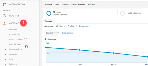
You can see in the screenshot from a client’s Analytics that mobile and tablet users outnumber their desktop users. And those numbers keep growing. To find out your numbers, go to Audience and then Mobile in Google Analytics.

One Website – Multiple Views
Remember, this is one site. In these screenshots of our website, you are seeing the mobile and tablet breakpoints. This means that users on these devices will be delivered content in an interface dictated by the size of their screen.
In other words, a responsive website is coded to know what device you are on and which layout to present. Again, this is one website. We don’t have a mobile website or a tablet website. We have one website that adjusts based on how it’s being used… it responds.
Handy Responsive Design Terms
As you go through a design process, understanding the concepts here will help a great deal.
- Mobile First means designing mobile layouts first and then tablet and desktop breakpoints. If you have a large mobile audience – larger than desktop, you might want to design for mobile and then work sort of backwards to tablet and desktop.
- Break Points are the resolution where the layout changes. Usually at mobile (320px – 480px), tablet (768px – 1024px), and desktop (1024px and above).
- Target Size is the size of a link or call to action. For mobile, it’s around 40pixels high and wide.
- Progressive Enhancement means you focus on the core content first and then layer in other presentation elements as the layout expands at certain breakpoints. This means that the site knows to “withhold” certain items at certain breakpoints.
Responsive Content
Because a responsive website is one site for many devices, the content on your website must perform for desktop, tablet, and mobile users.
Responsive content is content that a mobile user can digest easily. Think about your content in terms of its…
- A headline grabs the user’s attention and makes them want more. Questions, lists, or provocative statement make for great headlines.
- The lead is the first sentence or two the reels them in, piques their interest.
- Body content is the meat that keeps them engaged. It’s info rich content broken into digestible chunks
- The conclusion reinforces the main points and gets the click, conversion, or share.
Responsive Design in a Nutshell
Well, there you have it, responsive design in a nutshell. Understanding these web design and development concepts will help your organization to make the most of your digital marketing and online communications.
If you have any questions or want to talk to us about responsive design, give us a shout.
Digital & Social Articles on Business 2 Community(49)