So, what does a successful landing page look like? I’ve put together my top tips for creating a landing page that will have maximum impact and get your campaigns converting.
1. Make sure it’s consistent with the source your click came from
If someone is clicking through from a PPC ad, email, SMS or direct mail piece, you need to make sure your landing page is consistent with this other channel. Keys things to consider include:
- Personalization
- Branding
- Images
- Headlines
- Messaging
- Proposition
- Offer
Some of these might be a bit tricky. For example you can’t personalize a PPC advert or customize it so it’s completely on brand, but you can still use the same main message. But with other channels like email you really can make it feel like a seamless on-brand and personal experience. Most good marketing automation providers will let you use the data about your customers that you use in your emails in your landing pages too. To make your landing pages highly personalized and relevant think of basic demographic data (like first name, DOB, company name), their engagement with your website, social interests, purchase history and any other interests they might have registered with you like their whitepaper preference or favorite chocolate bar.
2. Make your call to action (CTA) easy to complete
If your email or PPC ad was strong enough to get someone to click through, don’t be let down by your landing page making it difficult for them to take action. Sign post your CTA i.e. ‘Click here to buy’ so it stands out. Buttons work well in making your CTA prominent so think of using these too rather than just links within paragraphs or sentences of text.
3. Make sure your landing page sells
Now you’ve got a click through, make sure your landing page sells. You don’t want to repeat what your previous channel said or slow down the process of your audience performing your call to action but you do want to reinforce why they clicked through and why they should now complete the CTA. Ways to do this include:
- Highlight your USP
- Layout the benefits
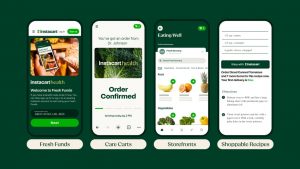
4. Lead with an image
Most pages on your website, especially your homepage will contain multiple images. That’s why it’s good when designing custom campaign landing pages that you only have one strong image and you lead with it. Realistically your landing page should only have one message, one CTA and your image should reflect this. You don’t want to confuse your reader with too many things when the whole point of your landing page is to get them to convert. A video however could be a good addition as long as reinforces the story you’re telling so doesn’t side track them and doesn’t bring other problems that could disrupt your audiences experience like low loading times.
5. Let your customers know if they’re close to completing
If your landing page happens to include a multi-page form please please please highlight your reader’s progress so they know how much is left before they’re done. For example, do by percentage or show they’re on page x of y. They’ll really appreciate it and you’ll benefit from more competed responses. Win win. Of course if you’re getting low fully completed response rates then it may be worth taking a look at your form/survey and amending. But that’s for another blog.
6. Think about your CTA. A lot.
There’s two parts to this. First of all, where does your CTA sit? Above the fold, under the fold, in the middle of a paragraph? This all depends on a) how much text you’ve got on your landing page and b) what your text says.
If you don’t think your reader will take action before reading what you have to say then place the CTA after it. If you think your previous communication did all the selling for you then make sure it’s the first thing they see!
Secondly, what does your CTA say? Ensure that the copy itself is impactful. Use verbs wherever possible – so ‘get’ or ‘choose’ rather than ‘submit’ for example. This may seem small but it can be very impactful – a US property site increased its conversion rate by 15% simply by changing the word ‘Order’ to the word ‘Get.’ (Source: ContentVerve case history)
Also think about the message of the wording beyond the action that you’re asking – ‘add to basket and save 20%’ may be better than ‘Buy’ even though it is merely replaying the saving being offered in the first place. Ensure that the wording reflects the readers’ motivation – why they’re there in the first place. And make it personal too – simply switching the CTA from your brand’s perspective to your reader’s (so ‘Claim My’ rather than ‘Claim Your’) can make a dramatic difference.
7. Prove what you’re saying is true
If you have a customer testimonial to back up what you’re saying – use it!
8. Create a sense of urgency
Maybe the final push to get your reader to convert is emphasis on limited time to purchase, limited availability or the fact that other people may secure the product or service first. Techniques you can use to get this across include countdown timers through ‘other people are browsing’ to ‘X people have bought in the last hour’.
9. Make it mobile responsive
With more and more people accessing emails and the website on their mobile phones and tablets it’s imperative that your landing page is mobile responsive. And the surveys and forms you include in it. This shouldn’t require any coding from your side – your marketing automation system should do it automatically.
And that brings me to end of this blog post. I hope you’ve found it helpful – and keep an eye out for my next blog on measuring the success of your landing page. If you haven’t already, sign up to our weekly blog update email.
(175)