 Govind Agarwal
The smartphone generation prefers to surf for information on their phones. They like the convenience of receiving or sending out mails, surfing the internet, playing games, reading news, watching videos and more, on the go. Apart from looking up for all this on their phones, they also want to do it fast; this has made it necessary for almost every business to have a mobile optimized website. It is one which is completely designed or re-designed with large navigation buttons, reformatted content and optimized images to work well on tablets and handheld devices. The smartphone user market is very huge and covers a major portion of the target audience for most businesses. Being able to reach out to the customers through their phones helps to improve your online visibility, increase number of customers and earn higher revenue.
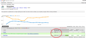
A comparative study can help to know the plus points of a mobile optimized website over a non-mobile optimized one.
• Wide target audience – The biggest advantage is being able to capture a huge target audience market that uses smartphones for internet surfing.
• User experience – It is essential for every website to focus on the user experience aspect. Viewing a regular website on the phone is tough as it is shrunk to be visible on a smaller screen. The text and images are very small and links are tough to click. A mobile-optimized website is specially designed for handheld devices. They provide an enhanced user experience and satisfaction by allowing easy surfing. It has larger navigational buttons letting you easily find what is required. There are no disturbing graphics or large text blocks. A contact number is usually provided which can be accessed with just a click.
• Download speed – The speed at which a website downloads determines the amount of time users are going to spend on it. Pages optimized for handheld devices ensure quicker download, reducing the waiting time unlike the desktop ones.
• Better SEO – It helps to rank better in mobile-friendly search engines. It allows for better placing in mobile and local directories which may not be possible with desktop designs.
• Brand image – As you are easily accessible to users and do everything to make their experience better, your brand is bound to gain a good identity among target audiences.
• Better connectivity – As your product information is accessible from anywhere at any time, you can constantly be in touch with your target audience which is not possible from desktops.
• Ahead of competition – A website that is not easy to use on smartphones is bound to lose users who get diverted to sites that are easily accessible. A website designed for smartphones and tablets gives you that competitive advantage as it helps to easily grab the attention of users.
• Businesses can make use of increasing advertising opportunities by posting ads online. These promotions are useful only when they lead to your mobile-optimized landing page rather than the desktop portal, increasing user traffic.
Mobile optimization is surely beneficial as it is a great way to increase user traffic considerably as compared to the number non-mobile optimized websites generate. This, along with improved user experience is bound to increase sales conversions, bringing about a rise in the overall business revenue.
Digital & Social Articles on Business 2 Community
(323)