— January 29, 2019
“Never judge a book by its cover” is a well-known cliché, but the cover is the detail that sells a book, the cover and the several paragraphs description on the back. Landing pages are pretty much the same and have the same mission. An optimized high converting landing page is the “wonder tool” that direct prospects to your sales funnel.
The aim of a landing page is to convince the user to complete a certain action, like signing up for your newsletter or register for a webinar etc. First impression matters, and you have some fractions of a second to convince your visitor to take the action you want. Optimizing your landing pages improves the user experience and is an effective manner of driving conversions.
Being the hub for leads generation, your landing pages are the realm where prospects decide to step towards becoming customers. Thus, you have to do your best to have the odds in your favor.
What makes a landing page convert well? How can one demystify this process to have the best converting chance? Which are the landing page best practices to achieve this desideratum? And what is a high converting landing page, after all?
Keep reading and you’ll find out.
To be honest there are some dozens of elements and landing pages best practices to be taken into consideration, a mix of psychology melt with prospect’s expectations that rule in the background.
To define in more precise terms what do that a good conversion rate is, WordStream conducted a research and found out that a median conversion rate based on search traffic is 2.35%. This is a starting point, but there are important fluctuations depending on industry and acquisition channel. A real estate broker selling high class properties will have lower conversion rates than an e-commerce store selling handcrafted jewellery.
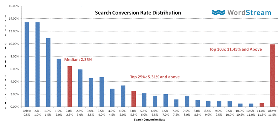
Search Conversion Rate Distribution. Source: WordStream
For more in depths details for each industry check the Unbounce Conversion Benchmark Report.
There is no Holy Grail or one-fits-all procedure that can be applied because there are different factors that imply like industry, audience, goals, products, services to name just a few.
But there are some characteristics that successful landing pages have in common.
Here are the essential landing page best practices that you have to keep in mind when crafting a compelling and high converting landing page:
Principal Landing Page Best Practices to Consider
Attention Grabbing Headline
The focal point of a landing page is the headline. With the headline starts and ends everything.
An effective headline should take into consideration the following:
· Keep it short – the ideal is around ten words of length
· Capture instantly the attention of the reader, ensure it stands out visually
· Clearly and accurately explains the service/ product and enhances the value of your proposal, don’t expect the user to dig in order to find out what you are trying to say, you’ll lose him for sure
· Should be in resonance with the landing page design
Check out the landing page example below and its headline – states exactly what’s the aim and what problem it solves.
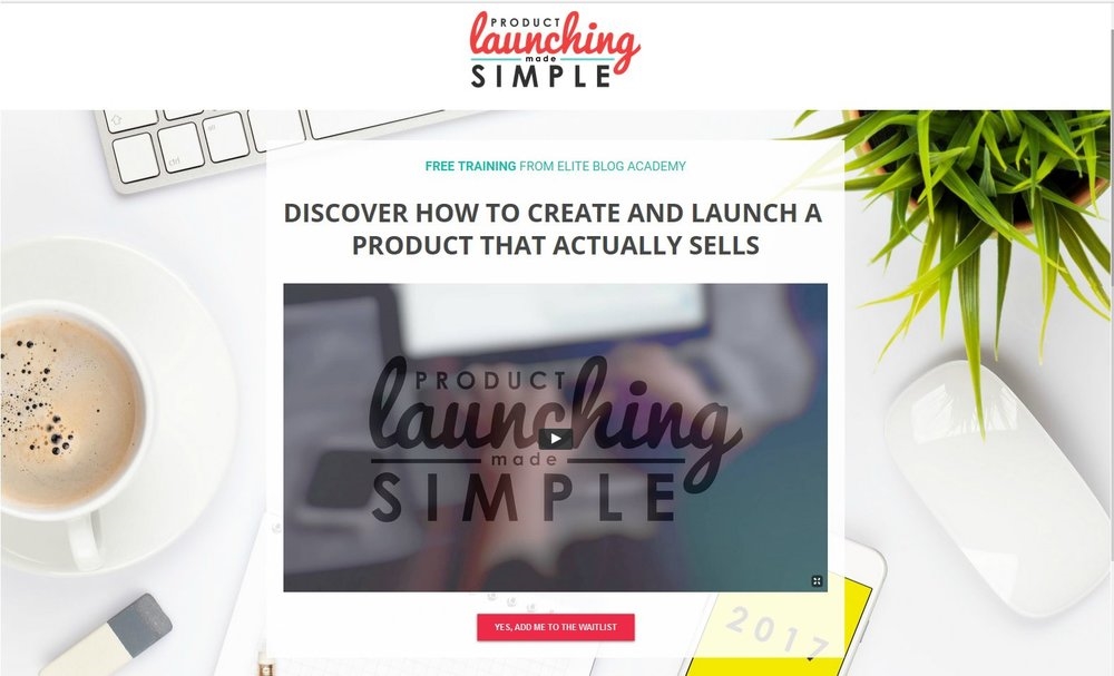
Product launch landing page example. Source: Elite Blog Academy
CoSchedule landing page clearly states what one should expect from this page, prominent headline, supplementary info with subheadline, elegant design, very visible call to action. Well done!
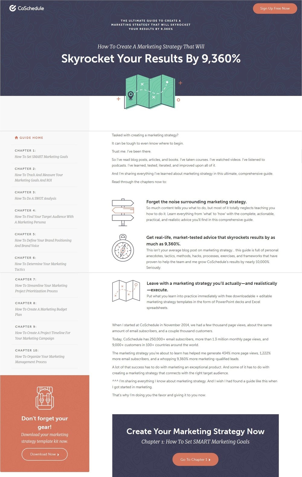
Landing Page example. Source: CoSchedule
Optimize the headline of your landing page for conversion. Experiment with very specific headlines, chances of conversion rise when readers know in a second what they obtain. Test the tone of the headline message. Underline benefits against loss or a question and identify which converts better.
Strong Call to Action
The Call to Action is the out-most important element of a landing page. It defines the action that you want your readers to take.
Compulsory elements of a call to action:
· Make it prominent, large, attention grabbing
· Use visual elements to draw attention to the CTA like people in an image looking in that direction
· Conceive a convincing copy that instigates to action. Be aware that this is the most important piece of copy on your landing page
· It should be a button, this a general expectation
· Make it stand out with a contrasting color, it should immediately draw the attention while on the landing page
· If there are several CTAs on a page stress on the primary one, if it’s long form landing page repeat it
The ultimate aim of the CTA is to drive conversions, all the design, content and flow should direct to a click on CTA. Code.org a nonprofit succeeded the exploit of increasing conversions with 12 million just by modifying the CTA.
Leverage your CTA, make it eye catching, like this large, contrasting colored from Teachable.

Source: Teachable
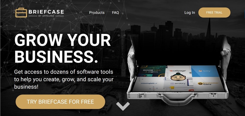
Source: Briefcase
Test your CTA to check which combination converts better:
· Try different designs for the CTA button, choose the one that is most eye catching
· Test the CTA copy
· Optimize the CTA button placement on the page
The purpose of most landing pages is to collect information through a form. Facility and design are important features of a form. If readers can easily identify the form and complete their information without headaches and losing too much time, that’s a huge advantage. The form and its complexity or simplicity are the game changer.
Check out a landing page example from DoubleYourFreelancing, simple prominent form that grabs attention and you’re done. Not to mention the highly emotional headline.
A very inspiring landing page indeed! A new proof of how less is more.
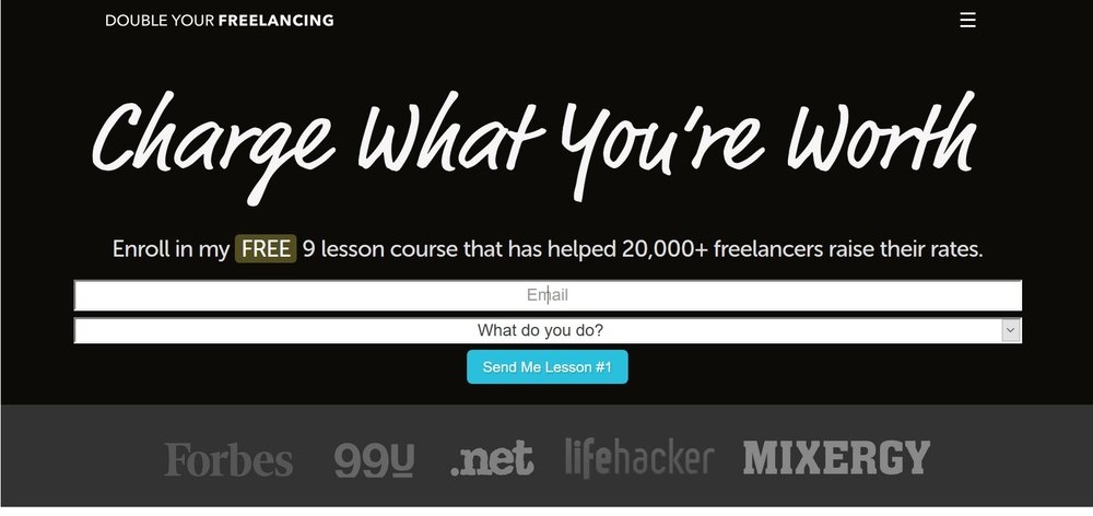
Simple Landing Page sample. Source: DoubleYourFreelancing
The lead generation form that you plan to use should be optimized and tested:
* Experiment with various visuals, see which gets a better response
* Test on the size of the form fields, larger fields may be more attention grabbing
* Make it simple, use just the essential fields
* State exactly what information you want to collect, for accuracy reasons
Convincing Subheadline
The headline has the mission to catch the attention of a visitor and the subheadline has the mission to convince, by providing additional elements to the puzzle. It is the second detail that fires the strength of a landing page.
The subheadline is supposed to extent the concept defined by the headline, support it and bring to attention key points into its favor. Should be eloquent and a bit more detailed.
Clipman’s landing page makes use of subheadings we have one above the headline and one below and the extra info under the video. The first is emphasized in different color and brings in straight clarification “NEW sales generation secret weapon…” to explain the bold purpose of the headline “Video Ads That Turbo-Charge Your Sales, Customers & Conversions”. The explanatory part is meant also to convince and attract “Buckle in…because you’re just minutes away from pumping out jaw-dropping Facebook, Instagram & YouTube video ads that will make you stand out… And DOMINATE your niche! “ and stresses on an irresistible benefit.
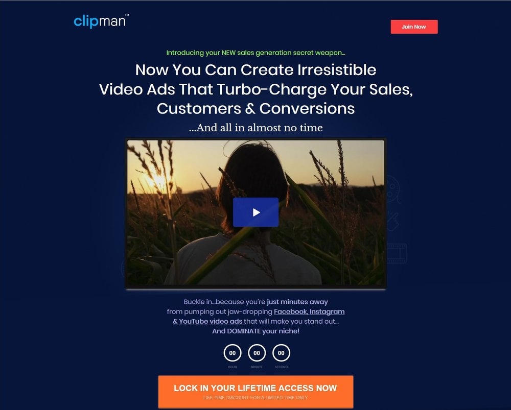
Sub-headline landing page example. Source: Clipman
Elegant and Appealing Visuals
An image makes more than 1000 words is an old dictum. Consequently, your images or whatever visuals you choose for your landing page will impact heavily and instantly on your visitors.
When choosing the visuals for your landing page be attentive that they:
* are high quality, without any exception, and are original, not common free stock photos
* are large format
* are relevant for the content and design of the page and to your product/service, having the mission to support your message
* are matching the message of the page and its purpose
Landing page design considerations:
* less is more, keep it simple and clean, allow visitors to focus on the call to action
* don’t use too many visual elements to spread attention
* use bullets or small blocks of text that are easy to scan
* large fonts ease readability and visitors grasp quicker the aim of your site
* use videos if appropriate, they seem to trigger a higher conversion rate
* loading speed is important, as quicker pages attract higher response rate, so, strive to have a responsive design
Styledstocksociety sells stylish photos so it’s natural to have a landing page that breath elegance and finesse with a simple layout, a centered visible headline and noticeable call to action.
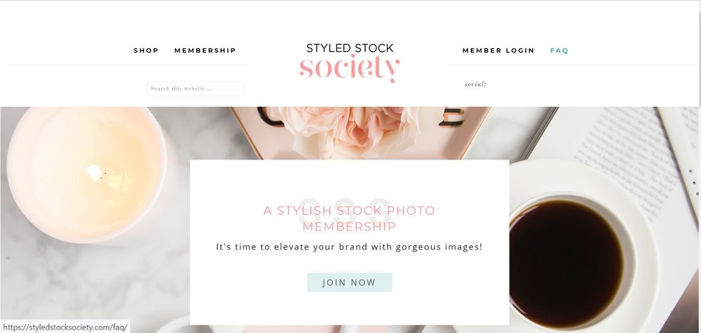
Elegant design. Landing Page Inspiration. Source: Styledstocksociety
Dior and the supreme elegance. A world-famous brand, a world-famous product and a landing page up to the exigencies, clean, impactful, distinctive and the ultimate grace. A great landing page example and a great inspiration for landing pages.
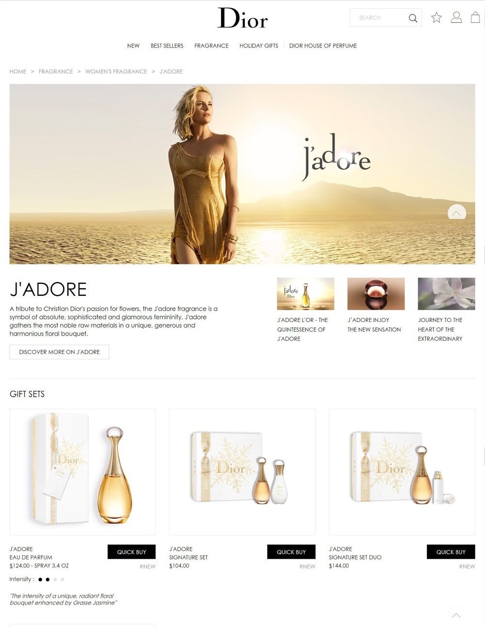
Famous brand Landing Page design. Source: Dior
Extra Info
It’s compulsory that your visitor gets the whole picture of your product/service right away, otherwise chances are that you lose him. Thus, an explanation, some supplementary information is necessary.
· Use less words, but be strait to the point
· Extra information may be integrated with the headline and the subheadline or separate
· The supplementary information as a whole may contain headline, subheadline, layout, image and/or separate paragraph(s)
· Extra information should be presented from the user point of view and focus on benefits. What’s in it for the user?
The following example presents the Extra info in the form of a list of benefits provided by the free webinar.
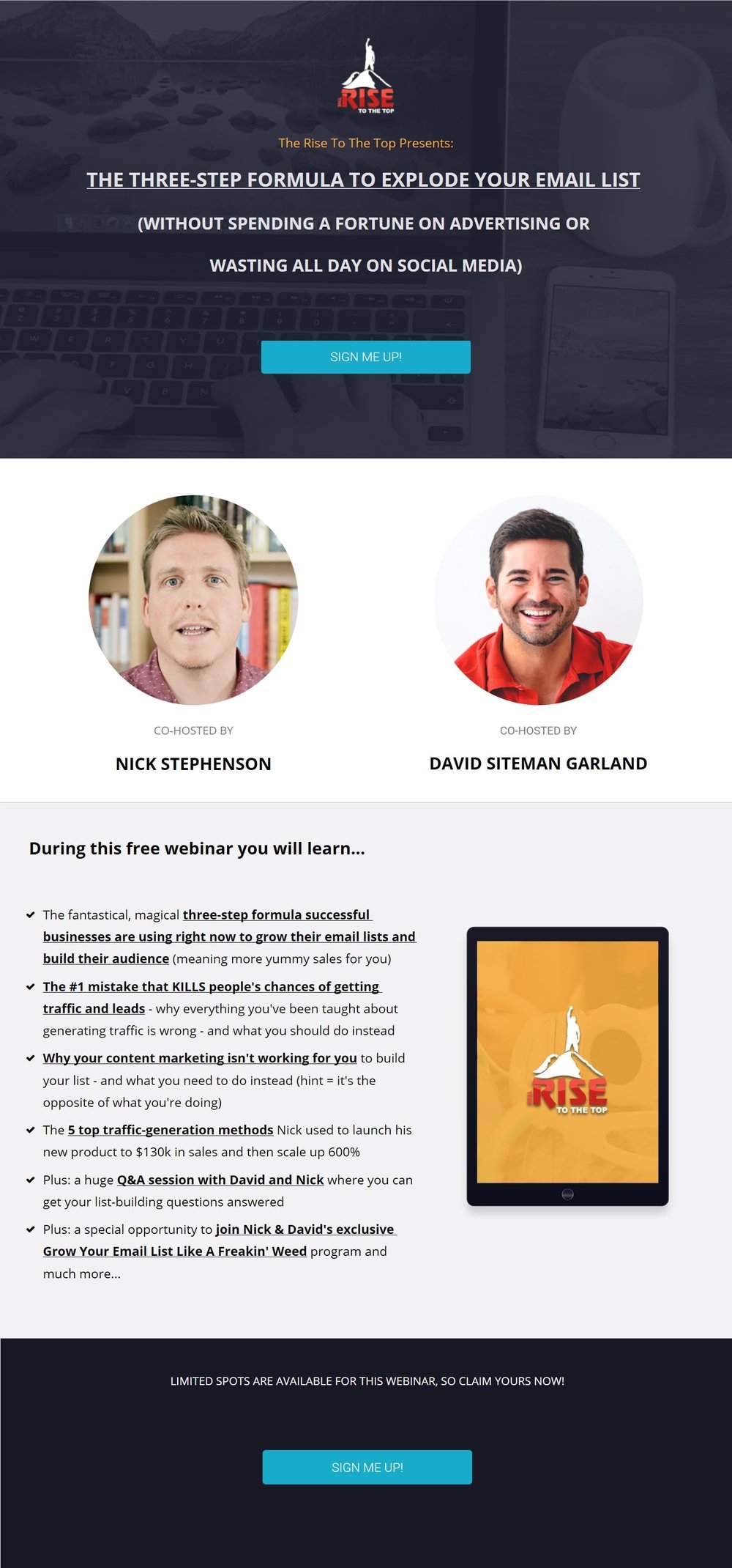
Long form Landing Page sample. Source: Growyouremailliststrategy
Valuable Offer
The offer refers to what receives the visitor in exchange to doing what you ask him to, like giving his email address and receiving a free ebook on a certain subject. The offer contains the benefits from the user point of view. It may comprise a price reduction, coupons or discounts, free trails, free consultation, free version of a product, etc. It’s decisive to be very easy to depict at a glance the benefits and value of your offer.
Some examples:
Landing page with a vague offer:
“Register for our webinar series now”
Landing page with obvious, clear offer:
Register for our biweekly webinar series! And you will:
* Learn how to use technical indicators
* Find out how to elaborate trading strategies
* Learn from top traders in financial markets
* Access exclusive invitations to live events and conferences in your area
The first example is very unprecise and provides no information on the value of the webinars. The second one instead clearly states how often the webinars will be held (biweekly) and lists the benefits that a visitor might be interested in.
The aim of the offer is to direct the users to the conversion funnel. If possible, insert a deadline to induct some emergency factors in order to drive an answer.
Use A/B testing with different versions of messages to see which converts better, as different benefits will attract different types of audience. Test also with your offer as headline and check on conversions, if you judge it appropriate.
Sample of landing page with offer included in the subheadline:
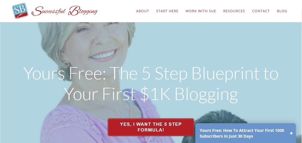
Example of high converting Landing Page. Source: Successfullblogging
A list of benefits is included to show what the course will feature. Landing page example from PinterestVA.
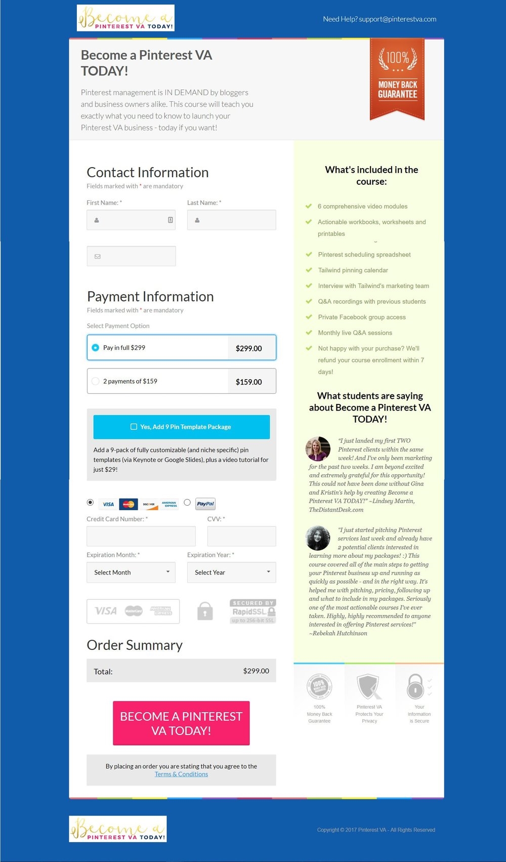
Benefits list in Landing Page. Source: PinterestVA
Logical Match of Text and Design
The design and content of a landing page should be consistent and match logically. In order for the visitors to follow the logical designed path and convert, they should engage with the landing page.
A proved persuasive structure of a landing page is the following: explanation, benefits, testimonials and CTA.
The CTA is the most important element of a landing page and its position and design are critical. Several CTAs might be used on a landing page, but it should be structured in logical sections and a CTA placed at the end of each section.
If the landing page has several sections than the design should clearly mark them, the visual coherence should support the logical flow.
Pay attention to the persuasive elements, they should be present in every section. Also, the length of a page counts, statistically the longer landing pages are more effective.

Long form complex Landing Page Example. Source: Unbounce
Unbounce has a long type landing page with multiple CTAs and sections. This one has 4 and a logical structure of sections.
Hence in most cases you should focus on the “1-1-1 Rule”: one offer, one message, one CTA on one landing page.

Standing out Call to Action in a Landing Page. Source: GetSOS
Leverage Psychological Elements
Psychological elements like pain or pleasure, play sometimes a decisive role when we make decisions. In conversions, they also have a role to play.
In general, we as human beings are pain adverse. Each product or service in some way relieves a pain. People perceive the loss more intense than an equivalent gain and usually we do all we can to avoid pain and loss. Include pain elements that were solved into real human testimonials. Offer the solution and the answer to the pain.
If we are looking to avoid pain at all costs, we are looking to obtain pleasure with every effort. Pleasure is a high motivator for humans. Each and every product/ service can be presented in such manner that it brings pleasure. Count on emotional need to create impact.
Instapage’s landing page counts on emotions, it asks the user: “Want to get it right on your first try? Welcome to Instapage.” Who doesn’t? So, they made a winning bet appealing to an emotional need.
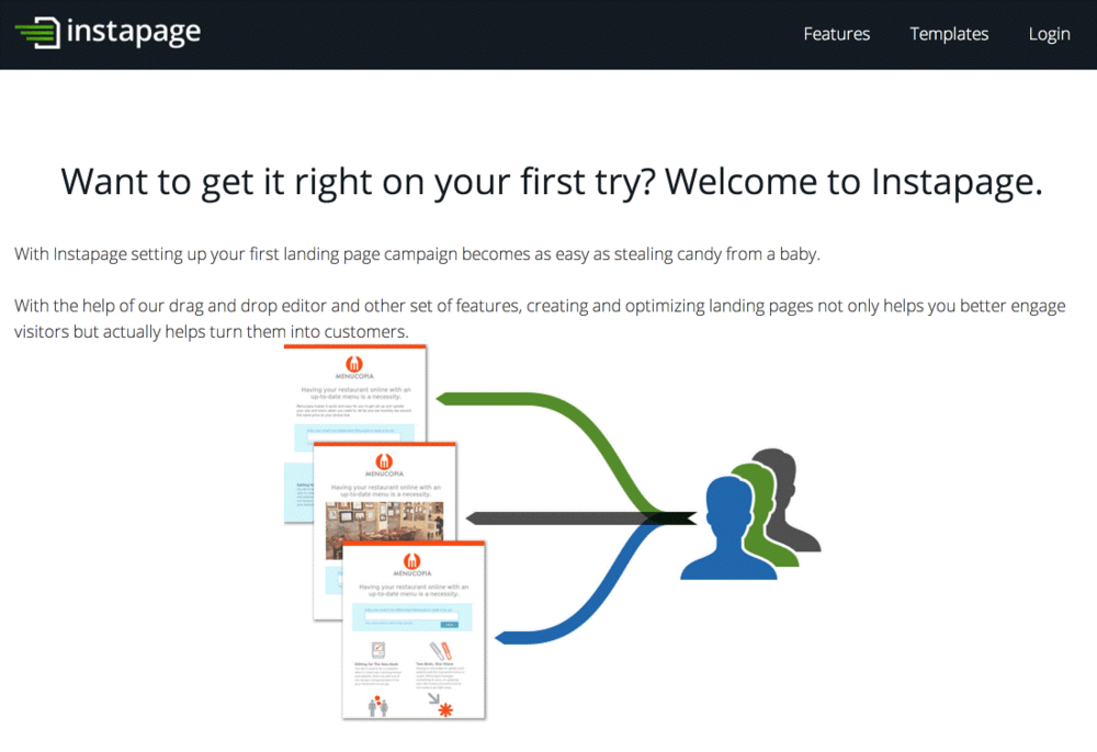
Emotional elements in Landing Page example. Source: Instapage
Trusting Social Proof
The evidence that you have a trusted brand is a powerful instrument. There are higher chances of conversion if other persons or brands did the same previously. Thus, build trust by emphasizing the social proof on your landing pages. Best landing pages reveal impressive social proof.
Social proof can embrace various forms, this is an example from Melyssa Griffin’s subscription to her library free resources “Join over 200,000 others and get access to my library of free resources for online entrepreneurs.”. That’s quite a number!

Social Proof in Landing Page example. Source: MelyssaGriffin
Social proof is increasing leads generation, there is no doubt on that, so ask for quotes from your customers, influencers if possible, or list the brands you have worked with.
Take a look at HubSpot’s social proof:
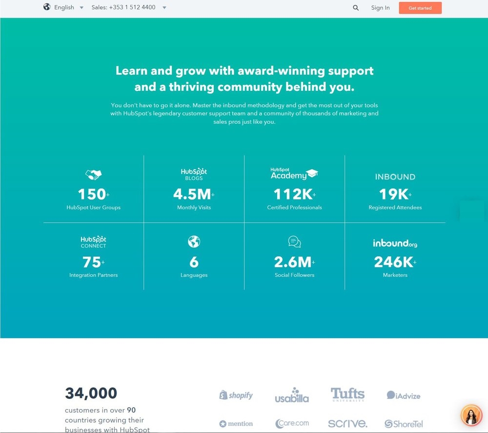
Solid Social Proof inserted in Landing Page. Source: HubSpot
In general, successful landing pages, that respect religiously landing page best practices, include one of the following type of social proof:
· Customer testimonials
· Customer logos selection
· Number of Facebook, Twitter, Pinterest followers
· Number of subscribers or attendees
· Celebrities or influencers testimonials
· Press and media mentions
Speaking about testimonials, the most convincing belong to real clients, buyer personas relevant to your audience, users of your products that relate about very specific features of your offer. Their testimony needs to be accompanied by their photo or logo. This is particularly important for developing trust and confidence.
Real clients testimonials with names, photos and sites, and notable logos of press mentions:

Testimonials inserted in Landing Page. Source: OptinMonster
Ways of getting in touch
The ease of getting in contact is a helpful element to stress on trust and if it’s possible to receive a pertinent answer in real time, that’s already an edge.
Some of the most impressive landing pages display several methods of getting in contact, like phone number, contact form, email address, physical address or even live chat. Live chats and phone numbers are important for large companies, with large number of products/services and customers.
HubSpot, an integrated marketing platform, uses a landing page with a pop-up chat function if you need to get in touch.
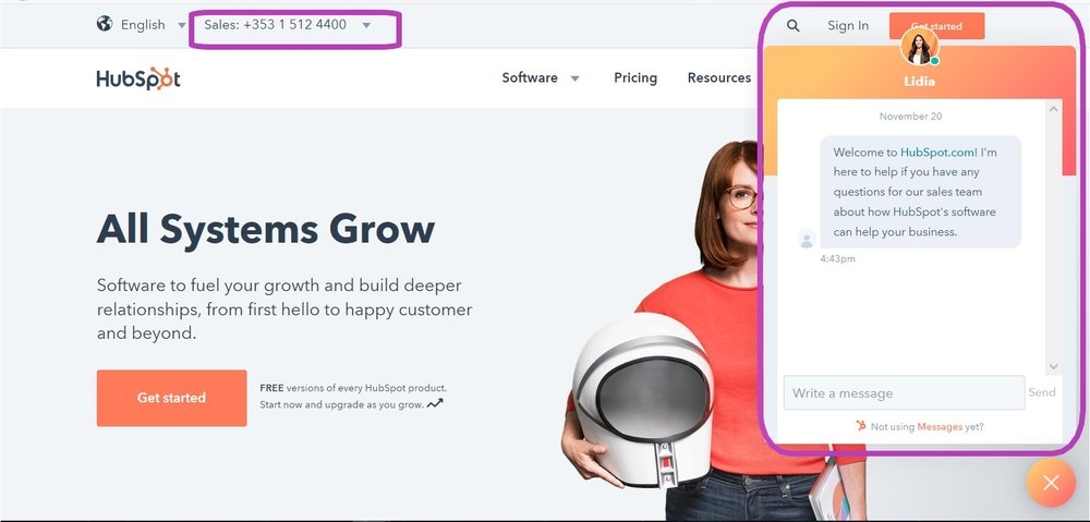
Contact details included in Landing Page example. Source: HubSpot
Insert Guarantee
Another important feature that emphasizes trust and improves conversions is the guarantee. It reassures potential leads and offers them peace of mind.
The point is to have a guarantee and to inform the potential client about it, something like money back, 100% satisfaction guarantee, or simply 100% no spam. The position of the guarantee should be in the neighborhood of the CTA, to provide the final reassurance.
Here is an example:
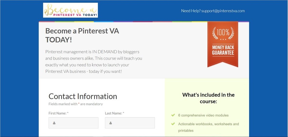
Guarantee provided in Landing Page.
Landing pages are the gates to monetization, one way or another. Creating a landing page is an ever-evolving process, you should always search for new landing page best practices, new ways to improve, test and implement. Taking care of including and testing all the above essentials will drive you to the path of high conversions and higher income finally.
Which are is your opinion the essentials of a highly effective landing page? Maybe you have some adds-on for this list.
Digital & Social Articles on Business 2 Community
(116)
