— July 13, 2019
There’s nothing like spending hours perfecting your beautiful new display ad and sending it off into the wilds of the Google Display Network (GDN) and Facebook. You’ve got a big red button, a blue background (that universally appealing color, right?), and the word “FREE” in there five times. This ad is going to do great!
But then the click-through rate dropped by .5%? Huh.

I’ve designed at least a hundred display ads over the course of my career, so I’m all too familiar with the confusion and disappointment of seeing your ad go wrong when you theoretically followed all of the textbook rules to get it right.
Here’s the thing: Those textbook rules aren’t always right for your campaign or your company. I’m going to share the seven biggest lessons I’ve learned so that you can get your display ad creative on track.
1. It’s not about the colors, it’s about the contrast
I can’t tell you how many blog posts I’ve read over the years that get into the great button color debate. What color button performs best? Well, I’m here to tell you once and for all, the definitive answer is orange.

Just kidding!
In reality, there is no hard and fast answer here, and a lot of it comes down to a) your audience and b) a little design principle called contrast. This study from Hubspot might, at first glance, appear to suggest that red buttons do perform better than green buttons. But a closer look at the page designs will reveal that both Performable’s logo and website used a lot of green. What contrasts well against green? Red.
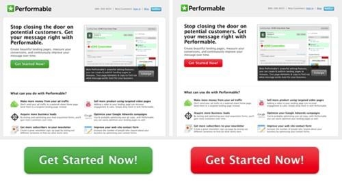
So how do you take advantage of contrast in your ads? The easiest way to find opposite colors is to revisit our old friend, the color wheel.
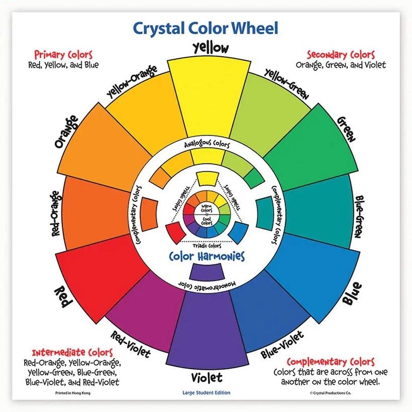
Find the most dominant color in your ad, and move to the exact opposite end of the color wheel to find your contrasting color.
Need some help creating color schemes for your ads? There are tons of excellent free color palette tools out there, but some of my favorites are Canva’s Color Palettes and Adobe Color, which lets you select a complementary (a.k.a., opposite) color scheme.

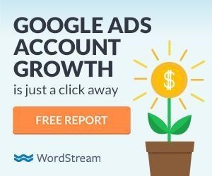
The orange button pops against the blue background.
Color isn’t the only way to create a sense of contrast in your banners—you can also play with things like brightness, saturation, and scale to make your button stand out more. Heck, I’ve created high-performing banners that didn’t even have buttons, but we’ll get to that in the next section.
2. Keep it simple
Communicating your message in the simplest, cleanest way is critical for successful ad creative. After all, only 9% of display ads are viewed for more than one second, and that shrinks down to a measly 4% for over two seconds. If a prospect can’t immediately understand your ad, they’re not going to click, let alone remember who you are.
Below is an example of an ad that didn’t perform well for us.

The contrast of the button looks good, so why didn’t this ad do well? Let’s dive into the problematic parts of this banner (and for the record, I made this, so I’m allowed to talk trash about it).
For one, there’s too much copy here. Between the headline, subheading, button, and the “Safe & Secure” text, there’s so much happening that you don’t even know where to look first. The call to action copy itself is too ambiguous (and probably wouldn’t fly with Google’s current policies). And the visual theme, which could be compelling, is too busy for such a small composition.
Here’s how I would make this better today:
So much nicer, right? A concise headline with better value prop clarity paired with a more direct call-to-action and a cleaned up design makes for a much better ad.
3. Context is key
Have you ever taken a high-performing ad from one platform and moved it onto another, just to discover that same creative tanked on the other platform?
Yeah, ditto. That is why it’s critical to consider the context in which your ad will be displayed when you think about the design. When I first started at WordStream and was just beginning to get a feel for our brand, I was tasked with making some new sidebar ads for our Google Ads Performance Grader. I felt good about how clean and modern my ad looked. I was certain it would perform well.
In reality:
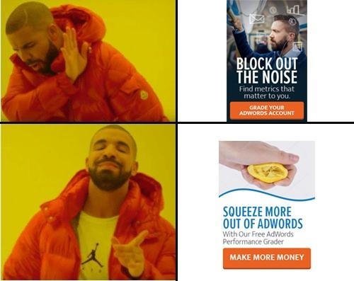
So what gives? What’s the magic ingredient at play here? I’ll give you a hint: It’s context! While that top ad might perform great on the Google Display Network (GDN), appearing on websites that have nary to do with WordStream, it did poorly on our own website because it felt too much like an ad.
We’ve found ads on our website tend to perform better when they work together to create a cohesive experience with the site itself. Otherwise, banner blindness comes in to play. Creating ads that blend in with your website is a great way to improve your clicks and conversions for on-site native ads.
Likewise, you may find certain ad formats tend to perform better on some networks than others. You might see great results with static images on GDN, but according to Facebook a combined approach of image and video drives the most conversions on their platform. And carousel ads tend to perform especially well for ecommerce businesses.
4. Copy and design = BFFs
I’ll be the first to admit that I’m not a copywriter. My brief desire to become a short story writer was quickly squashed by my 10th grade English teacher. Regardless, I recognize how important it is to have engaging copy in the display ads that I design. I’ve learned that it’s important to develop copy and design in tandem when planning an ad campaign.
Too many words will not only make a banner feel cluttered, but they will also make it much harder to effectively communicate your value prop. Less is definitely more when it comes to display ad copy. This banner redesign for Delta does a great job of stripping down the messaging to the most important parts (you can also see how they’ve improved their button contrast):


Source: Forbes
Concise ad copy is especially important when considering mobile views (not to mention cramming more than five words into a 320×100 banner is one of my least favorite tasks).
5. Use seasonality to refresh your creative
Aside from being great fuel for clever copywriting, utilizing holidays and seasonality in your ads is a great way to refresh existing campaigns throughout the year.

I’m not gonna lie and tell you this isn’t the best thing I’ve ever written.
Take the above ad I created for one of our guides–we have a standard ad we promote throughout the year, but for Halloween we decided to have a little fun and it really paid off. We saw a huge bump in click-through rate and conversion rate, and we were genuinely bummed to have turn it off after Halloween was over.
Just remember to be considerate of your audiences when making seasonal or holiday-themed ads. While it’s heating up for summer here in Boston, Australia is starting to cool off for winter—and your Fourth of July themed ad is likely to fall flat in geographies outside of the USA.
6. Take advantage of free resources
Not every business can afford to hire a full-time designer or wants to splurge on a stock photo subscription when they’re just getting started, so it’s a good idea to make use of all the great free tools that are available (hot tip—you cannot just pull images from Google and use them in your ads). In addition to the color palette resources I mentioned above, here are a few other free tools I can personally recommend.
Moat, the GOAT of competitive creative analysis
While Moat offers a paid product with more in-depth data, their free banner ad search tool is a FANTASTIC place to start if you’re looking for some creative inspiration. Simply type in an existing brand, and Moat will return with several examples of ad creative that has been run by that particular brand.
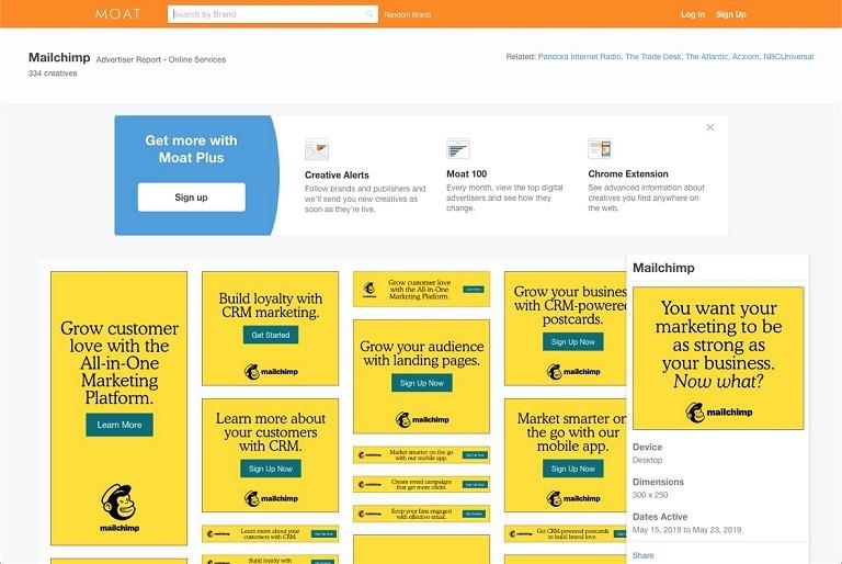
Be sure to use this information responsibly. Just because someone has done something, doesn’t necessarily mean it performed well for them. Consider this more of a jumping off point if you’re stuck.
Unsplash, for free stock photos that don’t suck
Even with access to a paid stock resource, I find myself occasionally browsing Unsplash, simply because the images are often superior to what I can dig up on your typical stock photo sites. The photography is high-quality and modern, plus it feels more natural than some of the stereotypical uncomfortably posed stock out there.
Am I the only one that cries when I eat salad?
WordStream’s Free Smart Ads Creator
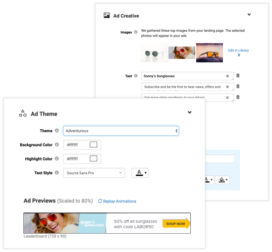
We recently released a new free tool, the Smart Ads Creator. Though it’s a less robust version of what we offer in our software, the free tool is still quite powerful and will allow you to quickly and easily create a set of display ads from content that already exists on your website and social media pages. Depending on your goal (leads, brand awareness, or ecommerce), the Smart Ads Creator will choose a layout that’s right for your audience. And if you want to put some of my earlier advice to work, the colors, fonts, and copy are all editable after the fact, so you can tweak it to perfection.
7. Kill your darlings
My final tip is arguably the most important: Don’t be married to your ideas!
As a creative, I totally understand how easy it is to get emotionally attached to something you’ve poured hours of work into. Learn to separate what you think is good from what actually performs well, because this is something that will be different for every business and every audience. Maybe you think cats are hysterical, but your audience LOVES dogs—that’s totally ok (but cats are better).
Good art may be subjective, but good design is objective. How something makes you feel might affect another person in an entirely different way based on their individual upbringing and life experiences (this is why I take oversimplification of color psychology with a big ol’ grain of salt). Learn what your audiences like by testing new creative frequently, and set up A/B tests to help you nail down just what the secret ingredient is that’s making a campaign a top performer.
Designing high-performing creative can be hard, but don’t get discouraged—by testing and iterating often, you’ll start to notice patterns that you can use to inform your future campaigns and the process will feel a little easier every time.
Digital & Social Articles on Business 2 Community
(78)


