— May 12, 2019
Color psychology is a concept often used when marketing a product or service. It’s no secret that color is capable of altering the mood and emotions of consumers. Business owners emerging on the market now are leveraging their use of color far more than ever before.
Customer perception can change dramatically depending on the color of your brand, the design scheme you use on your website, and even the color of your individual products. Many new marketers and entrepreneurs want to learn more about color and how they can use this simple psychological trigger to improve their conversion rate.
We want to take a careful look at how color impacts our behavior and what we can do to sales numbers just by using the correct hue.
Red Builds Excitement and Drives Conversions
There’s a massive debate in the marketing community over what color button to use when you want a consumer to follow your call to action (CTA). In many cases, this could mean convincing a customer to sign up for your email list, taking a survey, or even purchasing a product.
A study from Hubspot revealed that red CTA buttons outperformed green buttons by a staggering 21 percent. As we can see below, red is a color that drives excitement, creates a sense of urgency, and appeals to impulse buyers.
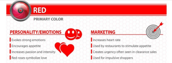
The lesson here is simple enough if you want to create a sense of urgency make sure you’re using red when promoting limited time offers, flash sales, and countdown timers.
Use Contrasting Colors
On the website design side of things, you should try to use a combination of complementary colors in both your brand and website design. However, contrasting colors are equally crucial for highlighting certain information and products you want consumers to see. Here’s an example showing the difference between contrasting and complementary colors on a color wheel.
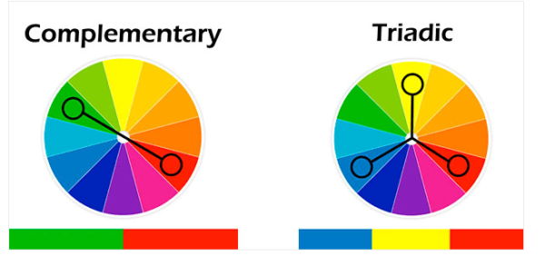
Triadic colors are a specific type of contrasting color, and also an effective color to use on your call to action. When you’re trying to find a triadic color, move across the color wheel one-third of the way all the way around and every color you land on is considered triadic.
For example, if your primary color is purple, your contrasting triadic colors would be green and dark yellow. These colors will stand out in your copy and on your website, which can have a marked improvement on your conversion rate.
Use Your Brand Color to Set Expectations
Consumers will instantly categorize your brand based on the colors you use in your logo. There are plenty of different emotions you can invoke just by using the right colors when your brand pops up on social media or your website.
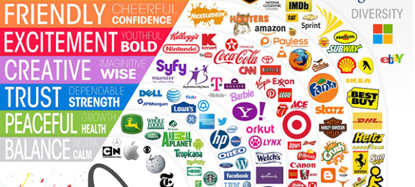
Let’s look at a chart showing the typical emotions associated with brand colors, and some examples of how businesses are using their brand color to their advantage.
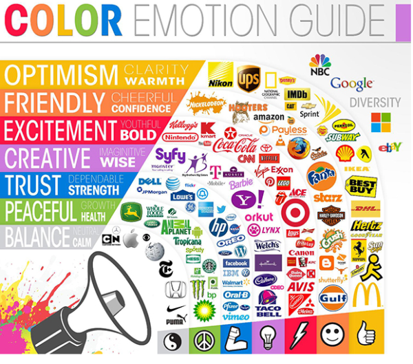
This color guide is one of the most circulated images that show color theory in action. Remember when we discussed red building excitement? Look at some of the brands that feature red, and you’ll start to see a pattern. Brands like Nintendo, Netflix, Lego, and Target use the color red because they want people to feel excited about the products they offer. When looking at Lego and Nintendo, they have the added benefit of appealing to children — which matches with their brand.
Now let’s look at the color green, which is meant to inspire a sense of peace and good health — most of the brands under this umbrella match one or both of these concepts. Animal Planet, John Deere, Spotify, and Holiday Inn all inspire a sense of peace. Meanwhile, Whole Foods, Tropicana, and Starbucks paint a picture of health and wellness.
We could go on, but the point here is obvious. When you’re creating or altering your brand logo, consider the emotions you’ll invoke in consumers when they stumble across your brand. The goal is to create a logo with colors and a design that matches the personality of your ideal customer and leaves them with a positive feeling that they will associate with your company.
Conclusion
There are countless ways you can inject color into your marketing strategy to improve your lead quality and conversion rate. It’s a good idea to split test your campaign with different CTA colors to see how your audience responds As your business evolves and you build your company image, you’ll be able to create more effective content and marketing that will bring in more conversions.
Digital & Social Articles on Business 2 Community
(35)
