— July 22, 2018
Are your product pages not converting at the rate you want?
The goal of a product page is to provide enough information to guide the visitor to a purchase decision.
To make this happen, the page copy, images used, and user experience must tell a cohesive story that appeals to the prospective buyer.
However, when working with your website every day, it can be easy to lose sight of the larger picture.
In this article, we’ll touch on a few best practices to help you assess what may be holding back your product pages.
Take a look and try out these tips to give your conversion rate a decent uplift.
1. Add Pin-Pointed Urgency
The team at ConversionXL tested the product pages of Bob & Lush, a dog food company, with and without elements of urgency.
According to Bob & Lush customers, one of the biggest concerns when purchasing is arrival time because customers are often making the purchase when their current dog food is about to run out.
Implementing a time-sensitive shipping option, the team found that after 1,877 unique visitors on the page, product pages resulted in a revenue uplift of 27.1%.
The control lacked any urgency triggers and, building on the sentiment of urgency, the optimization team also included a countdown timer to help users understand when the shipping option would become unavailable.
Specially, they added the sentence “Free next business day delivery if you order before 4 PM (UK).”
This helped to speed up the decision making process and to reduce customers urge to comparison shop.
2. Minimize Anxiety
The changes you introduce to your product pages should answer your visitor’s specific worries.
Once you understand the anxieties driving your customer decisions, you can use these to maximize conversions, while also providing a more mentally sound buying journey.
Marketing Experiments conducted tests on an eBook product page, changing specific page elements to analyze visitors’ greatest anxiety when purchasing an eBook.

- Version A: Added security security seals on the page.
- Version B: Included details on device compatibility with the eBook.
- Version C: Included a small summary of the eBook.
- Version D: Had a statement on how soon you could access the book.
Three versions improved conversions by a small amount, however, Version C, adding the eBook synopsis, resulted in a 78% lift — taking the conversion rate from 1.92 to 3.42.
By including a small summary, visitors were able to get a sneak peek and decide if it was right for them. This experiment proved that while device compatibility and security were on the reader’s mind, knowing whether they would enjoy the book was the top anxiety preventing visitors from making the purchase.
Recently, while browsing a few books I’ve been putting off purchasing, I noticed this on Amazon:

Clicking on “Look inside” gives me a preview of the book.

However, this tactic can be used for more than just eBooks and can be applied to any downloadable product.
3. Optimize the Call to Action
The ‘Add to Cart’ button is easily the most seminal component on a product page.
The area around the button should preferably be whitespace or at the least not cluttered.
The goal is to remove all possible distractions, so that the visitor’s eye goes directly to the ‘Add to Cart’ button.
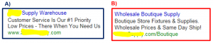
Here’s an example from the luxury bracelets site FarFetch.

The “Add to bag” button is the most dominant CTA on the page, is located above the fold, and the black color is in stark contrast to the white space on the page.
In an opposite example, the page from Micro Atticus could have done better.
The ‘Add to Basket’ button is barely visible and the cloud of text is what draws the user’s eye first.
In addition, because other websites use grey to indicate something that cannot be clicked, the color sends mixed messages to the user.

Making the CTA button more visible can make all the difference.
Let’s see one more example.
This one from Tateossian does use a contrasting color, but falls short of best practices by adding too many CTAs.

In addition, the company is assuming that shoppers already know what “Drop a Hint” means.
While a witty brand voice can be fun, don’t be too clever with the language in your CTA. In the end, users respond best to simple and clear statements.
When it comes to button design, color and placement perhaps you could take a cue from this article about top 50 eCommerce sites.
On top 50 eCommerce stores:
- The most common button color is orange
- The most common shape is rounded
- Most use the word cart
- Only few use the image of a shopping cart
4. Small Triggers Can Have a Big Impact
The smallest changes can have big impacts on conversions.
Let’s see an example.
Making small changes to their product pricing page, the company BaseKit improved conversions by 25%.
First, they added colors behind the three price tiers to make them the most prominent elements on the page.
The “try now” button was also improved to stand out from the rest of the content.
The new iteration was cleaner and improved conversions.
Most of the existing advice on “Add to Cart” buttons recommends not changing the wording.
However, I believe that slight variations to the copy can result in big improvements.
For example:
In an A/B test run for Unbounce’s PPC campaign, the goal was to increase the number of prospects signing up to the 30-day trial.
Changing the possessive determiners was the only change they made in the test.
- Previous CTA: “Start your free trial”
- New CTA: “Start my free trial”
The results?
After testing the new copy for three weeks, they found that the CTR increased by 90%.

5. Optimize Product Images
Never compromise on the quality of the pictures you’re using.
Compared to brick and mortar stores, eCommerce sites are riddled with disadvantages.
The retail store has physical products that customers can see, touch, and interact with. However, none of that tangibility is available on online stores.
An image is the closest thing you can provide that mimics that feeling. Compromising on images will lower conversions or reduce them to zero.
A large image can give more space for the details and help buyers arrive at a decision.
What kind of images should you use?
Usability expert Jakob Nielsen points out that people pay attention to images and can recognize stock images easily.
Stock images are ignored due to this very reason since they appear false.
Always use original photos wherever possible, as this should also give you a small SEO boost.
In addition, test using contextually relevant images. For instance, let’s say you’re selling outdoor grills.
Try working in one image of a person grilling so that users can imagine themselves in the same situation. However, again, do not resort to cheesy stock photos.
As a piece of final advice — reduce the file size of the images.
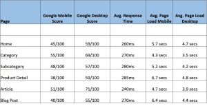
Ecommerce stores may have thousands of products and, therefore, images. Optimizing those images can result in faster loading pages, which can improve conversions and SEO rankings.
Digital & Social Articles on Business 2 Community
(100)