If you run a business, you know you need a website. But more importantly, are you using yours to it’s full potential? Too many of my clients recognize the importance of having a website, but they don’t always know why. Most seem to be more pre-occupied with cool design, or cool features than with having a website that actually moves the needle for their business. But I’m here to tell you, you can have the best of both worlds: a current, well-designed website that has the power to convert more of your casual users into actual customers or leads.
Now that 2016 is in full swing, we are starting to see reports that predict all of the newest trends in web and user experience design. There are even a bunch of them that are proven to increase those conversions.
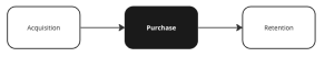
If you are unfamiliar with the term “conversion,” it refers to any time a visitor on your website takes the action you want them to. This can include a visitor:
- Buying something
- Giving you their email address
- Calling you on the phone
- Emailing you
- Physically coming into your brick and mortar store/office
Watch the video below, or jump to more explanations of these trends after the jump.
Trend 1: Full-Width Images
Whenever you can replace several smaller images with one large one, it makes an impact. People stop and take notice of it, which can really be an advantage. Layer a well-worded call-to-action (CTA) button over it, and you have a very good shot at people stopping, noticing, and clicking.
For bonus points, you can use images of happy, smiling people, which people always connect with. Just be careful these photos aren’t of the cheesy stock variety. You can use custom photos, or take your time to select high-end looking stock photos.
Large background video, or cinemagraphs can pack even more punch. Just make sure they aren’t too flashy or distracting.
Trend 2: Split-Screen Layouts
If you offer several different types of products or services, you would ideally want to split your audience toward whichever section on your site they will most likely convert. By having a clear delineation right on your homepage (or landing page,) you can get them there faster.
Trend 3: Monochromatic Colors With Contrasting CTA
Imagine a page with a monochromatic color scheme. Let’s say it’s a nice subdued hue of purple. Now, imagine a big, bold CTA button in bright yellow on top of it. You would notice that, right? That’s the idea here. By making your CTA pop out in an eye pleasing way will make your page look polished, and your visitors will know exactly what they are supposed to do.
Trend 4: Prioritized Navigation
Countless studies have shown that when presented with too many options, people will suffer from “decision fatigue,” and are ten times as likely to take no action at all. Instead, I suggest paring down your navigation in the following manner:
- Decide on your top 2-3 pages, which are necessary to entice people to convert. Keep those in the main top navigation bar.
- What is your main CTA? Style that as a button, and place it in the top navigation bar, alongside the other 2-3 pages.
- Place all other page navigation items in a hidden menu, accessible by clicking on a menu icon.
When done correctly, you have successfully prioritized where your site’s visitors should go, increasing the likelihood of a sale or lead generation.
Trend 5: Minimal Lead Capture
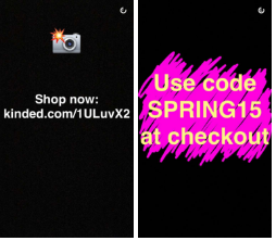
If your CTA involves capturing your visitor’s email addresses in order to market to them later, here’s a great way to get them: simply ask!
By designing a landing page that is uber-simple, with only a grabby headline, persuasive sub-headline, a single form field and strong CTA, you are much more likely to get that email.
Trend 6: Video
I am a huge fan of videos on a website, for one reason: trust. Trust is one of the biggest barriers between site visitors and making a sale. You can use video to essentially give them a glimpse at who you are, and what you do. They will feel like they know you in a sense, which will enhance the chances of a conversion. Some fantastic uses of video include:
- Welcome videos
- Ambient background videos
- Testimonials
- Product demos
Trend 7: Sticky CTA Button
Your CTA is the most important part of your website, so it’s a good idea to keep it visible at all times. The simplest way to ensure this is to put it in a sticky header, or sticky sidebar that stays in place as you scroll down the page.
In the case of mobile, I recommend a sticky footer CTA that is always right at the bottom of the screen, keeping the header free for navigation elements.
Trend 8: Card Design
Pinterest pioneered this design trend that is currently setting the web on fire. It is also useful for conversions, because it allows people to quickly and visually go to whatever topic, product or category interests them the most, where they are most primed to convert.
Trend 9: Single Column CTA
Even if the rest of your site uses multiple columns or a sidebar, it helps to break that layout up a little when presenting your CTA. In that section, use a full-width layout. Include a headline, subheader, and strong CTA button, with plenty of white space around the whole thing.
This puts the focus right where it should be, increasing conversion rates.
Trend 10: Personalized User Experiences
This is best illustrated using Amazon.com as an example. Whenever you visit, they already know what you looked at before, and they show those things to you. They know that not everybody will convert the first time, so they show you things they know you’re already interested in. They know this dramatically increases the odds of you buying that item the second time around.
Any time you can use browsing data, location data, or anything else to cater each experience to each individual user, you will see a similar result.
Digital & Social Articles on Business 2 Community(68)