E-commerce businesses are relying more and more on their email marketing to get new customers and build relationships with their existing clients. So why is email marketing so efficient? Email marketing has the highest ROI of all marketing channels, and one of the reasons is that email marketing is a direct line of communication between businesses and consumers.
Email marketing can be used to send personalized campaigns to potential customers as well as retain existing customers with targeted messages.
However, your email marketing efforts will be lost if you don’t have an email list of high quality and relevance. The people on your list should have shown an interest in your business, or you’ll never convert them into paying customers.
The best way to grow your email list with relevant and high-quality leads is through your website. People who visit your site already have an interest in your product or your content, and thus, they are prime candidates for your email list.
If you manage to convert these visitors into email leads (typically newsletter subscribers), you have a much higher chance of converting them into customers through your email marketing.
So how do you convert your visitors into valuable email leads?
Simple. You use opt-in forms on your website to get your visitors’ attention and convert them into leads. In this post, I’ll guide you through the practice of collecting leads through opt-in forms, as well as present an awesome lead capture opportunity – the content upgrade.
Let’s get right to it.
Popups… Aren’t they just annoying?
The most common, and also most used type of opt-in form is the popup. The popup has taken the internet by storm, and in the process collected quite a few haters along the way.
I completely understand why. So why would I tell you about them now? Because popups simply work! No matter how much you dislike them, they are the best onsite engagement tool out there. I’m not saying that all popups work. It’s all about how you use them and what you use them for.
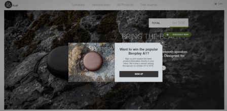
Let’s have a look at a popup example from B&O Play’s website.

As you can see, this popup appears in the middle of the screen and blocks the content on the website. This is one of the reasons why people hate popups. They are perceived as intrusive.
However, they don’t have to be. Presenting your pop-up at just the right time will have a very positive effect on your conversion rate.
Time your popup
I’ve looked at countless popups, and by analyzing the results, I now have an idea of what works and what doesn’t. One of the most valuable lessons to be learned is not to show your popup the moment a visitor enters your site. You need to give them a chance to form their first-hand impression before you smack an offer in their face.
However, you shouldn’t wait too long and risk the visitor leaving your site before you have a chance to convert them. Thus, I’ve experienced that presenting your pop up after 7 seconds is ideal. You should always test if that’s the case on your site as well. What works on some sites might not work on others.
Create matching designs
When it comes to the design of your popup, the design is just as important as the timing. The design of your popup should always match the design of your website. If your site is in neutral colors, your popup should be too. If your website is in bold colors, your popup should be too. You get where I’m going. You can even add a background image to your popup in the same style of your website and make your popup more interesting to look at.

At Kalon Studios, they use a popup that has the same background image as their front page. This makes the popup much less intrusive while still catching the visitor’s attention. Creating a popup that matches the design of your website will not only make it less intrusive, it will also increase the overall credibility of the popup, as it’s easy to see that the popup was specifically created and customized to match your website.
Convert with images
In continuation of the design aspect of your popup, we need to talk about images. In our time working with opt-in forms, we’ve experienced that adding an image to your popup can increase your conversion rate by 50%. Livingshop increased their conversion rate by 64.5% just by adding an image. Here are the two opt-in forms they tested.
We are, as humans, very visual beings and by adding images to your popup, they become much more fun to look at. Make sure that your images are always relevant to the content of the popup. Take this example from Airtame.

The message of the opt-in form is that you can win a free airtame, and the picture illustrates that same airtame. This image exemplifies what you can win, and makes winning the competition seem more achievable in the sense that visitors can see the exact product they have the chance to win.
Introducing… The slide-in
Popups are not the only type of opt-in form you can use on your website. Though it might not be as famous as the popup, the slide-in is just as effective. The slide-in has the same purpose as the popup, but what makes it different is the way it is presented to your visitors.
The slide-in slides in from the bottom corner of your website and stays in the corner of the website until your visitors fill it in or close it down. You can see how it works in this example from Eva Solo:

As you can see, the slide-in doesn’t block the content of the website, and it allows your visitors to continue browsing the page without having to close it down. It can be argued that the slide-in is much less intrusive than the popup, as it doesn’t force your visitors to take action.
So is it effective?
Yes! The slide-in is just as effective as the popup, so the easiest way to decide which one to choose is to test both types on your website and see which one your visitors respond best to.
The slide-in is rather new compared to the popup, and it has taken a while for businesses to realize the potential of the slide-in. However, according to the statistics we see every day from our customers at Sleeknote, the slide-in converts just as well as the popup.
It all depends on what works best for your website. If your competitors use a popup, it doesn’t mean that a popup will work for you. Always test your opt-in forms to ensure you always have the best performing opt-in forms on your site.
The teaser
One of the awesome things about the slide-in is that you can add a teaser to it. The teaser will sit at the bottom when the slide-in is closed, and with a compelling headline, you can convince your visitors to open it. This is an example from Kapten & Son:

The teaser is effective when you have visitors who enter your site with a specific goal, such as buying something. They know exactly where to go because they’ve done their research in advance. They’ll close down the slide-in without even looking at it because they don’t want to be disturbed in their buying process.
Once they’ve closed down the slide-in, the teaser will remain at the bottom of the page, so your visitors have the option to reopen it once they’re finished with their purchase.
Thus it’s important that the headline on your teaser is compelling and tells your visitors what the content of the slide-in is.
As in the example from Kapten & Son, the headline on the teaser is “Win a pair of sunglasses.” And the content of the slide-in is the same: Sign up and win a pair of sunglasses. This headline is both relevant and intriguing.
Input fields
When you determine the number of input fields you want to add to your opt-in form, you need to keep in mind that it shouldn’t take more than a few seconds to fill in the form. People are very busy in today’s society, and everything has to happen in a very smooth and time-efficient manner. Your opt-in forms are no exception.
Whenever you want to add an input field to your form, you need to ask yourself: Is this information necessary to get value from my visitors? Typically, the answer is no.
All you need is your visitors’ email addresses, and if you want to send personalized email campaigns, you might need their name as well. However, we have experienced that every time add an input field is added to a form; the conversion rate decreases by 50%.
If you need additional information from your visitors, you can always send them a follow-up email asking them to complete their profile once you’ve gotten their email address.
The content upgrade
When trying to capture leads on your website, there is yet another relatively new method you can use – the content upgrade. The content upgrade is an exclusive piece of content that your visitors can get access to by giving you their email address.
The content upgrade has begun to appear on blogs, consultancy websites, and SaaS websites. However, e-commerce websites have yet to discover the great potential content upgrades bring.
Content upgrades should always be presented within relevant content and add value to that content. Here’s an example of a content upgrade from a blog post about newsjacking on our blog:

The content upgrade appears in a yellow box in the middle of the content where it’s relevant. In this case, the content upgrade is a step-by-step guide to successful newsjacking which is the topic of the blog post as well.
When you click “Download,” an opt-in form appears where you fill in the necessary information to get access to the gated content.
By using an opt-in form to get this information, you avoid redirecting your visitors to a new page which enables them to continue reading the content after they’ve downloaded the content upgrade.
This content upgrade was created specifically and exclusively for this blog post. However, you can also create more evergreen content upgrades that can be used on multiple pages on your website to save time.
Content upgrades for e-commerce
E-commerce websites can add content upgrades to their websites as well. An example could be if you have an e-commerce that sells sporting equipment, you can add a content upgrade to all your product pages with tennis rackets. The content upgrade could then be a how-to guide on how to string a tennis racket.
The possibilities with content upgrades are endless, and they have a lot of potential to increase your onsite conversions. Check out this ultimate guide to content upgrades to learn more about content upgrades and how you use them.
Conclusion
Even though opt-in forms have quite a tainted reputation, they are one of the most efficient lead capture tools on the market. There are multiple ways of using these opt-in forms, and the most important advice I can give you is to always keep your customers in mind when you design your opt-in forms.
Always test different options to see which works best on your site and converts more visitors. I hope you’ve learned a thing or two from this post, and that you’re ready to start growing your email list with high-quality leads through creative opt-in forms.
That was all from me this time. If you have any questions or comments, feel free to express them in the comments below. We’d also love to hear about your own experiences with opt-in forms, and what lessons you’ve learned.
Thanks for reading along.
Business & Finance Articles on Business 2 Community(151)