The unsubscribe experience is often a poor one, when it comes to email newsletters. There are many ways to do it. As a user, I sometimes wonder if the list owner has even spent much time thinking about it.
If you manage your email newsletter through an email service provider (ESP) like InfusionSoft, Aweber or Mailchimp, the unsubscription link is probably added automatically to the end of your email newsletters. The process for unsubscribing is perhaps dictated by the ESP.
As an exercise, I tested a few newsletters to see what happens when you click the unsubscribe button. Here are the examples of unsubscribe processes. As a brand owner you should think about the user’s experience first and your experience second.
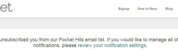
Pocket makes it easy

Pocket automatically adds you to its mailing list when you join the site. But unsubscribing from the automated alerts is easy. Just click an unsubscribe link at the bottom of the email and you are taken straight to the resulting message – “We have unsubscribed you from our Pocket Hits email list.”
Couldn’t be simpler.
Voyage Privé makes it confusing

Voyage Privé is the opposite of easy. When you click on the unsubscribe link in the email newsletter, you are taken to the screen that you can see above. It is split into two sections, making it unclear whether you are supposed to fill in both sections.
Some brands allow a straightforward “unsubscribe from everything” option. Because I have experienced that, I could easily assume that I only need to select that option and click submit, but when I do that the other items are still set to yes afterwards.
I have to separately select no for the other options and click submit again.
In addition, Voyage Privé sends a follow-up email saying that settings will be updated “soon”. Why so cryptic and confusing?
Another approach, from 38Degrees

While the Pocket approach is the easiest for the user, the approach by 38Degrees is also easy. You click on the unsubscribe link in the email newsletter and, instead of having an instant confirmation, you are taken to a screen with an unsubscribe form.
This form allows the user to add a reason, which will help the brand know why you have decided to leave the list.
Additionally, the form shows the email address you are unsubscribing, which is useful if you use multiple email addresses and can’t remember which one you used to sign up for the list.
George.com is OK, but…

I was registered for the George.com newsletter – which is a sub-brand of Asda.
When I clicked on the unsubscribe link, I was taken to this page. There are two problems here. First, the brand on the page is Asda and not George.com, which is confusing because I am separately an Asda customer.
Does this mean I will stop receiving all emails from Asda? I’m not sure.
Second, it refers to “the following email address” but the email address is not shown on the page.
Design fail.
Inbound.org hides the message

Inbound.org has a smart unsubscribe page. When I clicked on the unsubscribe link in the email newsletter, I was taken to a page full of enticing content and offers.
The problem is that, hidden in an inconsequential and hard-to-spot line within the content is the only message I am looking for on the page – confirmation of the unsubscription.
If you unsubscribe from this, then that’s it

Another example of an easy unsubscribe process. IFTTT simply takes you to a screen telling you that you have been unsubscribed.
MyPicture takes the two-step approach

MyPicture.co.uk adds you to its mailing list when you buy something from the company. Fair enough. Unsubscribing from the emails takes you to the first screen, with a message that implores you to stay on the list.
The page includes a button for you to confirm the unsubscription, but it also includes a button for you to affirm that you want to stay on the list.

When you unsubscribe, you see a second screen confirming you have been removed from the list and inviting you to come back any time.
Crunchbase also uses a two-step approach

Crunchbase’s two-step approach is less wordy, but it offers two choices and you need to read the text to understand the difference. The first button removes you from only one list. The second removes you from all emails – presumably adding you to an internal suppression list.

After you unsubscribe from Crunchbase, the website offers an instant option to undo your choice.
Groupon’s link did not work

The link in Groupon’s email to unsubscribe from all emails didn’t work. It just took me to a screen with an error.
Rule number one, obviously, should be to make sure your unsubscription functionality works.
Flybe gets granular

The unsubscribe process for Flybe took me to a detailed form. I like this approach because it gives me a good overview of the multiple lists that Flybe may have me on.
I can see the email address and select an option to simply unsubscribe from everything.
Travelodge – not easy to spot

Functionally, the Travelodge process is like Flybe. You are taken to the page with a form. However, the form is low down the page, below other content.
When I made my selection and hit the “Unsubscribe me” button, the page simply reloaded with no confirmation. Trying this several times, I was left unsure of whether anything had happened.
(200)