Herman Miller has a new brand identity, but you probably haven’t noticed.
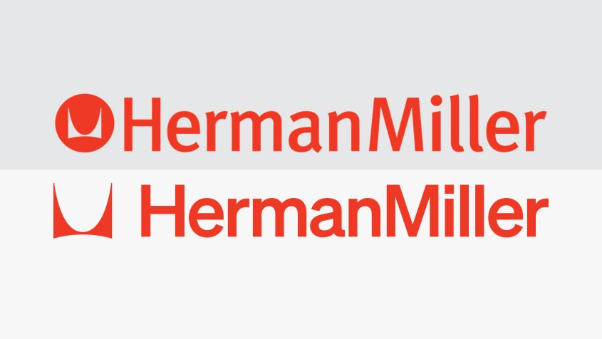
On January 2, Herman Miller announced a refreshed brand identity by Brooklyn design office Order. The new look, which will be rolled out over the next few months, includes a slightly different logo, a slightly different color palette, and a (more than slightly) different typeface. The point being: The new look is subtle, respectful, and perfectly encapsulates the evolution of a legacy brand that has stood the test of time for almost 100 years.
Herman Miller was founded in 1905 and has since grown to become one of the most iconic furniture companies around. With an unwavering commitment to design and influential partnerships with the likes of Charles and Ray Eames, George Nelson, and Isamu Noguchi, Herman Miller has earned tremendous brand recognition.
The problem is that 1940s Herman Miller, or even 1990s Herman Miller (when the company’s last brand identity was created) are two very different companies. The commitment to design remains the same, but the business and marketing strategies have changed drastically.
“It was just getting to the point where the system did not seem rigorous enough to contain the multitudes of all the places that Herman Miller shows up in the world [today], and it wasn’t flexible enough to read at a really small scale as well as large scale,” says Kelsey Keith, brand creative director at Herman Miller.
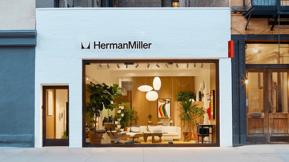
The misalignment isn’t all that surprising, considering the last brand identity predates Herman Miller’s investment into e-commerce, brick and mortar, and social media. Today it remains a contract business, but it also counts 29 stores in six countries, underpinned by a robust social media presence with more than 500,000 Instagram followers.
As of 2021, Herman Miller is also part of MillerKnoll, which Keith explains was yet another reason for the rebrand: “Herman Miller and Knoll still stand on their own,” she says. “We design our own products, we have our own point of view, we own our own respective histories, and so there was a case to be made that . . . under MillerKnoll, it’s important to communicate that Herman Miller is still here as a brand.”
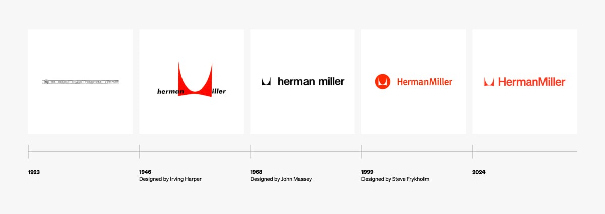
The new identity has been about a year in the making, and Order took on the task with evident humility, making a point to leave certain parts of Herman Miller’s brand identity untouched. “When we were thinking about the things that needed updating versus what didn’t, the piece that we all felt shouldn’t change was the symbol because from the very beginning that was there,” says Jesse Reed, partner at Order.

Reed is referring to the famous “M” logo that was designed by Irving Harper in 1946. Over the years, it had been used in many different ways, including to stand in for the letter M in Miller or to lock it inside a circle. For Reed, the fact the M lived inside a circle was the biggest (and only) problem with the brand logo: “That symbol was always in a circle and it really limited the brand expression and personality because it was so locked in this container,” he says. Today the M is mostly “free,” as Reed puts it, apart from places with limited room for expression, like a social media logo, or the side of a piece of furniture.

Order took a bit more creative liberty with the typeface and color palette. The latter is still centered on Herman Miller’s iconic red but also includes 14 other shades inspired by a time in the company’s history—from the 1960s to the early ’80s. As for the typeface, Order ditched Herman Miller’s longtime font, FF Meta (designed by Erik Spiekermann as the “complete antithesis of Helvetica“), for a typeface that hearkens back to 1960s Herman Miller, when the company was still using Helvetica.
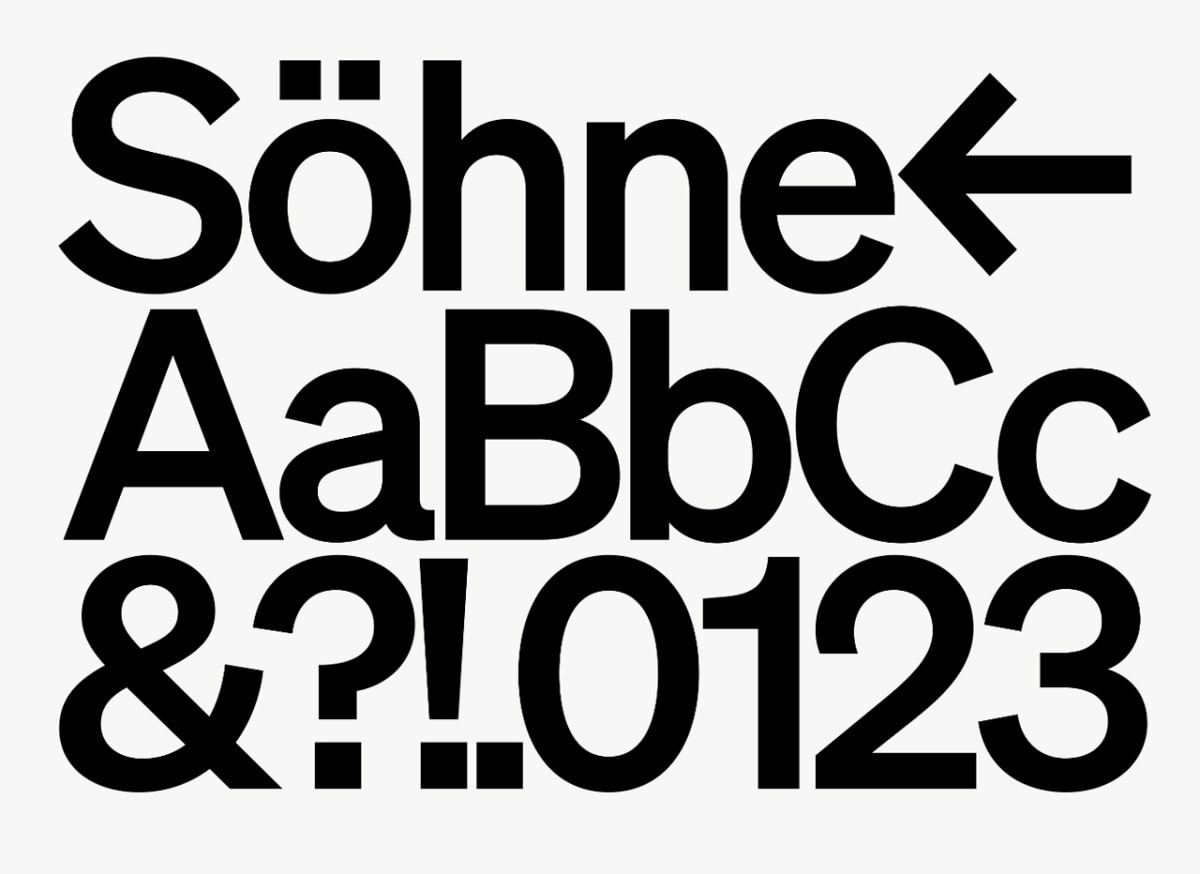
The typeface is called Söhne, and it is “the next iteration of Helvetica, just with practical considerations in mind,” Reed says. Söhne (pronounced soo-né) is designed for both print and the screen and comes with an extended array of weights to make it legible and accessible.
It’s worth noting that Söhne was designed in 2019 by Klim Type Foundry. Did Reed think about designing a custom font instead? Probably, he says, but only briefly because not every brand needs its own custom typeface just for the sake of a custom typeface, much like not every brand needs to change things just for the sake of changing things.
(4)

