We’re living in over-branded times. Maybe you’ve noticed it: the fancy olive oil, the prestige beans, the tinned fish (so much tinned fish!). Recent years have seen a packaging renaissance, where even the most mundane of products now sport labels designed to grab—and keep—consumers’ attention.

Nowhere is that more apparent than in your pantry. “We’re trying to bring excitement, color, energy, beauty, and playfulness to a category that for many years has been written off as boring,” says Kat Kavner, cofounder and CEO of Heyday Canning Co., a canned bean startup whose logo and labels were designed to tap into a modern sense of nostalgia.
Heyday is part of a bigger trend in consumer packaged goods that utilizes elevated branding to transform seemingly basic pantry items into specialty foods worthy of date night or dinner party menus. In 2022, the sales of specialty food reached $194 billion, marking a 9.3% increase compared to the previous year. According to the annual industry report by the Specialty Food Association, it’s projected that sales will reach $207 billion by the end of the year, and presently constitutes about 22% of total retail food and beverage sales.
Consumer behavior also shifted at the beginning of the pandemic, increasing the demand for canned foods and other non-perishable pantry goods, and VC firms took notice. Most of the CPG brands dominating the pantry scene these days launched during 2020, when funding to food and beverage startups surpassed $1.3 billion.

In a world oversaturated with visual content, this new crop of ultra-designed pantry staples is an effort to break through the endless scroll. But through smart branding and creative storytelling, young CPG brands are earning a loyal following on social media, leading to rapid success offline through scaleable brick-and-mortar partnerships with boutique retailers as well as Whole Foods and Sprouts.
One of the biggest success stories in the pantry revival is internet darling, Fishwife. Since launching the company in 2020, they’ve grown by 9,900%, and have amassed over 72,000 instagram followers. That’s a lot of people getting behind tinned fish. But do we need to be excited about the aesthetics of tinned fish to keep buying it? Or are we buying tinned fish more because we’re suddenly excited about the aesthetics?
The answer to this question appears to be the latter. Sales of canned seafood shot up by 10% (to $2.7 billion) in the U.S. in 2022, according to Euromonitor International. This comes after a 40% decline in packaged fish over the last three decades, and countless 2018 articles about how Millennials were killing Big Tuna. But there was a sea change in 2020, when brands like Fishwife saw a gap in the market for sustainable canned fish, and suddenly took over the internet, not just because of their ethically sourced products, but because of their exuberant packaging design.

Becca Millstein, cofounder and CEO of Fishwife says she worked with illustrator Danny Miller to create the brand’s logo mark and packaging, which draws inspiration from the aesthetics of traditional Spanish conservas culture as well as other brands like Topo Chico and Cafe Bustelo. “We felt they represented this marriage of utilitarianism and vibrance,” Millstein explains. “The challenge became, how do we pay homage to a tradition with such deep roots while also making it feel new and relevant today?”
Bridging that gap between traditional and contemporary design is the primary challenge for any young brand entering the pantry space. Though the aesthetics may vary, there’s a visual through-line in modern pantry brands that’s striving for a sense of timelessness in their identities.
“We wanted the brand to harken back to this ‘heyday’ of home canning while also putting our stake in the ground that we’re starting a brand-new ‘heyday’ of canned food,” says Kavner of Heyday’s identity. She explains that when you look at Heyday’s labels, they’re nodding to the past without necessarily being pinned to any one point in history. “They feel modern without feeling too of-the-moment in a way that will end up looking outdated just a few years down the road.”

Ky Allport, creative director at the design studio Outline, created the identities for Heyday as well as Omsom and Droosh, DTC brands selling instant noodles, sauces, and traditional Indian spices, respectively. She says that by rebranding the pantry space, young companies are doing more to create a deeper context for consumers. “Whether it’s transparency in ingredients or sourcing, or teaching about cultures and culinary traditions, I think that roots a traditional product in a very modern, communal, dynamic setting,” Allport explains.

While nostalgia has been part of the design zeitgeist for the past decade, it has evolved from hipster heraldry crests and vintage logos to something more experimental. Today, many pantry startups begin as DTC brands, growing a loyal following on social media and then making the jump to retail. Allport says she’s seeing brands taking more risks not typically seen in the grocery space because DTC has become more prevalent. “Starting with DTC gives brands a chance to really express their unique personalities without being too concerned with the conventions of the shelf. If they can capture the hearts of their audience early, customers will expect to be able to find them IRL and help to drive that demand,” Allport explains.
And yet, a recent New York article discussed the homogenization of contemporary pantry goods; how every local shop seems to be selling the same products, many of which are DTC pantry brands that found early success online. Reporter Emily Sundberg writes, “We know these minimalist-ish generic aesthetics are not connected to any true local origin, but we see them as indicative of some kind of authenticity. My current thought is that they don’t feel local to a place, but instead they feel local to the internet, which is, after all, where we all live.” Mike McVicar, partner at creative agency Gander agrees that the internet has created its own version of the corner store or local shop on Main Street, except the Main Street is Instagram or TikTok.
He believes grouping these varied pantry brands under the same umbrella of “internet aesthetic,” just because they have a vibrant online presence is an oversimplification. “I think it implies that these brands are just using an aesthetic that they’ve seen somewhere else, adopting them, and then bringing them into the round. Whereas we try to create brands that actually have depth, story, intent, and purpose.”

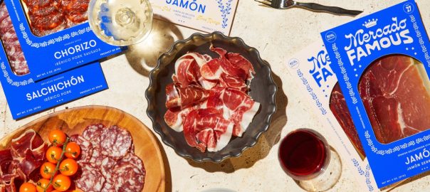
Gander has a full portfolio of dynamic pantry rebrands—Phil’s Finest, Graza, Pop Up Grocer—and their recent identity for sustainable charcuterie brand Mercado Famous is yet another great example of design guided by storytelling. “With Mercado Famous, we wanted to capture the spirit of Spain,” explains McVicar. “As if customers felt like they’d just visited a small town in the countryside, and stumbled upon this tiny little market with amazing food and wine.” The team used five different logos, giving the branding a casual and easygoing quality. “There’s a real hodgepodge nature to it, like a brand that feels like it’s been around for longer than the internet.”
The idea that these brands feel both older than the internet and also at home online creates an interesting visual dichotomy. It’s a tall order to achieve a timeless look when we’re living in a moment where trend cycles have become so condensed that they collapse in on each other, creating an Everything Everywhere All At Once design effect. But as McVicar says, “Design is fashion; it follows trends and the intangible aspects of contemporary culture while staying responsive to things that happened before.”

So maybe the pantry doesn’t need a rebrand, but reimagining traditional aesthetics for a new generation is how design evolves over time. For Heyday’s Kavner, there’s a lot of shared energy in the aesthetics of new pantry brands right now. And while the design execution looks quite different from brand to brand, Kavner says they do share one thing in common: “I see a lot of us as beating the same drum and saying, ‘hey! The pantry is fun now!’”
(16)