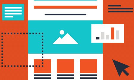
 Landing pages should have everything a visitor needs to make a decision. Far too often, however, a campaign’s success rate will suffer from a poorly constructed landing page.
Let’s examine how mastering the art of creating landing pages that convert could drastically increase your revenue and net profit.
We’ll first examine the core features of a landing page: heading, body, call to action, and above the fold. These core features have been proven to work for generating leads or on-page actions. Then we can see how to customize our landing pages for best results.
Core Features
The heading should be a quick scan and read that confirms our visitor is in the right place. If we sell weight loss products and the visitor is on our landing page about weight loss products, there’s a good chance they’ll convert into a lead.
However, if they’re on our page for weight loss and our headline is about gaining muscle or some business opportunity, there’s a high probability that the visitor will leave the page.
Here’s a good article on how to reduce bounce rate on landing pages.
The body of our landing page should support the heading and the reason the visitor is on the page. We can include written content, a video, or both. These details should provide more information about the heading but only gives the visitor enough information to increase curiosity about what’s on the other side of the Submit button or the call to action.
The call to action (CTA) is what we want our visitor to do while on the page. It can be a hyperlink to another page, a clickable button like Shop Now that leads to an online store, or a form with as little information needed as possible for a customer to become a lead. Name, email, or phone number is a must, though, if we intent to collect their information. The CTA is the same as asking for the sale in a sales situation.
The CTA must be crystal clear as to what the visitor must do while on the page!
Above the fold is what appears on the page without scrolling down. This will be good for desktop and tablet users. It’s the first impression a visitor has when on the page. We want to make it as easy as possible for the visitor to see all of the information and take our CTA.
As the number of mobile users increases, we want to show each core feature one by one. The heading is what the mobile users should see first then scroll to the body then to the CTA.
Landing Page Optimization
Now that we have the core features, our next objective is to set our landing page and optimize for best results. This can only be done by testing different versions of our landing page on live visitors. Think of this like different versions of a cold calling script that a sales rep would use. A sales rep will need to test on live prospects to see what works best. Here’s a great article on what is called A/B testing.
A/B testing with multiple versions of our landing page will yield results as to what works best. As in prospecting, we should always look for better ways to optimize our landing pages for best results. Try adding or changing images, text, fonts, and colors.
Keep it simple; start with two versions of the page and expand once there’s some numbers on both. Then create another version and keep testing different pages until you see the desired results. The key to creating landing pages that convert is to have the core features on the page and test different versions of the page for the highest conversion rate.
Digital & Social Articles on Business 2 Community
(86)


