
 Julie Chomiak — March 27, 2017
 It feels like every day new statistics are released about the rising prevalence of mobile usage in the world. People are accessing their email, viewing websites, engaging on social media, and making purchases all from the convenience of their phones or tablets. It’s safe to say, if your website is not optimized for mobile, you’re missing a huge portion of your target audience. The time is now to get your website into tip top mobile-friendly shape for maximum business exposure.
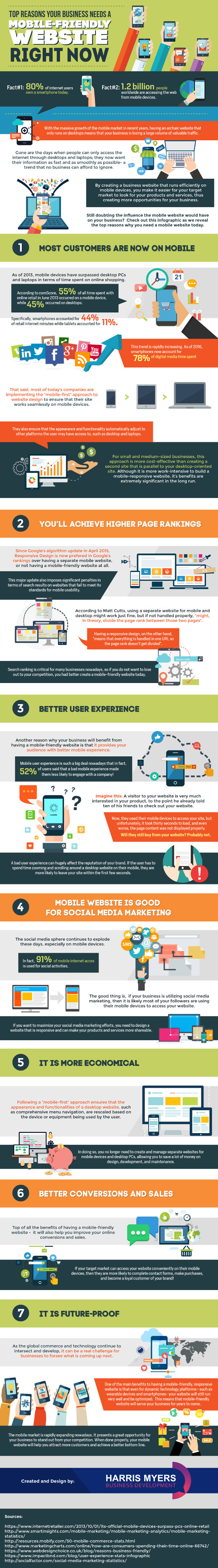
Unconvinced? Don’t just take our word for it! MarketingProfs put together an infographic with the top reasons your business needs a mobile-friendly website right now. The full infographic is at the bottom of this article, but the most persuasive facts for having a mobile-friendly website are listed below. They are:
“1.2 billion people worldwide are accessing the web from mobile devices.”
Let that sink in for a minute. Over one billion people rely on their mobile devices for their web activity. This means your business has the potential to reach a ton of people. However, we know that first impressions last a lifetime, and if your website is not mobile-friendly, your impression will be less than ideal. A mobile-friendly website ensures your audience sees the optimal version of your brand. When a viewer has a consistent experience with your website across any device, it reinforces your credibility to your prospective customers.
“Since Google’s algorithm update in April 2015, Responsive Design is now preferred in Google’s rankings over having a separate mobile website, or not having a mobile-friendly website at all.”
Google has invested heavily in algorithm updates to provide the most relevant and personalized search results to its users. Unsurprisingly, an optimized website is a simple way to receive higher rankings. Through this minor change, your SEO will increase and your business website will show up higher in searches. Responsive design websites take the work out of website optimization: you create one site and the software adapts the pages based on the user’s device.
“52% of users said that a bad mobile experience made them less likely to engage with a company!”
A bad mobile experience is all a customer needs to move along and consider doing business elsewhere. A positive mobile experience means that there is no difference in quality between device usage. A website that is well-design and mobile-friendly is your ticket to establishing a reputable online presence. This two-pronged approach to customer experience ensures your business makes the intended impression upon its visitors.
With Vistaprint Digital’s website builder, designing a website is a piece of cake. You take care of the design elements and we handle the responsive design. The builder automatically optimizes your website for any screen size. This means your website will render perfectly without you having to fiddle around with image size and pixel ratios. With the technical work taken care of, you can get back to other aspects of your business.
Having a website that is mobile-friendly and user-friendly is the first step in staying competitive in the digital marketplace, and ultimately long-term business success.
Infographic courtesy of MarketingProfs
Digital & Social Articles on Business 2 Community(90)