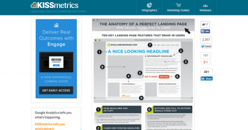

According to KissMetrics, there is no single design that makes a landing page perfect, but there are some key ingredients that can help. We’ve talked about many of these items over the last several months here on WHSR, such as:
- Elements of user engagement
- Ways to improve conversion rates
- Successful Call to Action (CTA) commands
Some of the other elements needed for a landing page that not only grabs your site visitors’ interest but guides them where you want them to go and keeps them there:
- Excellent headlines
- Subheadings
- Strong but condensed landing page content
- Testimonials
- Simple navigation
- Visually pleasing use of images that add value
One of the best ways to learn how to build a beautiful landing page that results in conversions is to study the landing pages of other businesses. By looking at what they do right, you can repeat their efforts and likely their success.
Wishpond

The first thing that happens when you visit the site is an orange box greets you, asking you to sign up for the blog and stay informed. The navigation is simple and a featured blog post sits at the top of the page to further entice visitors to enter a contest. What seems to work particularly well about this landing page is that it isn’t cluttered. You can easily find the area you want to navigate to and the focus is on the content on the site and subscribing to it. It is clear that Wishpond wants to convert visitors to subscribers and has that singular focus.
Bear CSS

Bear CSS is a site that allows people to convert a basic HTML file into a CSS template. Their landing page makes it pretty clear what the focus is: Upload your HTML document and convert it now. Bear CSS has limited the items on the page so that all you focus on is the “Upload HTML” button. Even the bear is pointing at the CTA button to encourage you to upload your files. The use of an image looking toward or pointing at your CTA is very effective to get people to look to that item as well. This page uses a cartoon character, but you can also use images of real people.
PPC Analyzer

PPC Analzyer uses the concept of encapsulating information. Sites like Unbounce recommend this method to draw the reader’s eye where you want it to go. For example, notice how the light blue box against the dark blue background immediately draws your eye? The goal is to get the site visitor to sign up for the newsletter. Once you’ve done that, your eye is drawn to three possibilities:
- Increase Conversions
- Decrease Cost
- Save Time
Apple

Apple’s focus for their landing page typically centers on their latest product release. In the sample screenshot above, it is obviously the iWatch. The smaller images under cater to those who are looking for other information, but such info about the new MacBook model. Beautiful images of your product can encourage site visitors to click on that photo and learn more about the product. Notice that navigation is kept simple. Click on a picture and go to that product page or click on a link at the top. There are no bright CTA buttons to draw the attention from the latest product.
Unbounce

It only makes sense that Unbounce would have an amazing landing page, since they are in the business of building landing pages. The focus when you first arrive at the site is on the blue band set against white and an vivid orange CTA asking you to “Build a High-Converting Landing Page Now.” However, Unbounce does something else that works well to convince readers you are legitimate and that is the use of testimonials, including photos of those giving the feedback. This adds an element of validity to the testimonials. The site visitor can see the quote comes from a real person.
iCracked

iCracked is a company that replaces broken iPhone screens as well as repairing other Apple devices. The landing page here is simple. They are trying to do one of two things:
- Sell you the service of repairing your device
- Buy your device you no longer want
This landing page also uses a large photo to set the tone, but it is in muted, neutral colors which draws the eye to the two encapsulated options. The CTAs are vivid buttons in bright blue and green.
U-Haul

U-Haul does several different things on their landing page that works particularly well and which you could emulate on your own site. First, they are using capsules to separate the different things visitors might be looking for, such as storage or moving supplies. They are also using sales stickers to indicate their best offers and entice the site visitors to click on the link. The photos are professional quality and used to draw the eye to the text, such as the woman with the box facing the different moving supply links. Finally, the page takes user persona into consideration. Once you punch in the dates and location you need, U-Haul can help you reserve a moving truck or trailer rental. The navigation is easy enough for adults of any age to easily use it.
Big Barker

When I first started writing this case study of landing pages uses good technique to create conversions, I knew I wanted to include a landing page that highlighted trust factors. However, I had a hard time finding one that was utilizing reviews in a way that was obvious to the site visitor. I finally found a reference to this site on WordStream, but their review of the design was not 100% positive. I agree with them that there are some things that could be improved here, including a more obvious way to order the bed and having the dog face the text instead of away from the text.
However, what this landing page does right is it adds a few trust factors that readers will relate to. First, the average Amazon review is 5 stars and they highlight that right under the image of their dog bed. They also add the “Google Trusted Store” banner to let you know that they have worked hard at customer satisfaction. They bolded the word “Guaranteed” and at the top they make it clear that there is a 10-year warranty and it is a quality made bed that is a USA manufactured product. These are all trust indicators that site visitors will respond to. With a few tweaks, this site could see a huge increase in conversions.
Sharelock

Sharelock’s landing page makes a few things clear to the reader without using a thousand words to accomplish that task. First, Sharelock works with mobile devices, something many similar products do not accomplish. The focus is on a photo of the software loaded onto a phone screen. the eye then moves to the right with two sentences that explain what Sharelock does. It encrypts info that is private. Finally, you can choose from two capsules and learn more or create your own Sharelock to get started. There is also a small download link at the top right and a way to share the page on Twitter. Other links are small, gray and in the lower left corner in case you need them. The page is so simple that you don’t even have to scroll down to see everything on the landing page.
Keep Testing And Learning
These landing page samples will give you an idea of some of the elements you can include on your own landing pages to entice visitors into an action, to buy a product or even to trust you more. However, what works for one site might not work for your visitor demographic. As you add new elements and try new designs, continue to do A/B testing and see what works best for you.
(288)