Did you know that not only do 70% of people expect a company’s website to include a self-service application, the same percentage of people actually prefer to use a company’s website to get answers to their questions rather than use phone or email. And it’s easy to imagine why – consumers today value their time and have grown to expect instant solutions – even if they have to find it themselves.
That’s why customer self-service portals, and knowledge base articles, in particular, are probably the most helpful section of a website. It helps customers clear doubts, find solutions and obtain important information almost instantly. It also eases the burden on your customer support team
Aside from the benefit of immediacy, customers also want to find answers as effortlessly as a quick Google search. So providing a rich help-center on the website that guides a visitor to the right information is important for both the customer experience and to reduce ticket volumes for your team.
What makes for a good knowledge base example?
A good knowledge base example should fundamentally help visitors find the answers they’re looking for, with the least difficulty. But there are many ways of making that happen. We decided to learn from the best examples around the web and highlight what we liked and what they were getting right.
These are a few aspects of a good knowledge base:
- Great navigation that makes it easy to search for content
- The knowledge base articles are detailed and to the point
- Consistency in tone and written in the voice of the customer
- Great interactive and visual design
Without further ado, here are some useful knowledge base examples:
#1. ReleaseWire
About the company:
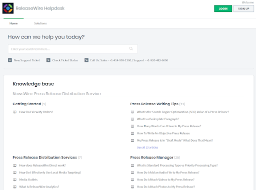
Releasewire provides a platform for journalists to connect with marketers and PR executives from organizations that have common interests in running a story or releasing an article.
What we like: Adds ‘knowledge’ to the knowledge base
What Releasewire does well is going beyond providing what’s required by trying to give users a great platform to learn and improve upon their craft. It has a writing tips section for PR that can be very useful for beginners who are just getting started in the industry. You’ll also see that the information provided in other sections is educational and has great value for visitors.
#2. Openstudycollege
About the company:
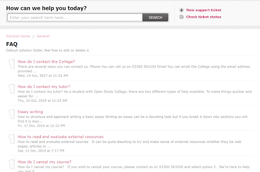
OpenstudyCollege is a distance learning website that allows you to choose from over 550 courses based out of the UK.
What we like: Simple and effective
Sometimes a knowledge base can have too many sections making it difficult to find important information. Openstudy have avoided being too elaborate with their knowledge base design, focusing on making it easy to read and scroll through. They have used a simple listicle format arranged in a way such that the most essential topics are at the top. This way the most critical questions get addressed first.
#3. Nectar
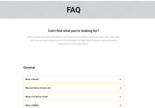
About the company: Nectar, short for The National eResearch Collaboration Tools and Resources project, is an organization that provides an online infrastructure platform for researchers to connect with colleagues worldwide.
What we like: Minimalistic design
Nectar have been very conservative with their FAQ page and it has paid off. They’ve divided it into three concise sections with each one containing questions pertaining to the overarching topic. The FAQ contains more than adequate information for customers to understand what Nectar is all about without overloading them with too many topics and questions on the page.
#4. Centrium
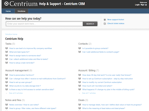
About the company: Centrium is a cloud-based CRM software that helps teams handle leads and convert customer accounts while keeping track of essential information.
What we like: Topic-based grouping
A great knowledge base is one that is well structured and puts the right information in the right places. Centrium does that by creating appropriate headlines that immediately grabs the attention and helps visitors easily identify the section they are looking for. By grouping your questions in an appropriate way your content becomes a lot more accessible while improving the overall value of the FAQ page.
#5. CashKaro
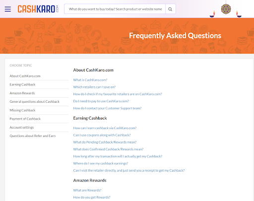
About the company: CashKaro is a cashback and coupon e-commerce platform in India. They offer several coupons and cashback offers shoppers can use to save money on their retail purchases.
What we like: Simple and intuitive navigation
CashKaro’s knowledge base might seem ordinary in design but is actually wholly appropriate for their customer, who is looking for a resource that is very convenient to use and navigate. There is a navigation bar on the left-hand side of the webpage making it fairly easy to jump to the section you are looking for. While a navigation bar doesn’t feel like a significant addition it drastically reduces the effort you have to put in. This way, you don’t have to worry about which section comes first, since visitors can find their own way.
#6. Rightmove
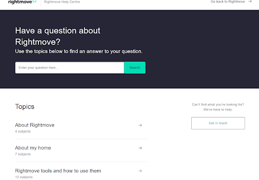
About the company: Rightmove is a UK based Real Estate website that helps connect buyers with sellers with agents ready to help you out based on your requirements.
What we like: Focus on the most common questions
FAQ pages sometimes tend to be long cluttered with a lot of unnecessary information people can get confused with. Rightmove has done a great job of decluttering their site real-estate and displaying the really important content people are looking for. The page is very concise with only 8 section names on the main page and each section leads to a dedicated landing site with only the most relevant information.
#7. BUX
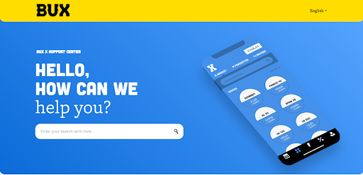
About the company: Bux is a fin-tech company based out of Amsterdam whose application allows users to invest and trade in various financial markets.
What we like: Using design to emphasize branding
The Bux support page is very pretty to look at but also equally enjoyable to browse through.. The color combinations are bright and happy making it very pleasing to the eye. The font chosen for the text matches the brand colors of the website. It also has a prominent banner on top with the main message in a big font, with the search bar easily visible. Overall it’s great visual design and reflects the brand and brand voice of the website.
#8. Fastmodelsports
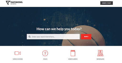
About the company: FastModelSports have developed products that can be used by sports coaches to help prepare their players, manage their schedules, and even create playbooks and strategies for matches.
What we like: A variety of content formats
When you look at this knowledge base example, right off the bat, you’ll see that there are different types of content available for users to choose from. Blocks of texts are not everyone’s cup of tea, something that Fastmodelsports understands. So they’ve ensured there is a variety of formats ranging from video guides to Faqs to break the monotony for visitors
Conclusion:
As you can see, there are several different approaches to build a knowledge base and several strategies to consider based on what your customer will require. However, deploying a modern and crisp knowledge base is easy. With Freshdesk you can deploy within minutes or hours, not months.
Business & Finance Articles on Business 2 Community
(43)


