Here’s how it goes: you are scrolling through the feed of your favorite social media network and you see a brilliant, compelling headline. It offers clear, relevant information and seems like it will offer a solution to a problem you’ve been facing. (Win!) So you click on the link, ready to start kicking ass with all the new tips you are about to learn. You are so pumped, it loads and you read the first sentence or two. And then you see this:

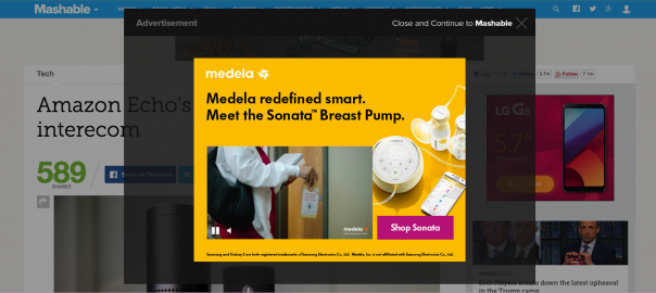
Did you hear that record scratch? In precisely 3.7 seconds, you’ve lost those loving feelings that were making you feel like Chuck Norris. Now you are angry. You’ve been foiled by pop-ups. Not only does this pop-up gate your ability to read the awesome article that you clicked on, it instantly starts playing the video — and to make matters worse, this content is unrelated to the article you wanted to read. This type of pop-up advertisement does nothing to delight the visitor or compel them to action. In fact, it’s a big, fat roadblock.
Now, take a second to imagine a different scenario. You are shopping online, you found your favorite product, and you know that you could probably find something similar in a local store and save yourself the $ 8 shipping charge, so you are just about ready to close the window. Then you see this:

Surprise and delight — you feel like you just won the lottery. That company just saved you a trip to the store, $ 5 off your purchase, and $ 8 of shipping.
The Big Problem
Some mystical thing happens when we sit down to create this kind of CTA (call-to-action) on our own website. Suddenly all the principles of being a shopper go out the window and we forget about delight and go straight to spammy ads and used-car-dealer level sales. So, how do we create beautiful, actionable, helpful, delightful CTAs that people love?
Here are a few examples of stellar pop-up and overlay CTAs that convert:
1. Be Clear and Concise (Refinery29)
Pop-ups, like this one from Refinery29, are short and provide little space for information, so get your point across quickly. Avoid using unclear language that fails to communicate exactly what the reader is getting. Remember, these pop-ups are basically mini landing pages. Use the same copy writing principles for headlines and benefits statements as you would on any other landing page.

2. Make it Engaging and Memorable (Wanderlust + Co)
In today’s technology world of DVRs and ad blockers, people are hard-wired to dislike things that interrupt their content consumption. Combat that by making your overlay CTA engaging and memorable. Consider your personas — speak their language, appeal to their pain points. Don’t just create another nice marketing message or sales pitch on your website.
Wanderlust + Co is a jewelery website that totally capitalizes on the language of their young female demographic with the language of their overlay CTAs.

3. Communicate the Benefits (OptinMonster)
Are you speaking about you or about your customers? Make sure that all of your copy communicates exactly why your visitors should care. What will you help them accomplish? What problem will you solve? If it’s not perfectly clear, keep refining your copy until you know that benefits to your viewers will be understood in a fraction of a second.
OptinMonster captures the readers attention right away and makes the language all about how readers will benefit from their content.

Remember that it’s really not about you. The viewer doesn’t care if you are the best site in the world, if there is no perceived benefit for them, they are not going to offer up their email address to you.
This example from The Chive shows how off putting this self-centered content can really be. The last thing you want to do with a pop-up is lose their trust on the first visit.

4. Consider the Buyer Journey (HotJar)
Take some time to plot out what action best fits with where your visitor is in the buyer’s journey. Don’t push your free trial right away on a blog post, offer an awareness level piece to help introduce someone to your thought leadership. This example from HotJar shows how they found great success adding this Action Plan to their pricing page. The guide takes users through best practices of how to maximize their software.
The overlay converted 408 visitors in the first three weeks, 75% of which were not existing HotJar customers. You can read the whole story here.

5. Capture the Attention of Users Leaving Your Site (Quick Sprout)
Overlays are a great way to try one last effort to capture their attention before they leave your site. This is a great place to offer an exclusive deal. Remember, they are just about to abandon your site altogether, so make them an offer they can’t refuse. Not every company is going to be able to offer a 75% discount like Quick Sprout does in this example, but you probably do have something of value that you can offer your prospects as a great deal to get them in the door.

Pop-up and overlay CTAs may seem simple, but there are a lot of pieces that you need to take into consideration to ensure they successfully convert. If you are looking to get started with overlays and pop-up CTAs, these are just a few of the principles that will help you think strategically. Have you seen overlays that you love or hate? Comment below with your best and worst examples.

(128)