If your content isn’t mobile, your business is losing money. That may seem like a strong statement, but the stats support its truth:
 87% of the world’s population uses a mobile device. (Source: Dynamic Artisans)
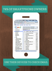
- 74% of smartphone owners use their devices to check their email. (Source: Gartner)
- Mobile now makes up the majority of email opens at 51%. (Source: Litmus)
- By the end of 2018, worldwide mobile email users are expected to total over 2.2 billion. By this time, 80% of email users are expected to access their email accounts via a mobile device. (Source: Radicati)
- 56% of shoppers are likely to make a purchase via a mobile app in the next year. (Source: Adobe)
- Mobile offers are redeemed 10X more frequently than print offers. (Source: eMarketer)
- 30% of mobile users will abandon a purchase transaction if the shopping cart isn’t optimized for mobile devices. (Source: Mobify)
- Mobile users spend more money per purchase than customers do on a desktop website. (Source: Fast Company)
Whether you’re a B2C business with ecommerce sales or a B2B company generating offers to potential leads, your website content and emails need to be mobile-friendly. It will benefit your bottom line in addition to improving the web presence of your company.
Here are five reasons your content needs to be mobile now:
- Mobile users want content in quick, digestible bites. People do not have the patience to try to navigate a website that is not optimized on their device. It your site isn’t intuitive, they will go elsewhere.
- Mobile gets traffic. Google made this clear with last year’s Hummingbird update. The future of search is mobile, and websites that aren’t usable on handheld devices will be penalized in their search rank.
- Mobile creates a positive online image. If your website is difficult to navigate on mobile, customers are less likely to trust you and more likely to go to your competition.
- Mobile increases conversions. If you want to convert your website visitors into paying customers, you need clear and easy to click calls-to-action. If your buttons are obscured or links difficult to click on your mobile site, you lose this opportunity.
- Mobile reduces bounces. If your website isn’t optimized for mobile, your bounce rate is likely high. If visitors have to zoom or squint to read the type, they won’t stick around.
So, what do you do if your website isn’t mobile optimized? Choose a platform that offers responsive design. This means that the system that your website is built on responds to whatever device a person is using – whether it’s a phone, tablet, or laptop – by automatically repacking the website pages to a design that best fits the device being used at that moment.
As a HubSpot VAR and Silver Level Partner, we love its Content Optimization System (COS) because it’s designed for mobile right out of the box. It’s also fast to load and with author tags, social media and keyword tools built throughout, the COS is optimized for the modern rules of SEO.
Many Content Management Systems (CMS) require special templates or additional coding to optimize for mobile. But Hubspot’s COS makes your content look good on any device. Your landing pages, blog and email will automatically adjust to whatever device is viewing it without any extra work on your end. This offers a scalable solution as devices continue to evolve. After all, who knows what we’ll be viewing our websites on in the next 20 years?
If you are interested in making the most of your online presence and want to explore HubSpot’s software, we’re happy to speak with you and show how we’ve used the tools to help our clients.
Business Articles | Business 2 Community
(424)