You’ve probably realized by now that at SHIFT, we like to work smarter, not harder. That’s why we try to automate our work when possible. For certain tasks, automation is obviously appropriate – the work is repetitive and clearly defined. However, for other tasks, finding a faster way to do things can be challenging.
It’s no secret that great design brings great business. Common sense tells us this, but most importantly, so does data. It’s also no secret that design can be one of the hardest elements of any business to accomplish quickly and easily. For marketing and PR professionals, generating images for campaigns or any other needs can be a trying and expensive process. Enter Canva, one of many new tools for simplifying the creation of graphics.
Canva and similar services are great for their ability to nearly automate good design. They standardize design tools that are typically hidden in a professional design program’s labyrinthine UI. This way, you don’t have to go to design school to make a simple blog image or email newsletter header. There are plenty of other free tools for image creation, like Infogr.am for infographics and Pablo from Buffer, but today we’re going to focus on Canva. The tool has offerings for both paying and non-paying users.
We’ll get you started on optimizing your team’s design process with these four quick lessons. Many of these use examples from Canva’s layout library, which provide images for direct customization and use (at a cost) or just inspiration. You can access the layout library at any time using the sidebar.

1.) Create Unity Across Images
You know how branding works in writing – promoting unity across a brand’s messaging creates a coherent identity. This concept applies in design as well. It’s best to use similar colors, fonts, and images through branded images but especially within campaigns. This can be made easier if there are specified branding guidelines for image creation – rules that tell you things like what colors to use. If this is not available, just keep the brand’s identity in mind as you choose a set of common elements for your images.
2.) Use Contrast Strategically
Use the concept of contrast to emphasize the most important messages in your image. Contrast sizes and colors to make certain words or images stand out. Promoting a company event on social? Try placing a shape behind the hashtag in a color contrasting to the background – it’ll pop out to anyone glancing at it. Make important pieces of information larger and with colors that contrast greater with the dominant colors in the image.
This image from the Canva layout library uses contrast well to emphasize the most important message of the image. Imagine this: an arts & crafts lover scrolls through their Facebook feed, until the word “craft” catches their eye. Coupled with the understated but coherent background image which evokes associations with trendy upcycling and vintage aesthetic, many potential customers will be hooked.

3.) Learn to Use Your Resources Well
Don’t have great, hi-res images to incorporate in your graphic? Don’t have any images at all? There is an easy fix for both those things.
In the case of low res images, which appear grainy when expanded to the size you need, you can expand them to the needed size and then blur them out. This creates an artistic backdrop for whatever text message you may want to overlay over the image. Best of all, Canva’s blur option allows for an entire spectrum of blurring. You can blur just enough to obscure the graininess while your viewer can still tell what the image depicts.

If you have no images at all, get creative. Is the graphic calling out the accomplishments of a speaker at a company event? Use their headshot from their company bio. Is the image a part of a greater campaign that has a landing page? Use already created elements from the landing page in your new image. You can also search the web for free images – some photographers and artists make their work free to use. Always check if they ask for attribution and respect this request if you use their images. DO NOT use licensed images from stock photography sites unless you have purchased them.
If all else fails, create a simple image with just text and a few simple elements that match the brand’s identity.
The example layouts in the layouts library often make use of elements similar to Canva’s free elements. Although one can only directly use Canva’s premade layouts at a small costs, they can always be used for inspiration. With plenty of shapes, borders, and other bells and whistles, it can be relatively easy to whip up an attractive graphic with no outside images.
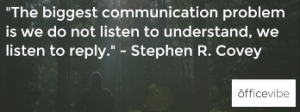
For example, this attractive graphic is created with Canva’s basic text, shape, and color offerings. Though the graphic is only available to use at a price, graphics of a similar character can be created for free. Quote graphics like this one are great for blog posts – call out an impactful line from the post using an image.

4.) Include Only the most Relevant Messages
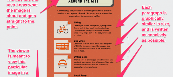
When in doubt, keep your image simple. Images for promotions, such as ads or social media images, are generally more like pitches than other types of writing. Keep your message direct, and let your viewer know the most appealing or important piece of information first. Certain images, such as infographics, are “allowed” to have a lot more information packed into them than other images. Think of these images as more similar to in-depth types of writing.
In simpler terms, don’t put too much information into one image – include an amount that is appropriate for the image type. This is easy for an image that only needs to get across a few piece of information across, maybe an event title and date. For more text-heavy image, things can be more challenging. Let’s look at another great example from the layout library.

Even armed with these lessons, you may be thinking, “how can I do this when I’m not a design person?” Don’t be dissuaded by these feelings – as a communications professional, you know more than you think about design. Know how to write a killer pitch or press release? Then you know how to present a message to an audience – what needs to be emphasized and what needs to be understated. Be #ballsy and apply that same thinking to the image you’re crafting. You may be surprised with how great the results are!
Digital & Social Articles on Business 2 Community(93)