Information overload. Infobesity. Infoxication. Whatever you call it, at some stage or other, we’ve all been there – sat in front of a data set so big or a report so heavy in detail it’s impossible to digest.
At FreshMinds, a significant part of what we do is gathering data or consumer feedback and then making sense of that information to provide actionable insights for our clients. That means filtering out the noise in the analysis phase to provide a clear, concise story.
What’s data visualisation got to do with it?
Data visualisation is not about just creating something pretty. It can really help us find the balance between presenting the overall story and the evidence in the form of data or information gathered. There’s no need to show every single quantitative data point if a simple heat map can demonstrate the key areas of contrast. Similarly, in qualitative research, something as simple as a few shapes on a PowerPoint slide can be worth a thousand words.
Data visualisations come in many forms:
A simple animation to illustrate a big idea
David McCandless is the data journalist and information designer behind Information is Beautiful. In his own words: “I’m interested in how designed information can help us understand the world, […] and reveal the hidden connections, patterns and stories underneath.” His ‘Debtris’ video is a great example of visualisation helping to make big numbers more relatable.
Video by Information is Beautiful via YouTube.
A variation on a classic
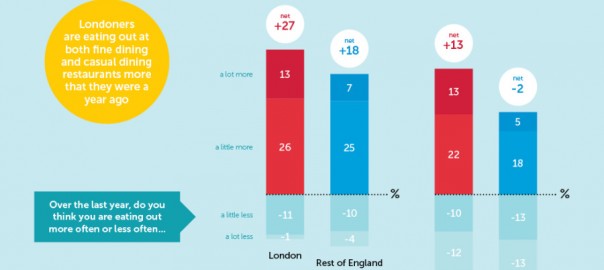
Okay, so it’s a bar chart, nothing fancy. But this example works particularly well as it allows us to draw direct comparisons (red vs red, blue vs blue), makes it clear which points we should be focusing on (the bright colours rather than the faded out bits!) and actually tells us what we’re seeing in the yellow bubble. Not just a bunch of bars. This is just one of the great pieces of data visualisation that Marketing Week is now using in its articles to bring key insights to life.
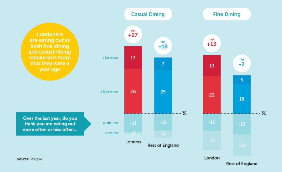
Infographic by Pragma via Marketing Week
When you’ve got a bit more to say…
…an infographic can help. An infographic is a visual representation of information in a graphic format, designed to make an idea or concept easy to understand at a glance. This example on mobile payments, a subject we’ve written about on the FreshMinds blog recently before, tells us a lot, but still feels manageable.
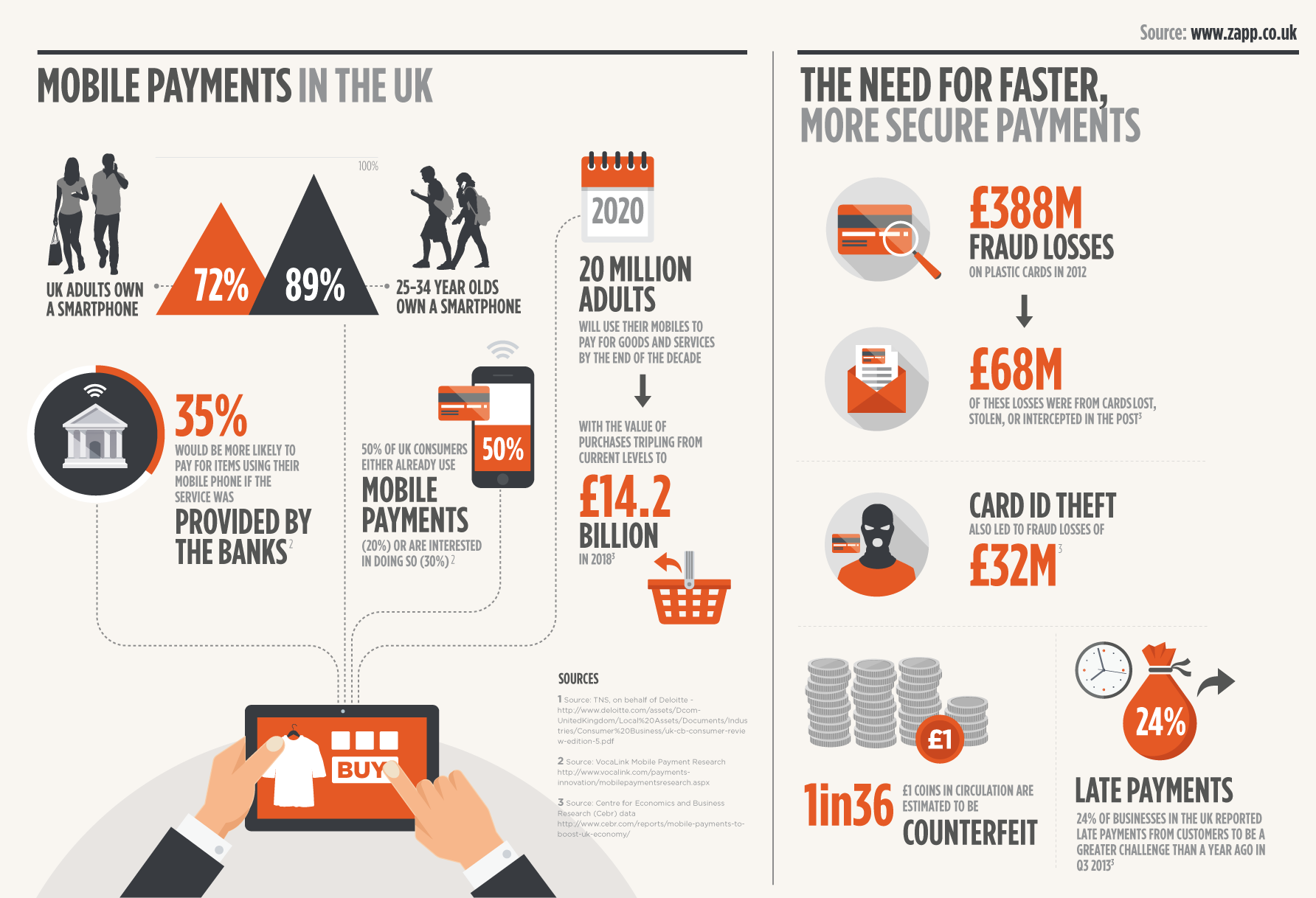
Infographic by Zapp Payments via Twitter
And to finish, something fun!
Infographics don’t only have to be used to bring hard data to life – they can be appropriate for more lighthearted subjects too. This great infographic from Huffington Post describing how to have the perfect day at work is one of our favourites:
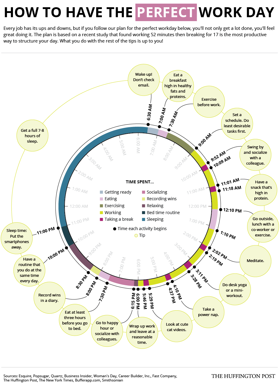
Infographic by Huffington Post
(419)