 Wesley Bradley
Responsive design is rapidly becoming part of the essentials in web design for 2015. It is a web design technique that provides users with an intuitive and functional website version for all mobile devices. The reliance on mobile phones and tablets, in addition to laptops and larger desktop screens, is increasing exponentially. Web users are beginning to expect websites to adjust to the screen of access and, if it does not, the result is often a very frustrated user. The good news is that responsive design is not as complicated as it sounds and can be implemented in a number of ways. We have prepared a quick cheat sheet to help you on your way to responsive design success.
The most simple form of Responsive web design is a website that changes its format to correspond to the screen of the device it is accessed from. However, the tool can also provide the opportunity for web designers to tailor content to different users; for example, by accessing the user location a website can tailor information to them on a geographical basis.
If you need convincing that the year to make responsive design a priority is 2015, the use of Google analytics can be very persuasive. After subjecting your website to the analysis, you can see directly how many users are accessing your website via cell phones by selecting ‘Audience’ and then ‘Mobile’. With more iPhones being sold than babies born in New Zealand, we can almost guarantee it will be more than you imagine.
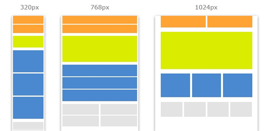
To make the move to responsive design there are two main paths you can go down; creating an adaptive website with multiple fixed width layouts set for common devices, or, using multiple fluid grid layouts to achieve a truly responsive user experience. There are positives and negatives for both so it is important you weigh them up before making a start. The positive aspect of multiple fixed width layouts is that you can have more control over the web aesthetics on each sized screen. However, in using fixed-width layouts your website will not have the ability to respond to changes in browser size. If you have ever had to have two windows open at the same time you will understand the struggle, which leads us to the more comprehensive version of responsive design; using multiple fluid grid layouts. Fluid grid layouts work on the basis of proportions rather than the more traditional pixels, which enable the content to change according to browser size as well as adapt to mobile devices. Web content is given a percentage of the browser or screen to take up and as the size of the viewing window changes, the content continues to take up its assigned percentage of the browser. The percentages can be calculated with a simple algorithm: target/ context = result, or total pixels/ content pixels = percentage.
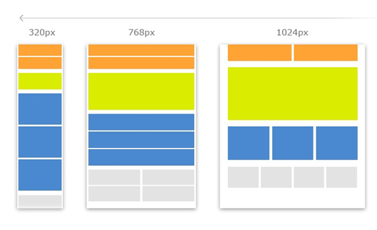
As browser size is an issue that mainly arises with desktop screens and laptops, a savvy way to implement responsive design can be to have fluid grid layouts designed for computers and fixed width layouts for mobile devices. Although, in saying this, there is a huge range of devices currently on the market, with more and more arriving all the time. It becomes almost impossible to keep up, which is why it may be better to let your website do the work for you, responding to new devices through the use of multiple fluid grid layouts.
To ensure your entire website is responsive it is important to think about your images also. Creating fluid images, images that resize within the confines of a fluid grid. This is easily implemented via the CSS code: img { max-width: 100%; }. This simple line of CSS code will ensure that the images on your website will never appear stretched or pixelated, giving a clean and professional impression.
For 2015, a ‘mobile first’ approach is what is recommended. As the title suggests it is an approach where web designers focus on producing a smartphone experience then move up in the scale of devices, from smart phones up to desktop screens. This is because mobile web browsing is very likely to eclipse that of desktop browsing if it hasn’t already, therefore they are your target demographic. Smartphones have more capabilities than their desktop predecessors, so you can design for the likes of a touch screen in the first instance, instead of as an afterthought. Smartphone screens are only capable of display the core of your website, no sidebars, adverts or social media buttons. It is much easier to start simple and work up.
You may be asking yourself, if we are starting with a ‘mobile first’ approach then perhaps we should be creating an application instead, and this is indeed something to consider. Our advice would be that a responsive website may be the better option in terms of universal compatibility. This is because the application world is fickle; with apple and android in a neck and neck competition, some applications may be exclusive to either iOS or android. Having a responsive website guarantees that all devices that have access to the Internet will be able to use your site, with no more fuss about which brand to side with.
If you’re thinking this is all just a bit too much work and algorithms just aren’t your thing, then not to worry. There are some excellent front-end frameworks (Foundation and Bootstrap are good ones) that you can employ to create your responsive website. Their grids have incorporated responsive design and have done the work for you. The result is an immediately responsive website.
We hope this has been of help to the web designers out there looking to 2015 as a year of change. We think moving towards a responsive website is sure to benefit both the user and the Beneficiaries.
(444)