You can find studies and reports that tell you audiences today crave longer content. Or shorter content. Or snack-sized content.
One thing is for sure, though. Audiences today are harder to engage. They need more from you than a plain ol’ blog post. If you can create an experience out of your content, you’re much more likely to capture your target audience’s attention – and keep it.
That’s the beauty of a microsite. Long or short, complex or simple, a microsite is an experience for your audience. Take those readers along for an interesting ride, and they’re also much more likely to take action at the end.
That’s not to say that other types of content aren’t effective anymore – because they are. Microsites, however, are rising in popularity for a reason. They spur the reader to explore. This medium is a playground for your creativity, too, because they demand a more unique layout and more flexibility than any other content type.
The goal of a microsite is to communicate a single, compelling message. A message that, once understood, incites the reader to take action. This demands focus on the part of the copywriter and innovation on the part of the designer. You can’t translate any content into the visual, exploratory medium of a microsite without a big helping of creativity.
In essence, a microsite is a single webpage (or rarely, a very small collection of webpages) that stands apart from an organization’s main website.
Though many have their own domains, many live on subdomains – there’s no hard-and-fast rule, there. One thing they all have in common, though, is that they are content worlds unto their own. The reader doesn’t have to go any further to get the message.
In this “more is better” world of marketing, zeroing in on a single, compelling message and moving the reader to take a single action is an art form. Following are 17 examples of microsites from companies and organizations that have mastered the art.
17 Examples of Masterful Microsites
1. Chipotle: A Love Story
Around here at SnapApp, this microsite from Chipotle is one of our favorites. The site itself is a combo of two different content mediums: an interactive game where users can earn free food and a cute little CGI film. This fun mix of mediums makes this microsite a cool experience. The message of “love can overcome our differences” is wrapped up in a sweet little story of young love, neighborly competition, and the humanity-restoring power of fresh ingredients.

2. Ferrari Infoseason 2015
This microsite from sporty carmaker Ferrari tells the story of the 2015 Formula1 season. All you need to do to interact with the site is scroll. Interactive technology does the rest to tell the story. It’s an experience you won’t forget from a company that makes pretty remarkable cars, too.

3. Wired and Netflix: TV Got Better
What happens when Wired and Netflix pool their creative resources? You get one epic microsite. This one actually won awards, and spending a few minutes on the site makes it pretty clear why. It’s got everything – powerful visuals, a compelling narrative, motion graphics, powerful statistics, poignant videos, interactive audio, and even an interactive timeline.
The whole engaging experience is a marketing masterpiece.

4. Washington Post: A History of Denial
This microsite from the Washington Post includes interactive timelines and a star-studded featurette. What really makes it compelling, however, is the question it asks … and attempts to answer. Is denial on the rise in America?
In today’s politically heated climate, a hard-hitting microsite like this is sure to stir emotions. It’s a risky move for any business, but the Washington Post handled it with class. It starts out with an exploration of where denial comes from, and ends with a call-to-action to learn more about the Denial movie.
The smart part is that anyone who nods along to the narrative is sure to be interested in the movie at the end. The learn-more-about-the-movie CTA is a clean tie-in to the microsite, and the microsite itself is a journey leading straight to the movie.

5. HBO: We Are the GOT Party
Another SnapApp team favorite, this microsite from HBO takes the 2016 U.S. presidential election and places it in the world of Game of Thrones.
Some might call this a playful take – but anyone who paid attention to the election and/or watches the hit Game of Thrones series knows just how serious this subject matter can actually be. HBO did a great job of making it engaging and entertaining with user-focused CTAs and strong visuals.
Interestingly, the purpose behind this microsite wasn’t to take a political stand, but rather to promote the sale of season 6 of Game of Thrones. With 1,666, 642 ballots cast on the site, my guess is that the microsite probably did its job pretty well.

6. Collaborative Fund: Future of Car Sharing
This microsite came out of a collaboration between Collaborative Fund and Hyperakt. It’s not only unusual in that you scroll to the right instead of up-and-down, but it demonstrates a clever use of animation, too.
The site may look simple, but there are many elements to explore and lots of information for the user to reveal as they move through the illustrations. For example, hover over the national flags when they appear, and you’ll discover even more interesting data. Hands-on microsites like this one can make the message even more memorable for users.
The lesson here is that your microsite doesn’t need to be a big, complex beast. Just make sure it’s a fun and engaging experience.

7. ProPublica: How Much Is a Limb Worth?
How’s that for a gripping headline? This microsite from non-profit newsroom ProPublica grabs you right from the get-go with the idea that your limbs are commodities.
Though this was intended as an educational piece about workers’ comp and the resulting lost wages, it’s also a powerful object lesson. Every state paid out a different amount for various lost limbs. See for yourself by selecting the limb and then selecting a state.
ProPublica illustrates the seriousness of on-the-job injuries quite well in this piece. It’s a message users won’t soon forget.

8. Highrise: Universe Within
I’ve used this microsite example from Highrise in other articles I’ve written, because it’s such an outstanding visual experience. It’s like an IMAX movie on your computer screen.
The Universe Within microsite is a digital documentary that explores the digital lives of highrise residents around the world. It’s a heartfelt story, but it’s also a thoughtful look at how technology has changed and shaped our brains and our relationships.
The elements used here are remarkable. BIG images, 360-degree views, haunting music, and a personalized experience based on how you click around.
Don’t view this from your mobile device, please. Put your headphones on and sit at a computer with a strong internet connection to experience this masterpiece.

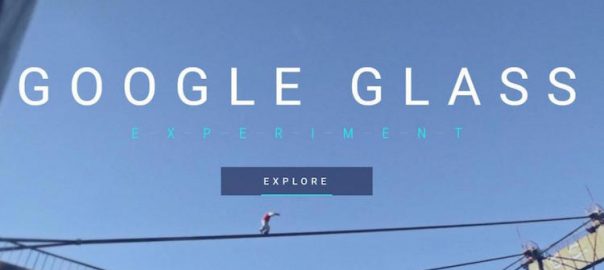
9. Google Glass Experiment
What do you get when you add mobile technology to extreme sports? Google wanted to find out, and this microsite takes you on a tour of their findings.
This cross-platform experience combined mobile devices, Google Glass, and an interactive web platform to create a game for sports lovers and players alike. The corresponding mobile app showed game progress and let you chat with competitors. From Google Glass, you could start your race, invite friends, and track your success. And the web platform is where you managed your account, watched the streaming videos, and followed friends’ activity.
Like everything Google does, they took this microsite to the extreme. If you wondered what the point of Google Glass was when the company launched the technology a few years back, this microsite was all it took to get it.
WARNING: If you’re prone to motion sickness, sit this one out.

10. Pharrell Williams: 24 Hours of Happy
Remember Pharrell Williams’s hit single Happy? That’s a silly question. Of course, you do. That song was everywhere. It was catchy and upbeat – a wonderful change of pace from so much of today’s music.
The thing is, while the song was great, one of the other reasons the song did so well on the market was because of the outstanding marketing behind it. It had a fun music video. It had its own dance moves. It had the world’s first 24-hour-long video microsite.
I challenge you to click that link and not dance in your seat.

11. Dumpark: Seas of Plastic
After that last microsite example, this one from data visualization company Dumpark will bring you right back down to earth. It’s a simple but compelling visualization of the world’s plastic particle concentration.
Rotate the globe with your mouse to see where all the plastic is floating around in our Earth’s oceans, and where it’s collecting en masse. It’s a sad message about the state of our planet’s environment, the human compulsion to create (and then ignore) waste … but it’s also a convincing look at Dumpark’s data visualization capabilities.

12. The New York Times: The Russia Left Behind
We hear a lot about Russia these days. Mostly negative and political stuff, unfortunately. This microsite from NYT gives us a different perspective on the country.
The microsite is an interactive journey through the heartland of Russia. It’s a story of the country that you don’t see in the news today. A country where people live in the past.
What works for this site is that while it has a ton of content, all of that content is focused around a single message, and it all tells one powerful story.

13. Krylon: The World’s Longest Yard Sale
By now hopefully you trust that after I give you a hard-hitting example or two, I’ll give you a fun, uplifting example to balance it out. That’s what you’ll get with this microsite from Krylon: fun and uplifting.
The Krylon team traveled 690 miles across six states to host the first-ever Pinterest yard sale, posting real-time updates along the way. They collected their experiences in this microsite.
The paint company was the first brand to use Pinterest’s new “buyable pins” feature. They sold all 127 items in their virtual yard sale and donated a total of $ 1,899 to Charity Wings Art and Craft Center.
Here’s where marketers need to sit up and pay attention, though: Krylon’s Pinterest follower number rose by 400% during this campaign.

14. Big Album of Beers: Beer Stats
Alex Skorulis isn’t a big brand … but you wouldn’t know it by looking at his Big Album of Beers microsite. Here he has recorded – and continues to record – his beer-drinking history. This site breaks down his journey by country, beer type, and brewery. As of this writing, he has consumed 1045 different beers from 487 breweries located in 63 countries over a period of 4 years and 4 months.
That’s an interesting enough story on its own. But it’s absolutely masterful how he has visualized it with this microsite, and how he makes his story more engaging with interactive elements on the page.

15. The New York Times Magazine: Walking New York
New York City is known for being walker-friendly – but this microsite from The New York Times Magazine shows you. As you scroll, you’re taken on a tour of some of the city’s most memorable walking areas. You’re virtually transported right into those locations with powerful images and absorbing stories.

16. Lucidworks: The Data That Lies Beneath
This spooky microsite from the digital search experts at Lucidworks reveals the scale and real cost of lost data. As you scroll, you’re treated to a visualization of how data is generated, how it travels, how it’s analyzed … and where unused data goes.
This unused data is called “dark data,” and 7.5 sextillion gigabytes of it are created every day. The problem? That dark data isn’t always secure. It’s a scary thought for any person or business today.
This microsite was created by Column Five Media for Lucidworks, and it tells a powerful story. It also makes a compelling statement at the end about what the company is doing to stop dark data from getting into the wrong hands.

17. Vision Critical: Evolution of Insight
Market research can be kind of a dry subject … even to those of us who readily use it in our jobs. Vision Critical made this boring topic much more entertaining with this microsite.
Unlike a typical microsite that asks you to scroll vertically, you’ll navigate this microsite using the timeline at the bottom. Click on the timeline points to take a tour of the history of market research, and see how far we’ve come since the turn of the century.

BONUS MICROSITE!
Since you’ve made it this far, I wanted to make sure you were rewarded with the BEST MICROSITE OF ALL …
Though only active a short time each year, this microsite lives on in infamy as one of the most entertaining and viral sites around. If you haven’t created your own Elf Yourself video during Christmastime to send to your friends and family, you’ve probably at least received one (or a dozen). When the microsite launches each winter, people flock to it, follow the prompts, upload their faces, and create hilariously adorable videos of themselves as dancing elves.

Though OfficeMax really did a good job of focusing on the user, here, and not pushing the brand, they didn’t forget their sales goals in the process. At the end of Elf Yourself videos, you’ll find coupons and promos.
Digital & Social Articles on Business 2 Community(150)