
Mobile users have outgrown desktop users.
That means that when someone is looking at your site, there is a greater possibility that the person is looking at it on a smart phone or a tablet.
Yet many brands still have not optimized their sites for mobile users. Some may be using a responsive design, but that’s just not enough to give mobile users the experience they need.
Google has started making changes to better meet the needs of mobile users, as well. The search giant has prioritized results from sites that meet mobile demand, and it is introducing tools to help brands measure the success of their mobile design.
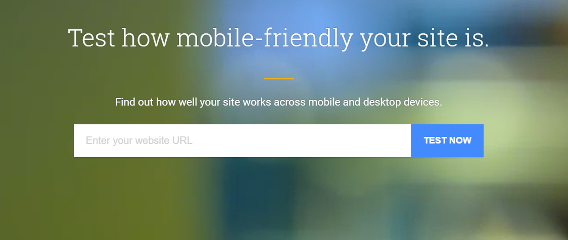
If you aren’t sure whether your site is optimized properly to get the most from your mobile marketing strategy, you can use one of the available tools to test it and you can follow this mobile friendly checklist:
Is Your Viewport Set Properly?
The viewport is the meta tag that tells a browser how to adjust a page so that it is scaled properly to be viewed on different pages.
If your site has no viewport, it will show up just like a desktop page on a mobile device. That means that your visitors will see about five inches of the top, left side of your page.
How much information do you think they are going to get from that? How many visitors do you think are going to stay around if they have to scroll from side to side constantly to read a page?
You need to have a viewport, and you need to ensure it is set properly. In particular, the width needs to be set to the device width rather than having a fixed width.
You can easily see if your viewport is set properly by checking Think with Google, a test site for mobile friendliness. If we use Moz.com as an example, the site gets a 100 out of 100 for mobile friendliness, and it gets a note showing that the viewport is set properly. If it weren’t, there would be a note telling it what to do.
Besides ensuring that the viewport is set properly, you also need to make sure that your content is appropriate for a mobile device. Some graphics just cannot be scaled properly, so you’ll need to rethink how you present the information.
Do You Use Large Fonts?
Since they are looking at a smaller screen, mobile users need bigger fonts to easily read a page.
Does your mobile site have fonts that are large enough for easy readability?
If you aren’t sure how big the fonts need to be, you can just pull up your site on a mobile device and see how easy it is for you to read it. You can also test your site on Think with Google. Moz.com — not surprisingly — shows that it uses “legible font sizes” on its test.
Is the Page Spaced Properly?
You don’t have as much space on a mobile screen, so you can’t cram everything together.
Not only will it be harder to read, but visitors won’t be able to easily tap on links or buttons. Visitors will try to tap on one link, and they’ll end up opening another. They’ll get frustrated and leave. Google will also penalize your site in search.
Aim to make your tappable targets at least 48 pixels wide, or about 7 mm.
Again, you can also test your site on Google’s new tool. Moz gets a checkmark next to “size tap targets appropriately,” which contributes to its perfect score for mobile friendliness.
Do You Have Flash on the Page?
So many sites are now using flash for video or for ads. But flash significantly slows down a site, which is a huge issue for mobile sites.
You need to get rid of flash completely.
If you aren’t convinced that flash makes a difference, run a test of your site speed on Google’s new tool. You’ll quickly see how the speed improves once you remove the flash elements.
Moz doesn’t score too well on mobile speed. In fact, it gets a 67 out of 100, which is considered poor. However, the report shows that JavaScript and CSS in content above the fold is the primary culprit, rather than flash.
You’ll need to run a speed check for your own site to make sure there are no other issues slowing it down.
Do You Have Pop Ups?
Pop ups should be used with caution on a desktop site, but they should mostly be avoided on a mobile site.
Google penalizes sites that use full-screen pop ups, like those used for email subscriptions. Instead of a pop up, sites are encouraged to use a banner or other, smaller link.
Google’s new tool will specifically note whether your site has used pop ups.
Take a good look at your site and start making changes that will make it more friendly for mobile users. Use Google’s new tool to test it out and make sure you have all your bases covered.
Digital & Social Articles on Business 2 Community(86)