 By Rachel Parker, Published November 2, 2014
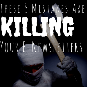
As we get closer to Halloween 2014, things that go bump in the night captivate our imaginations … But there’s nothing fun about these five super-scary mistakes that can subject your carefully crafted e-newsletter to the same fate as that goober in every horror flick who says, “Hey guys, let’s split up. I’ll take the attic.”
Even the best-intentioned e-newsletter can fall victim to the delete button — or the spam box — if you’re making these critical mistakes.
1. It’s all about you
Try not to take the term “e-newsletter” too literally. It’s not your weekly/monthly platform for blathering on about all that’s cool and amazing at your company.
As with all your content, your e-newsletter must be laser-focused on the needs of your target audience. Focus on one or more of the main missions of content: educate, inform, entertain, inspire.
2. Too much information
Your e-newsletter is an opportunity to deliver digestible content, not a catch-all where you can cram every iota of sharable information, no matter how engaging.
Limit yourself to one self-contained article, plus two or three links to other pieces, such as your latest blog post or podcast. If readers really are craving more than that from you, they can always click on your social links.
3. Text overload
Offering readers row after row of text, no matter how clever and engaging, could be a one-way ticket to Unsubscribeland. Include eye-catching visuals to break up the text and offer some eye candy. (Bonus points if you include photos featuring people.)
4. Image overload
While images are important for increasing the visual appeal of your e-newsletter, overdoing them can get you in a heap of trouble. Including too many images or image files that are too large can lead to seriously slow load times. (Think about all those poor mobile users with just a couple of bars or really crappy wifi.)
Also, today’s spam filters tend to weed out emails with too much going on visually. Aim for images to take up no more than 30% of the total space, and keep your file sizes on the small side.
5. No personality
Remember, your humble e-newsletter is competing with umpteen other missives vying for your reader’s attention. Remind them who you are — and why they followed you in the first place — by infusing your brand personality into your content.
OK, your turn: Got any email foibles to add to the list? Tell us about it in the comments — we’d love to hear from you!
Business Articles | Business 2 Community
(252)


