
Do you have something you want to sell? Do you have users? If you answered yes to both these questions, then you probably have to get your users through some kind of a funnel.
That’s tough. When we set out to do this for a financial services company recently, we thought we knew a lot already (after all, this company had already achieved product-market fit). But what we learned surprised us.
What was the problem?
This company asked users to give up a lot of information in order to approve a loan.
Mobile conversion was less than half of desktop’s. As traffic increasingly skewed mobile, optimizing the mobile funnel became a big business priority.
Time to roll up some sleeves
We started by talking about what we thought might be going wrong on mobile. We fleshed these out into hypotheses, prioritized those experiments based on how scared we were about the potential results, and ran them through Optimizely. The fear came from the fact that if we weren’t careful, we could risk accidentally taking down the mobile storefront, not capture key information, or worst of all, issue loans to unqualified applicants.
Creating a series of tests

What we learned from running mobile funnel A/B tests surprised us.
We had a lot of potential starting points. We could:
- Take out fields
- Help users recover from errors better
- Show more information about the full application process
- Offer more human support
As we identified all these areas, it became clear that the area of highest risk was the funnel’s overall interaction model. It touched on two complex areas: design debt and technical debt. Because of architectural limitations and design decisions over past years, we realized that funnel structure posed the biggest business and technical risks as well as the most potential user value.
Tools we used
To know what the heck was going on, we relied on a few tools:
- Optimizely – we added Optimizely snippets to all the pages in our site so we had control over traffic volume to each experiment variation.
- Kissmetrics – we use Kissmetrics to track individual users’ journeys.
- Google Analytics – we used GA to compare our experiment conversion with past conversion performance since we had been relying on Google Analytics to track the funnel before this project.
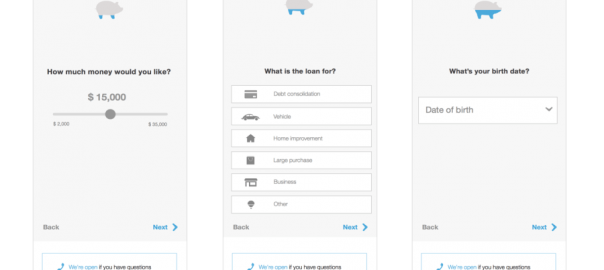
And now for some pictures
We designed three different versions of our mobile funnel. Luckily, this company had enough traffic to test all three at the same time.
Here is the original:

Version 1: This was our Control. Similar to the Original, but with styling that was more modern and readable. We tested this version against the Original to test the new styles and reduced copy before testing variations on the interaction model.

Version 2: Expandable drawers to group questions. Note that we removed a question on credit quality in Version 2.

Version 3: Each funnel question presented individually.

The results
Version 3 won by a landslide. Conversion improved by 20-30%. Version 2 did well too, especially in the beginning of the mobile funnel but conversion dropped mid-way through.
What we learned
The structure of our funnel had a huge impact on conversion. Previously, we operated under the assumption that the funnel was simply too long to convert well on mobile. We learned that the length of the funnel mattered less than how the questions were presented.
The more impactful lesson came to us as a byproduct of our experiments. When we started this project, we assumed people were filling out the entire application in one sitting on one device. But, as we ran our tests, we saw significant drop-off towards the end of the funnel.
After digging into our Kissmetrics data, we discovered that people weren’t leaving altogether – they were coming back and resuming through all kinds of channels, including different devices, search ads, bookmarked links, and special email promotion links. It was all over the place! This learning allowed us to correct how we tracked conversion. More importantly, it also helped us design a more seamless experience for people cross-device.
Top 3 takeaways
- Fake it til you make it. Shipping faster with features that were hacked together behind the scenes helped us make better decisions. We learned first if it was valuable to our audience, then we talked about changing the API.
- Data doesn’t equal insight. You will get weird data. Don’t be afraid to dig in and question it. Not all data will yield a straightforward explanation – you might need to talk to users and run reports in multiple tools to investigate what’s actually going on.
- Think big, test often. A testing strategy can help make big decisions feel smaller and more iterative for product owners. That’s not to say you should base an entire product strategy off your key metrics – testing can help you get closer to your vision, or get closer to realizing your vision’s all wrong.

This post was written by Audrey An and Alexa Roman from Carbon Five.
Digital & Social Articles on Business 2 Community(148)