By now you already know that an eCommerce website is a place where business is conducted; from selling goods and services to advertising products through affiliate sites, and you have an idea of how an eCommerce site looks and works.
You know that a good eCommerce site has a main page, a great range of images, a search bar and a menu to select product categories from. This is the basic anatomy of an eCommerce site and covers the basic ways to navigate it.
What does a very successful eCommerce site need to have inside it? What are the elements that, when combined, truly create a great user experience inside one? Here you’ll be able to see what has made some of the best eCommerce websites around the successes they are now!
The name
The name of an eCommerce site is like its face, because it is the first thing that people will see, whether you are inside the website or by reading about it somewhere else. Generally, the name of a website needs to be simple and easy to remember.
A name for an eCommerce website doesn’t necessarily need to be reflective of the nature of its business or product. It will help if it has some interesting story or meaning behind it. The classic example of this is Amazon.com.
Amazon is a simple name that its founder choose after deciding that it represented something that in his own words is exotic and different. The Amazon River is the biggest river in the world, and Amazon’s founder wanted it to become the biggest retailer in the world.
The homepage
The homepage of an eCommerce website works just like the entrance of a real-world storefront. Once you get inside, your first impression will make your mind up about it. Does it look like the kind of place that is selling what it offers? Is it organized and easy to navigate?
Take for example the homepage of umbra.com, which showcases some of its featured products by having them occupy a whole page, just like a stand in a physical retail shop. It is effective because it makes you feel it is the natural environment to sell those products.
The category menu
Finding products under a certain category on a webpage needs to be straightforward and easy, especially on eCommerce websites, where a handful of products are sold and not all can be put under a category, which means using subcategories for each category.
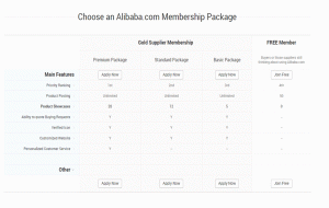
Alibaba.com is one of the biggest and most successful eCommerce players today. They offer an immense variety of products from suppliers around the world, which means that it has millions of different products in its store.
That is why alibaba.com has a category menu that can be easily reached after getting inside the page by scrolling down a little. There, the main categories are displayed. When you put your mouse pointer over a category, a subcategories submenu will be displayed.
If you want to see a more detailed view of the categories and their subcategories, it is a simple as clicking on “all categories”, which will take you to a page where all categories are displayed along with their subcategories in list form.
The product page
The product page will show you what a product is like. In a product page, you’ll see the product’s description, details, multiple pictures with close up angles, price, and the buy button. Often, you’ll be able see similar products, as well.
For backpacks on skatewarehouse.com, you can see the description, price, pictures and other similar backpacks of the same brand. Alongside the product info, you can find the “add to cart” button.
The checkout process
The checkout process is a section of the page where you land once you have decided what you are going to buy. It used to be that you needed to be registered on the site to check out, but now, this is not the norm.
Amazon.com is one of those pages that still require you to register to checkout, but it is such a streamlined process that you’ll only need to do it once. It is as simple as entering your email, password, and some personal info like name, address and payment method.
Once you have registered, it is as easy as adding something to your cart, clicking on “check out now”, verifying your payment and shipping info.
Streamlining the checkout process in this manner has helped modern eCommerce websites convert first time customers into repeat customers, and it has worked like a charm!
It is important to also prepare a “thank you” and a follow up “successful purchase” page after your customers are done checking out, so they’re not left hanging after they have made a purchase. It gives them the details of their finished operation.
A customer service section
A customer service section consisting of a “help” section and a “contact us” section is a requirement for all eCommerce sites that want to be trusted by visitors and customers. A help section should show people an easy way to use your site and navigate it.
You can see that thinkgeek’s help section offers detailed information on how their services work, information about their pricing, shipping options, check out process, security measures and anything that can be done and found on their site.
The help page also has the option to live chat with customer service. It also gives you their contact information, and by scrolling down you can find other ways to communicate with them.
That is how you construct a streamlined user experience for the best eCommerce website!
Digital & Social Articles on Business 2 Community(99)