Former Googler Daniel Gilbert shares an AdWords Script from Brainlabs that will automatically create heat maps from your data.

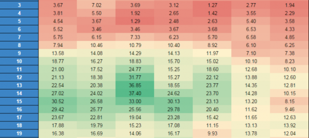
Everybody loves heat maps! They make it so much easier to see patterns in your data. They’re especially good for looking at how performance changes over the hours of the day and the days of the week: with 168 different data points, it’s hard to see anything if you just have a table of numbers.
So the team at Brainlabs (my employer) wrote a script to help you create heat maps automatically. We hope you love it as much as we do….
What Does It Do?
This script takes the metrics of your choice and then totals them up for each hour of each day of the week. It also smooths the data. Then it pumps the result into a Google Docs spreadsheet where — through the magic of conditional formatting — it turns into a heat map. As a bonus, we’ve thrown in a line graph, so you have another way to see the difference between the weekdays.
[Read the full article — and get the free AdWords script — on Search Engine Land.]
Some opinions expressed in this article may be those of a guest author and not necessarily Marketing Land. Staff authors are listed here.

(Some images used under license from Shutterstock.com.)
Marketing Land – Internet Marketing News, Strategies & Tips
(112)