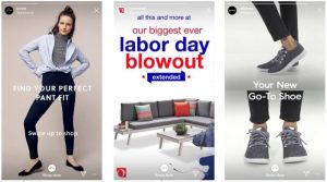

E-commerce sales are on the rise, making it an increasingly appealing business platform. But, there has never been more competition for your web visitors’ attention.
One of the best ways to stand above the crowd and increase your chances of a sale is to reduce decision fatigue. After all, with that much more competition online, users have even less patience trying to find what they need on your site. Visitors come to a site with only a certain amount of mental energy, and a confusing layout with many steps will only hinder the sale.
If that weren’t enough of a reason, ignoring the factors that contribute to decision fatigue will undoubtedly hurt your website’s user experience, which may impact your Google ranking. In fact, Google’s next ranking update in 2021 will be even more focused on user experience.
5 Tips to Reduce Decision Fatigue on Your E-Commerce Site
1. Understand Your Web Visitors
When it comes down to it, the only way to make your site relevant to your web visitors is to understand the types of visitors who come to your site.
Some visitors will be more knowledgeable about your products and business. Those that are will likely have less patience to go through numerous steps to find what they need to make a purchase. Your website needs to cater to them, and to those who need more information, alike.
Also, consider what kind of urgency there is around the decision to buy your products, and the potential impact of making a bad decision or wrong purchase. The types of products that you are offering and their price point will factor into this. A lower priced product that isn’t a vital purchase may be a quick decision whereas a large product purchase may require more research.
For an e-commerce site, you may have both wholesale versus individual consumers making purchases. The goals for each type of these customers will be very different and your site should provide clear paths for each purchase process.
Once you have a better understanding of your customers, you can make more strategic choices with the website structure and design in order to guide visitors to the right product and purchase.
2. Streamline Your Website Navigation
Your website navigation serves as the road map for your visitors. If you are seeing low conversion rates and little time spent on the website, evaluate your website home page and navigation first since this is where visitors start their journey.
For an e-commerce site, it’s helpful to have a link to the main Product category page and a call to action to Shop or Order Online. You’ll also want to include a login link for returning customers to easily login to their account.
In the past, there was a tendency to overcrowd the navigation with every major page on the site. As web design trends continue to move toward clean and simple layouts, the navigation needs to be as streamlined as possible. Consider moving any miscellaneous elements, such as social media links and resource page links, to the footer.
The mobile UX design is an important factor for an e-commerce site, so evaluate how your navigation will display on mobile. Reducing the number of drop downs in the top navigation can make it easier for visitors to navigate on a mobile device.
Lastly, if you do have a large e-commerce site and want to display numerous options in the navigation, create a mega menu design on desktop. A mega menu offers a cleaner, two column menu and is a lot easier for visitors to scan and quickly view options in a drop down.
3. Reduce the Checkout Steps
The check out process on your e-commerce site is the most critical experience for visitors. Any hiccups that visitors encounter here will directly affect conversions and sales.
Reducing the number of steps and time involved in the check out process is a sure-fire way to minimize decision fatigue.
An easy first step is to offer the option for guest check out for visitors. As a business and marketer, you may wish that every user would set up an account on your site, but you’ll probably see better engagement if you offer guest check out. This can reduce the time involved in setting up a username and password on the site.
Next, the most tedious aspect of the check out process is filling out the online forms with billing and shipping information. A good way to minimize this is by setting up auto-fill options for addresses. There are options available to utilize Google’s Places API so that your check out forms will auto-fill the address as visitors type in their shipping or billing information.
Also, you’ll want to make sure that visitors are staying on your website during checkout rather than redirecting them off-site for payment. This disruption adds another step for visitors and may cause a second of mistrust because they now need to consider whether the new website they’ve been directed to is also trustworthy. With all of the major e-commerce platforms, you can set up a payment processor and make sure transactions are handled on your own website.
Lastly, go through your check out process and make sure there are clear labels and error messages set up for any missteps. If visitors are distracted mid-form, or misread the instructions, mistakes can occur. Providing clear error messages is also an essential step for an ADA compliant website and such instructions can help all visitors complete a transaction.
4. Offer Product Search & Filters
Offering a search bar for visitors to easily search for products can also cut down on the time it takes for a visitor to navigate through the site and help to reduce decision fatigue.
After setting up this feature on the website, make sure to review all reports of what keywords visitors are searching for. This can give you insight into the most popular products – and which items visitors are struggling to locate on the site. The most popular e-commerce platforms like WooCommerce and Shopify offer these types of business reports in the backend of the site.
In addition to a search bar, you can also set up product filtering options. You’ll typically organize your products into certain categories, such as t-shirts and dresses for an apparel business. However, you can reduce the time and mental thought process by organizing products by attribute as well, such as color, brand or price.
If you are selling very technical products with precise dimensions and details, you may want to consider a table layout over the traditional photo display of products. This can be especially helpful for technical products in the technology or manufacturing industries so that visitors can easily compare and contrast detailed information in a product table.
5. Use Visual Hierarchy in Your Design
You’ll definitely increase the chances of decision fatigue setting in quickly if you require visitors to read through dense content on your site. Today, visitors typically spend less than 10 seconds on a website page and tend to scan the content quickly as they scroll.
Focus on your high level messaging, which refers to the headlines, sub headlines and calls to action on each page. This is the most important messaging that visitors will read as they move quickly through the site.
A web designer can then work with you on the visual hierarchy of each page, which refers to the use of font sizes to help visitors easily differentiate a headline from paragraph text. You can also help visitors easily spot buttons and key features by creating a visual consistency across the site. When buttons and calls to action all have a similar look, visitors have one less thing to interpret.
For the mobile user experience, make sure that elements are given enough space, even when viewed on smaller devices. Thumbs are not as precise as a mouse when it comes to clicking buttons, so you don’t want to frustrate visitors by putting buttons so close together that the visitor ends up somewhere they didn’t intend to go.
Lastly, e-commerce platforms like WooCommerce and Shopify offer product page layouts with tabs for detailed product information. You can utilize these features so that visitors don’t need to scroll through information on a detailed product page that isn’t relevant to their shopping decision.
Digital & Social Articles on Business 2 Community
(76)