
StartupStockPhotos / Pixabay
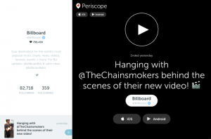
Social media marketing is a visual heavy medium. From the Instagram Infographics currently dominating your feed, to the banners and videos you see on Twitter and Facebook.
It can be difficult to know how to strike a balance between being “on brand” and “on trend”. You never want to create graphics that feel outdated, but equally you don’t want to create anything that is the opposite of your brand identity.
There can be good reasons to go with a trend. A lot of the muted colors and serif fonts graphic design trends currently making the rounds on Instagram graphics are specifically designed for clarity of communication, with easy to read messages on clean and simple backgrounds. There’s also the algorithm to content with – all social media platforms boost what is receiving the most engagement meaning that if people like and comment on your post, your post will get shown to more people. And people tend to be creatures of habit, preferring designs that feel familiar to them, meaning that a lot of what gets boosted seems very samey.
Equally, the arguments for sticking within your brand are compelling too. Building a brand identity depends on having consistently branded visuals. In general there will be 5-7 brand interactions before a consumer remembers your brand, so picking an identity and sticking with it can help speed up that process. Any good brand identity will have been developed based on consumer insights, to paint your brand in a specific light. Veering away from your brand can hurt your positioning and confuse your audience. Brand colors have very strong connotations and moving away from your colors can signal a change in values.
So how can you tell when to pick a visual that is on-brand or on-trend?
One option is to find a happy medium between the two by creating a slightly more trendy version of your brand. Picking a secondary color palette with more muted shades in it, or using a simple clean layout with your existing fonts can be enough of a nod to a trend without completely overriding your branding.
If this isn’t an option, you need to think carefully about what you want your visuals to achieve. If you’re sharing a Facebook graphic to advertise a new product it’s best to use your branding. In this case, you want people to associate your new product with your company, so it’s best to keep it within your already defined branding.
However, if you’re launching a new campaign, such as a seasonal holiday campaign, you have more room to play with trends. Because you’re advertising something that is distinctly different than your usual offerings, using trends can fit nicely. They can also help express the seasonality of your campaign. Using a trend that is big right now will help your campaigns feel timely.
Alternatively, if you want to create one-off graphics to share knowledge it’s best to strike a balance between trends and brands. Whilst one-off graphics should absolutely sit within your branding, including colors and fonts, they can be a fun space to incorporate small trendy elements. Using background shapes or modern clean photography is a good way to show that your brand is hip without overpowering your established identity.
Digital & Social Articles on Business 2 Community
(84)