So… What is a landing page?
A landing page is a section of a website accessed by clicking a hyperlink on another web page, and much different from the website’s home page. The main difference is all in the focus of that page.
Your landing page should always be the first thing your customers see when they click on your URL. In short, landing pages are designed for conversion. Don’t worry, we’ll go deeper in this soon.
Believe it or not, a homepage and landing page are not the same and have different purposes. A landing page is for conversations as we’ve previously stated. While a homepage is actually for exploration, they give general information on your website, which is also needed.
Today we’ll be dissecting the difference between landing pages and others, along with 5 ways to increase your conversations with a landing page!
What is landing rate conversion?
This basically tells you the traffic of visitors converting into leads and accomplishing its true goal! Keep in mind, not every customer clicking on your landing page will take the CTA and move accordingly. Many will bounce while some may read your content and still choose to leave and or come back.
For example, your business is booming so naturally you create a landing page for more traffic from an email marketing campaign. The purpose of this will always be to convert your customers into purchasing your products, thus being able to effectively track your landing page rates.
Now, this will show you a couple of things, what interests your customers and also what you’ll need to improve on! But one might ask, how do you get your landing page conversion rate?
Calculating your conversion rate
The average rate of landing page conversions is 9.7% and you can do this quick math as well! Take the number of people who converted, then divide that by the number of people who visited your page, and lastly multiply it by 100!
This is important to note as you apply these tools to converting more of your customers through your landing pages.
Focus on a clean layout
In order to increase your conversions using your landing page, you want to take out all and any distractions. This can look like taking out your site navigation links.
Of course, your logo shouldn’t be worrisome, however the more options you give viewers, the more competition you give your call-to-action button. So if that means giving up your sidebar as well, do it.
There are plenty of designs you may have and can use to attract your customers, however blank or white space (also known as empty space or negative space) is the most underrated trick you’d have as a small business owner. This allows your page to look less cluttered along with:
- Increasing readability
- Improving focus on the important elements
- Providing a greater comprehension of your offer
- Enhancing your customers experience
Think about the last time you were on someone’s website and saw their landing page… What stood out to you? Could you remember what they were offering right now? Chances are you can’t and this plays a large role in it.
Use the right images
Which leads us to the age old question, just what are the right images to use? Well we could start off by telling you which NOT to use… You know the ones where you can’t help but roll your eyes because they’re staged? Yeah, those ones.
Provide realist and positive-driven emotional photos and see how quick of a conversion rate you’ll receive. Why? Because your audience can tell just as much as you can when a picture is fake.
You want images that’ll draw your customers into what you’re offering. For all our product-based business owners, you’d want to make sure your product is the image. Whether that’s someone wearing it, eating it, wherever your product may fall in that category.
For our service-based business owners with a less tangible product, you’d want someone in the image benefiting from your service or any creative way you can showcase that it is in fact a service.
At the end of the day, knowing your audience and converting them is what’s important.
Use one specific and clear CTA
Call To Actions are amazing when used correctly and not overwhelming the customer. For your landing page to start creating the conversions you’re looking for, your CTA needs to be clear and concise. You want your CTA to be just that-a call of action, literally creating an urgency for that customer.
Whether it’s having the customer fill out a form, grab an eBook, or any other action… Your designs, copy, colours, and everything must align for that CTA.
Keep in mind, you want to make sure the colour and contrast is implemented. Your size of CTA is important as well. It shouldn’t scare your customers away and it shouldn’t be too small for them to miss it.
Declutter your landing page and ensure your customers can tell from a mile away what they’re supposed to do on that page. Here’s a cool exercise for you:
After creating and implementing only one CTA, step back from your screen, squint your eyes until it goes blurry. If everything meshes together as one and you can’t tell where your CTA is, it’s time to revise!
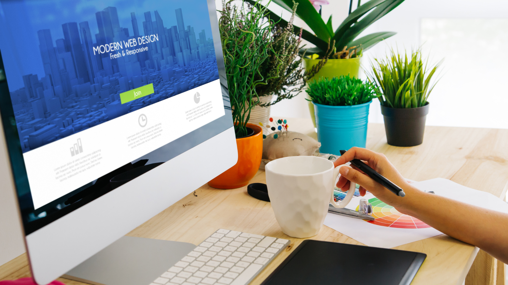
Implicit vs. Explicit Visual Cues
A great way to increase your conversions through your landing page is using visual cues, or directional cues. Widely known as explicit & implicit cues, which both aid in post-click landing page conversions as they tell your customers precisely what they should pay attention to!
Explicit cues
These are more direct and can be noticed a mile away on your site. A primary way to implement this is to add arrows pointing to the most important page elements, like your CTA for instance.
Keep in mind, the arrows pointing to your CTA indicate that there’s more content beyond that page, it directs your customer right to it – at least it should. In addition to the arrows, you can always opt-in for a circle around your CTA and arrows leading up to it.
Implicit cues
Implicit cues differ from the explicit as we just discussed. These are more subtle, mainly going unnoticed by your customers but still as effective! Some examples would actually be empty spaces, contrast in colours or even encapsulation.
Many of us have heard the phrase, ‘wearing white makes everything look big’. Right? Well, turns out it’s the same with your landing page. With the white or empty space, it’ll draw the attention to the highlighted elements on the page, therefore the customers are forced to focus on them-this is how implicit visual cues pay off!
With contrast of colours, between a dark background and white tone, help the customers to focus on what’ll look elevated to them.
Lastly, the encapsulation. This simply makes your colour contrasts ‘pop’, giving way to your conversions!
Strong copy is everything, but use video too
Studies have shown that there’s an 86% increase on conversions just by implementing a video rather than just a picture for your landing page. Why is this though?
Believe it or not, according to studies our average attention span is anywhere from 7-8.5 seconds. This is in regards to just our attention span online. So, by providing a video that’ll captivate your audience you increase the time span of one staying on your website, decreasing the chance of a higher bounce rate.
This all comes back to convenience – customers want, rather, thrive off of convenience. Your landing page should bring in a higher conversion rate as you implement this step. Because, if we’re being honest no one likes sitting through an essay of writing for any landing page.
Consider opting for a 1 minute video that’s straight to the point, impactful and presenting that urgency for your customers. These videos should speak of your target audience’s pain points and how your business through its service or product will solve them and provide that convenience.
Add promo codes or special offers
Coupons and promo codes are some of the most effective tools for driving sales. A great way to increase your conversion rate through your landing page would be to include promos for your returning & loyal customers!
Having unique codes and extra incentives for your customers and their favourite products is a bonus many small and large businesses haven’t tapped into yet. No matter your business, you want to ensure in all areas you are servicing your customers and what they enjoy from your business.
Now this wouldn’t be possible if you didn’t understand your target audience and what interests them. Offering promos would mean nothing to a confused audience because they wouldn’t be sure what your business would be providing in the first place.
Always provide clarity over your promos and understand your promos are valued only by those who value your business.
Time for conversion
Woohoo, we’ve made it to this last tip! Conversions work through a couple of things, one in particular would be trust! Building trust with your customers in order for a higher conversion rate can be accomplished through your logos, security badges and of course customer testimonials.
Nine times out of ten, new customers will look at what previous customers have said about your business. They do this to estimate whether or not they’d end up in the same position, positive or negatively.
Take for example, you having a customer testimonial, complete with their headshot, full name, affiliation, and position right above your CTA button. Now, it shows you have real life customers who value your business.
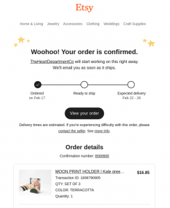
Consider having an automated email sent out to each new and loyal customer once they make a purchase! Add a special personal touch so they will always feel a part of your VIP!
This not only keeps the conversation going but shows your audience that you value them as much as they value you! This gives way to trust and thus builds your rapport with your audience while conversion rates increase all because you chose to show that extra touch to your customers!
A quick summary…
Your landing page will only be as successful as you allow it to be. In short, for your landing page to increase its conversion rate you want to make sure you’re implementing the below:
Ensure you have removed any and all visual distractions from your landing page. Have the colour contrasting in full effect, in order for your landing page to stick out. Remember, if you take a step back and you from a distance cannot tell the difference of your landing page and it’s CTA time to revise!
Once that’s taken care of, focus on the type of images and videos you choose. You want them to be realistic and compelling. If you can tell they’re fake, so can your customers. Your landing page can have an extra 86% increase by just adding a video as well-never forget the convenience you can offer your clients.
With every landing page you have, coupons and incentives add value for your first-time and loyal customers! Ensure they feel included from the start and they will not be a part of your bounce rate.
The truth is, you won’t get it right the first try, that’s why we’re here. Consider these and many more ways to increase your conversion rates through your landing page and see the growth in your target audience!
Digital & Social Articles on Business 2 Community
(44)
