— November 19, 2018
Landing pages are the first pages you want your potential customer to go to when visiting your website. They are specifically optimized to get maximum conversion and increase sales. In fact, a properly optimized landing page can increase conversions drastically and bring a business to new heights when it comes to sales. This includes optimizing your home page with lead forms, contact information and designing an easy to use mobile website. We will discuss in another other article great ways to optimize a website but here is our list of awesome landing page examples.
Front Page Lead Form Examples
Insurance companies are notorious for having great landing pages. Just think about it, a business that has billions of dollars probably has a well-researched and implemented landing page. Most insurance companies high-light a lead from front and center of the web page with a very simple “get started process”. If you can just get a customer to input that first small amount of data it’s likely that they will go ahead and finish the lead form.
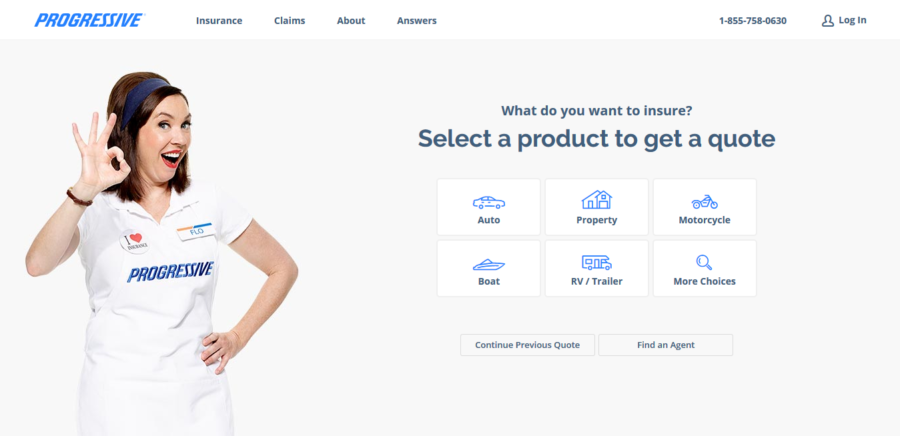
This is the front page of Progressive.com. There is content below the lead form, but this is generally what you see as soon as you hit the page. It only asks for the minimum data (zip code and insurance type) to get the process started. This kind of lead form is not only optimal for organic traffic but pay per click as well. However, if you are going to have a lead form of this size above the “browser fold”, you need to make sure your website has content. Many pages that were designed as lead forms only lost their search engine rankings for lack of content.
Side Bar Lead Form Examples
Sidebar lead forms are really effective and less intrusive than the big front-page lead forms. They are generally found on the front page but also may be on all the pages or the most important pages. These types of forms are great for industries such as storage, marketing, construction, or any other specialized service that requires a highly custom project to project quote. Just like with front page lead forms, you want to keep these generally short and require only the information you need to give the client a quote or to follow up with them. Usually somewhere between five and ten fields is the perfect size for a sidebar quote form.
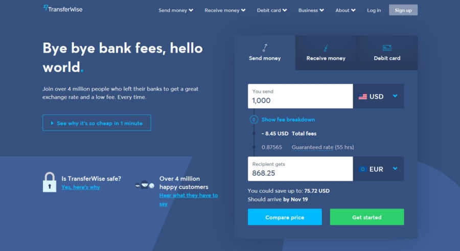
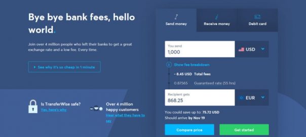
Transferwise.com, has been praised by many in the SEO community for awesome SEO tactics. As you can see here they also use the classic side bar landing page. This bar is on a few additional pages and after filled out takes you to some additional questions to get your final price quote.
Email Capture Landing Page Examples
Not all landing pages are designed for selling products or delivering quotes. Some landing pages are developed for capturing email addresses for future marketing efforts. These landing pages come in a variety of formats from the basic web design with a newsletter sign up to the traditional long sales page used for affiliate marketing. In most cases, the best way to market email sign ups is with a compelling call to action or a free give away such as an E-Book.

Neilpatel.com is doing a nice job by utilizing the power of popup and coercion to get people subscribed to his website’s newsletter. This is a light box that pops up immediately to request the visitors’ email by giving away what appears to be an E-Book. This is a highly effective way to get conversions before the user gets to distracted on the website and doesn’t “feel like signing up for anything”. Many platforms such as WordPress offer plugins for light boxes and newsletter forms.
Mobile Landing Page Examples
Mobile landing pages are somewhat new among the internet marketing realm….but not that new. These types of landing pages can greatly improve conversions due to easy navigation and form filling. Many WordPress themes offer responsive themes that adjust your web page size to fit the size of the mobile phone or tablet. These themes are very useful and can be of great help to improving your sign up and conversion rates. However, 100% mobile sites still work better in our opinion for converting visitors into customers.
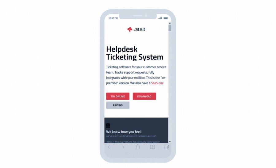
Here is an example of an ideal mobile landing page developed by Jitbit. Jitbit’s mobile landing page is extremely easy to navigate and the page is brazing fast. Generally, you would place a button to “request a quote” on most mobile landing pages. There are three CAT buttons which could be an overkill
If you are still using a regular website design on your mobile device you may be losing out on lots of leads. I know for myself, if I am on a website that isn’t set up for mobile I usually don’t feel like scrolling and probably will just search for something else.
Digital & Social Articles on Business 2 Community
(134)
