
 Joy Ugi
Today, you can’t get away with not using a responsive email template. It’s a must. A have-to-have.
Because mobile readership of emails is growing exponentially, there’s no choice but for marketers to abandon the old way of designing emails, which now often look ugly on mobile phones, and jump on board the responsive design bandwagon.
- More than 53 percent of email opens occur on a mobile phone or tablet.
- 71 percent of consumers delete an email immediately if it isn’t mobile optimized.
- Responsive design results in a nearly 15 percent increase in unique clicks for mobile users from a 2.7 percent average to a 3.3 percent average.
I can see you nodding your head in agreement that these mobile trends are true.
But are you are actually using a responsive email template?
It’s not as easy as it sounds
The gap between knowing something is true and putting it into practice is wide. Responsive design is taking center stage in this conundrum right now.
Media queries, coding, design, testing – email marketers hardly have time for this. Between the meetings and the content wrangling and the subject line writing and the A/B testing, it’s easy to procrastinate coding a responsive email template one more day.
Plus, you may not feel like you have the skills to successfully and quickly pull off a decent responsive email template, much less a gorgeous one reflecting your brand. You can take a stab at using skeletons or ‘frameworks’ such as Twitter’s bootstrap.
These give you quick access to popular media query aspect ratios, (the main way responsive design works), and allows for a simple way to find and edit code without having to be a coding wizard.
However, unless you are well versed in the technical aspects of coding and design, it’s still a hassle to code a responsive email template from these skeletons.
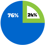 It’s no surprise 24 percent of email marketers aren’t optimizing their emails for mobile – it’s just not that easy if you don’t have the time and expertise to code one.
It’s difficult to create a responsive email template
Responsive email design, (and arguably excellent email marketing), is difficult.
With the drastically growing volume of emails sending today, email marketers are already consumed with just making sure their messages make it to the inbox and get opened.
So much manpower is spent on crafting the perfect subject line, A/B testing, and staying in the good graces of ISPs. These are essential for any email marketing program. But email design sometimes ends up as the black sheep: a little overlooked and taken care of at the last minute.
While a lot of experts in the industry shout that email marketing is easy, and that responsive design can be pulled off with something as simple as a tutorial-style blog post, you know that’s not true. You’re in the trenches every day, and you understand sending personalized email marketing that does everything it’s supposed to do is hard.
What’s a marketer to do?
Get Help
Switching over to a responsive design is not only going to make creating emails much easier for you, it’s going to boost engagement rates overall on your email program: Revenue per mobile click is almost double that of a desktop click.
To get that kind of revenue, you need to find tools and people who can help you create and use a responsive email template. There are a few options to pursue when it comes to this.
First, you can download a responsive email template builder. This is a toolbar, sometimes a WYSIWIG-type editor, which is sometimes tied to an email service provider. The disadvantage of this option is if you don’t have time on your hands and want a template you know is fully coded and functional, building a template yourself is going to be a hassle.
Another option is to download a responsive template someone has already created. This is a better choice depending on the template, as you can usually customize it to fit your needs. The template will already be designed and coded, so all you have to do is switch out images, text and links.
To take it one step further, a responsive email template that is simple and clean with interchangeable sections is your best bet. Not only would swapping images, text, and links be easy, but deleting, adding, and rearranging sections would be a breeze.
Here’s to kicking the ugly email habit in 2015.
(218)