
When you were a child and you had to go antique shopping with your parents, did it make you feel uncomfortable? Like you couldn’t touch anything without breaking it? As a child, you were probably more comfortable at Chuckie Cheese’s in the foam pit with all your friends.
Your website user experience is the same way. If your website is built with antiques that users don’t know how to navigate or touch then they’re most likely going to bounce away and find a website with a foam pit where they feel more comfortable.
If you design and create a website that makes your users comfortable while helping them accomplish a goal, then you can count on increasing visitor time on your website and most likely, increasing leads.
Load Speed
The very first thing a user will notice about their experience on your website is the time it takes your website page to load. Some companies throw load speed out the window just to have an amazing design with crazy amounts of functionality. At the end of the day, a user cares more about how fast your content is going to load than how many GIFs you have on the page. The fact is, the slower a page loads, the quicker it takes for a user to leave your website.
According to Kissmetrics, 47% of consumers expect a webpage to load in 2 seconds or less. If it takes more than 3 seconds, users will abandon the site. The internet has increased the need for instant gratification, and this translates to website load time as well.
How to test
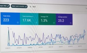
Use PageSpeed Insights from Google to test your website load speed.

How to fix
The first thing to check on is that you didn’t go crazy with functionality. Focus on your buyer persona and figure out what the most important pieces of information on the page is that they’ll be interested in.You can use functionality to call out those pieces of information, but don’t overload it so much that you underload speed time.
Check all image sizes. If they’re too large, they will slow down the load time of the page. JPEGs load faster than PNG images so keep that in mind as well. Also, make sure that your website is setup to cache user information. This ensures that they don’t have to download anything on the page twice if they come back to visit.
Navigation
What’s the #1 thing that users get irritated about? It’s most commonly known as “not being able to find stuff” or navigation. This is the most powerful weapon in user experience after the user loads the site. If your navigation is flawed, your users get frustrated.
How to Test
Find someone who could qualify as a potential customer that has not used your site before. Give them a task with your web site and just watch them navigate through the site to accomplish it. In your notes you’ll have the exact way that you envision a user reaching that goal. If the user accomplishes the goal but reaches it in a different way, that’s not necessarily a bad thing you just have to make the buyer’s journey more clear. If they simply get frustrated or take longer than expected to reach the goal, then you have a larger navigation problem and need to reassess how your website is setup.
How to Fix
The problem most likely lies in the fact that your buyer’s journey is not setup correctly. Prospects go through different stages during the buying process. Called “The Buyer’s Journey,” these stages are:
- Awareness: Customer identification of a need and the realization that your online business can potentially fulfill it.
- Consideration: Customer evaluation of how your offering meets this need, including the evaluation of offerings from other ecommerce sites.
- Intent: A customer’s logical and emotional inclination towards one solution or another, ultimately leading to a purchasing decision.
- Purchase: The action of purchasing a product or service.
- Repurchase: The emotional and logical process that may lead to a repeat purchase or upgrade.
To efficiently build a site you must place the information your website users will need in the right places and lead them further through the journey with CTA’s to more relevant copy and offers until they reach their goal.
Mobile Friendly… and Tablet Friendly!
Almost every year, mobile-friendly or responsive websites rank Top 5 on everyone’s list of things to focus on in the next year. That is because every year, your users are relying on these devices more and more. in 2015, Google started to dock websites and place them lower on Google search results if their websites were not mobile friendly.
If that’s not reason enough to fix it, then the fact that non-mobile friendly websites have an incredibly high bounce rate. Meaning, a user will immediately leave your site if they get to it on their mobile device and see it’s not mobile friendly. This also applies to emails, if a user is opening emails and the email won’t load on a mobile device or is hard to read then the user will bounce off of that email as well.
Every year we’re told that “This will be the year for mobile”. If your mobile channel is simply your website plus ‘pinch-to-zoom’ then this is a good place to start to improve the experience of your users. For your mobile channel, take the red routes you’ve identified and strip away everything else.
How to Test
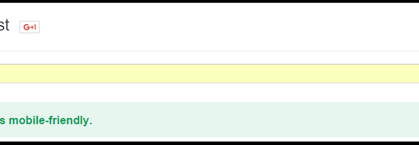
Use Google’s Mobile-Friendly Test tool here to see if your website is completely optimized.

How to Fix
The best advice I can give you to make your website responsive is to take that buyer’s journey you identified earlier, and completely strip down your website to only allow them to make that journey. This means don’t display irrelevant content! If you have a high bounce rate on mobile, you need to optimize even further.
Another issue with mobile are forms. If your forms are too long, a mobile user will not fill it out. This is because forms are just plain hard to fill out on mobile devices. Consolidate the form to only include name and email if you can. This simple change could potentially increase your visitor to conversion rate on mobile.
Takeaway
There is so much emphasis on getting traffic to a website, that sometimes the user experience is forgotten about and no thought is put into getting users through the website. In order to completely optimize for user experience, running a test with someone who has never visited your site before will completely open your eyes to issues you did not even know existed. Don’t forget to also monitor your changes so you can tell what is helping and what might actually be hurting their experience.
Digital & Social Articles on Business 2 Community
(106)