
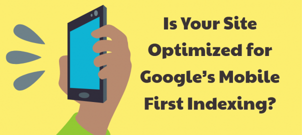
A study from 2017 revealed 57 percent of all online traffic now comes from mobile devices. In response to the significant shift, Google announced it would develop Mobile First Indexing. The index makes mobile content the first thing Google will search when ranking websites, even if the user is searching from a desktop. Google’s changes are in place after slow and careful development. In light of the adjustments, it is important that all websites have their mobile websites optimized for the index. Try these tips to ensure your website runs effectively on mobile devices and will rank in Google searches.
Check Your Mobile Usability Report For Flaws
The first thing you need to do to prepare for Mobile First Indexing is look through your mobile site for any flaws. Luckily, Google has a tool called the Mobile-Friendly Test that can sort through your design. The test only takes a few minutes and will highlight anything that is an issue for users on mobile devices.
Google has also added a “Mobile Usability” report on the Webmasters Tools Search Console. The report will pick up any elements of your website that do not function correctly or appear unnatural to users.
Monitor Google’s Crawl Activity
Google will notify you when it has switched your site over to the mobile-first model. Both before and after receiving the notification, monitor how search engine bots access your site and what they find once they are there. You will get more information about the traffic your website is receiving from smartphones as opposed to desktop computers. Fixing any crawl issues is an important step for optimizing your mobile website.
Switch To Responsive Design
Responsive design isn’t really an option for businesses who want to stay ahead of the digital curve. With responsive design, a page will automatically change the layout depending on whether the user is viewing it is on a desktop or a mobile device.
If you have a single, responsive design, the same content will automatically show up on the website, regardless of the platform the viewer is using. There’s no question this kind of design makes it easier for end users to navigate because they don’t have to switch devices to engage with a business. Additionally, it makes it easier for them to share information because it no longer matters what device the recipient is using. Having a responsive design means designers and developers do not need to monitor two separate websites and can work on a single template. It’s a win-win.
Make Your Website Ideal For Mobile Users
Now that Google is using a new way to rank websites, your focus should shift optimizing your site for mobile. Mobile users are looking for different things in a website than those who use desktops. For instance, long blocks of text without headers or paragraphs are more frustrating on mobile devices because of the size of the screens. Most users do not want to squint at their phones trying to read small fonts. Large chunks of solid text will most likely drive mobile users away from your website.
Keep your text clear and to the point. Shorten your paragraphs and insert headings and sub-headings. This will make the content significantly easier to read and decrease the chances users will immediately navigate away from your site.
Check Your Links
Google checks for the links used by your site and rewards connections between content. Links on mobile sites, though, are a little more complicated than those on desktops. You must make sure the link connects to a website that is optimized for mobile devices. Users will become frustrated if they follow a link from your website and it brings them to a website that is not compatible with their devices.
Make It Easy To Select Items On Touchscreens
Touchscreens are common on most smart mobile devices, but plenty of laptops and desktops also have them. Make sure users can easily touch and select links, images, and all elements on your page – whether it’s a full-sized personal computer or a smartphone. If the elements on your page are too close together, the user will most likely have to zoom in to select something, which is an inconvenience that takes extra time and can cause frustration.
To optimize your website for touchscreens, you can try using large buttons instead of links, adding separation between any touchable elements, and designing navigation menus so they are optimized for use on mobile devices.
Some people worry that using buttons and images instead of links will affect their SEO. Add an “ALT” tag to the buttons and images so Google will know what they represent, giving it the ability to index it correctly.
Use PagesSpeed Tools Or Other Speed Tests
The speed of your website is bound to have a massive impact on your bounce rate. Whether you are using a mobile device or a desktop, having to wait around for pages to load is unpleasant and unappealing. Recent studies have shown more than 50 percent of users will leave if a website has not loaded after three seconds.
Google has a free tool you can use called PageSpeed. It can analyze the performance and speed of your website and give you suggestions for improvement. You can also use the Pingdom speed test. Website speed tests can help you identify which parts of your website are slow and how to speed them up.
Adjust Titles
Check your titles and make necessary adjustments in preparation for the Mobile-First Index. You are only allowed a certain number of characters before your title will trail off into ellipses. Google does not have one set allowance for characters because it depends on the pixels and what can be shown in the specific space.
It is always safer to keep your titles at a length that can be viewed completely on the search engines. You want users to gather as much information about your website as possible on a first glance so they feel motivated to explore your site. If your title is cut off halfway through, a user is more likely to keep looking for a website whose title they can see in its entirety.
Get Rid Of Adobe Flash
Adobe Flash Player, a software that once was the foundation of animation and video on the internet, is now inferior to other content delivery forms such as HTML5 and JavaScript. One of the biggest issues with Flash is that not every mobile browser supports it. Some mobile users cannot access your content without downloading Adobe Flash on their devices, which few people are willing to do.
HTML5 and JavaScript have left Flash in the dust with regard to reliability and overall improvements. They are superior choices both for mobile devices and desktop computers.
Accentuate Location
Rather than searching for specific businesses, people have started asking Google for the best local businesses. Half of all people who use smartphones and 34 percent of those who use tablets visit a store they researched the same day they discovered it. Use your city name in titles, headings, and on various other parts of your website so you will rank when people search for businesses in your area.
About the Author: Stephen Moyers
A study from 2017 revealed 57 percent of all online traffic now comes from mobile devices. In response to the significant shift, Google announced it would develop Mobile First Indexing. The index makes mobile content the first thing Google will search when ranking websites, even if the user is searching from a desktop. Google’s […]
The post Is Your Site Optimized for Google’s Mobile First Indexing? appeared first on Search Engine People Blog.
(95)